New British Library exhibition pays tribute to most amazing scientific diagrams in history

For free real time breaking news alerts sent straight to your inbox sign up to our breaking news emails
Sign up to our free breaking news emails
For many, the rise of the infographic is linked to the digital age. Yet a new exhibition will show scientists and statisticians have used images to explain data for centuries, including Edmund Halley and Florence Nightingale, who used a diagram to help drive through health reform.
Beautiful Science: Picturing Data, Inspiring Insight opens tomorrow in the British Library’s Folio Society Gallery. It marks the first time the organisation has ever had a science exhibition and seeks to highlight how important a role picturing data plays in the scientific process.
Johanna Kieniewicz, lead curator of the show, said that “while the mass amount of data and abilities to animate it is much more advanced, in some ways we’re similar. Going back a long time people saw diagrams as tremendous potential to communicate scientific ideas.”
The items on display run from a 17th century illustrated diagram to a moving infographic of currents in the world’s oceans compiled by NASA.
Dr Kieniewicz said there were parallels with developments today and, in particular, the Victorian age. She said: “We are in an era of big data, but there was also an explosion in data back then, particularly related to vital statistics and climate. They too were trying to reconcile how to work with the information and communicate it to the public.”
Beautiful Science: Picturing Data, Inspiring Insight
Show all 6Among the items on display is Nightingale’s “rose diagram” from 1858. “Most people know Nightingale as a nurse and the lady of the lamp, but she was also a very hard-nosed statistician,” Dr Kieniewicz said of the first woman to be elected to the Royal Statistical Society.
Her diagram showed that significantly more deaths in the Crimean War were down to poor hospital conditions than battlefield wounds.
Dr Kieniewicz said: “It was a means of communicating what was going on in the hospitals. She put it on pamphlets and sent it to government ministers and anyone who would listen to her. It showed the importance of the visual image.”
The rose diagram was “very political” the curator said. “She was using it to try and drive through health reforms.”
The curators set out to show that in the age of advancing technology that the challenge of presenting data in visually appealing ways is not a new one.
Dr Kieniewicz said: “As big data is becoming such a topic of huge interest, we wanted to show the important connections between the past and the present.” She added that centuries-old data “is now being used to inform cutting edge science”.
The earliest piece in the show is Robert Fludd’s Great Chain of Being, a visual representation of a hierarchically ordered universe from 1617.
The curator revealed that the Met Office still used data from log books used on East India Company clipper ships to test their climate models. Dr Kieniewicz said: “The idea is to understand weather patterns of the present and future we need to be tied into what has happened in the past.”
Eberhard Werner Happel drew a map in 1685 charting the oceans’ currents. Sitting opposite is Nasa’s moving infographic charted off satellite readings and buoys.
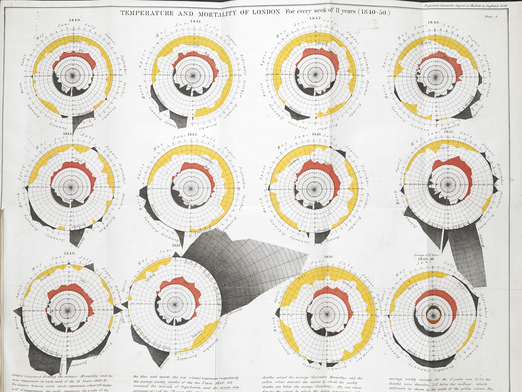
The exhibition also looks at William Farr and John Snow’s use of statistics to study a cholera epidemic and compares it to computerised models of a flu pandemic in 2009, which animates how it spread around the world.
As well as health and weather the exhibition’s third strand is the tree of life, which uses data to map evolution
“Data visualisation is a technique with a rich and surprisingly long history,” Clive Izard, head of exhibitions at the British Library, said.
Subscribe to Independent Premium to bookmark this article
Want to bookmark your favourite articles and stories to read or reference later? Start your Independent Premium subscription today.
Join our commenting forum
Join thought-provoking conversations, follow other Independent readers and see their replies