Inspiring home of the week: A modern, monochrome dwelling in San Francisco
'We’re deeply committed to the idea that modern architecture isn't arcane'

For free real time breaking news alerts sent straight to your inbox sign up to our breaking news emails
Sign up to our free breaking news emails
A couple who run an architecture practice have realised their dream home in an understated, monochrome apartment in the Californian city of San Francisco.
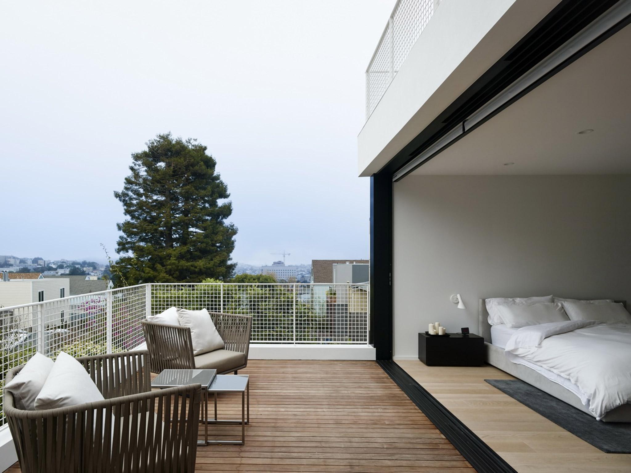
Vivian Lee and Robert Edmonds, who met at Columbia University’s architecture school, designed their home which sits on a slope in Noe Valley in the city centre. The upper half of the three-storey home known as the Switchback is occupied by the couple and their two young children, while the rest has been leased to a tenant. Owing to the topography of San Francisco, the property is positioned on a slop - which is mirrored by its slanted roof.
Designed to accommodate their young family, the home is inspired by early twentieth century modernist aesthetic, with its clean, white facade.
We spoke to the architects about designing a home inside which their family will grow.
Please tell us a little about your practice
We founded Edmonds + Lee in 2005 after moving to San Francisco from New York City. We met at Columbia University GSAPP and always talked about founding our own firm. We’re currently at seven people.
What is your practice known for?
Our work has been recognised for a combination of ethereal materiality and total precision. We are always engaging with light, space, plane and material. We’re also known for being a multifaceted team - Vivian is the big developer and Robert is the intense residential theoretician.
We’ve worked with a lot of high-profile developers on their interiors for massive multifamily projects - as well as more boutique ground up buildings, like Parcel T here in San Francisco, which emphasises our ability to integrate high design in a tight urban lot with challenging budget. We love doing big work but we can also think about the particulars of a stairway, like we just did for a surgical remodel of an Esherick house, for months. We’re known for range: of exploration, building, and ideas.
How would you sum up the project in five words?
Iconic; open; accessible; fluid; intriguing.
What was the brief for this project?
We needed a proper urban infill house for a family of four that’s both deeply rooted in local history but also avoided the replication of a lot of “contextual” housing that crops up here and there in San Francisco.
We wanted a house that is visually intriguing but programmatically flexible suited to a growing family whose needs might change in the future. We also wanted something accessible in both spatial arrangement and materiality.
We’re deeply committed to the idea that modern architecture isn't an arcane thing that doesn’t work for a family. This house, which happens to be our own, is meant to operate as a model for how architecture can be deeply integrated into a life. We want people to come in and say “ohhhhhhhhhhhhh I didn’t know you could do this here!”
What did you hope to solve as you designed this home?
Aside from larger questions of architecture and modernism, pragmatic issues. We had to bridge the visual gap between the two buildings on either side and respect the sloping topography of the site. So we created a roof line that slopes down, connecting the two neighbours and mimicking the slope of the hill. The site also sloped down in the back, which gave us an opportunity to step the living space down by a significant amount, and create this very cool stadium seating.
We also wanted to solve really practical needs and address San Francisco’s urban complexity; we might want our parents to live in the lower unit apartment at some point. And we wanted a house that could grow with our children; they share a room now but in the future they’ll want their own spaces. We see the blend of privacy and togetherness that we feel in our family life truly reflected in the layout and design of the house.
What makes this space unique?
There’s a huge amount of southern light that comes in through the double-height frosted glass facade. The slanted ceiling opens up pockets for skylight to come in, and also makes this multi-story family house feel like downtown loft living. And it’s also a bright, open, airy, modern structure - in a neighbourhood that’s mostly filled with warren-like Victorians. We also have a unique kitchen island - it’s a singular long black kitchen island made out of an Italian self-healing nanotechnology; ours is the first residential project to utilise this material in California.
What was your inspiration for this project?
The intensity of opposites: black vs white, natural wood floor vs super-smooth nanotech resin; solitude vs togetherness; restoration vs city life; openness and refuge.
What was the toughest issue you encountered when this building was being designed and built?
San Francisco is notorious for having an extensive Planning Review process - it was a nerve-wracking process dealing with everyone’s needs, but we ended up getting unanimous approval which felt great for us.
What do you wish you could change in hindsight?
An extra room for the boys to hang out in when they’re teenagers who *really* want to be left alone!
What sort of experience do you hope people using this space have?
We hope they leave with a sense of wonder at what architectural spaces can do for home and for a family. We hope that they understand how unusual materials and surprising decisions can actually work to bring a family much closer; and how living in an open house is an incredible gift. And that architecture isn’t just for museums!
Subscribe to Independent Premium to bookmark this article
Want to bookmark your favourite articles and stories to read or reference later? Start your Independent Premium subscription today.
Join our commenting forum
Join thought-provoking conversations, follow other Independent readers and see their replies