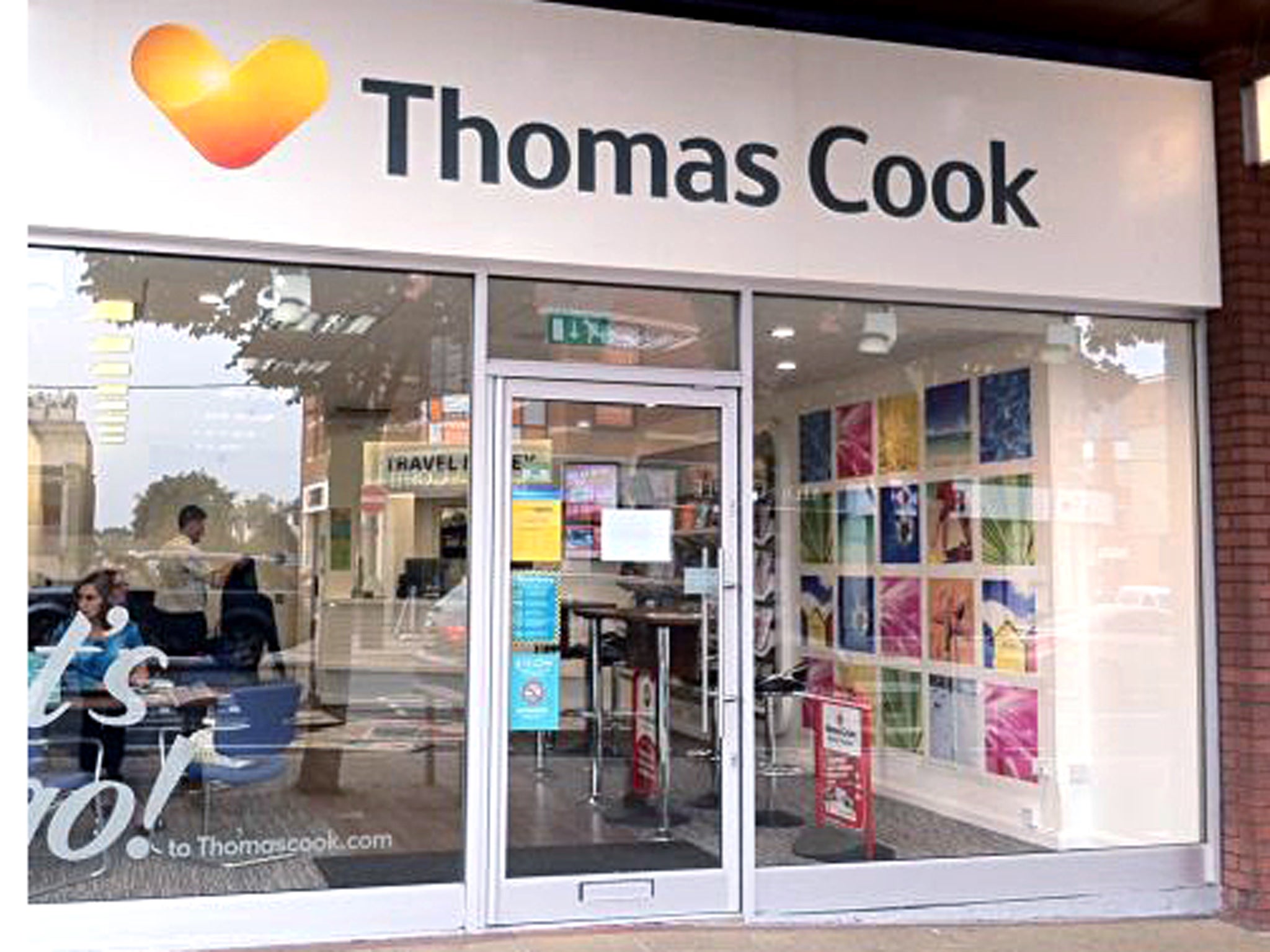
Simon Calder: Will Thomas Cook's new look entice you to book?
The man who pays his way

Choosing a logo for a travel company is easy. Just ask Stelios. When he invented a low-cost airline in 1995, the entrepreneur plucked a colour that nobody "owned", the garish orange known as Pantone 021C. (The first beneficiary of his choice was the Milton Keynes branch of Benetton, the closest stockist to Luton airport of industrial quantities of orange garb for the cabin crew.) He found a banal font, presumably among a pile of discarded typefaces that did not deserve to see out the Eighties. The name "easyJet" was duly slapped on the side of a plane, along with a telephone number; older readers may recall that was originally the only way to book a no-frills flight.
Today, the orange glares out artlessly from more than 200 planes at airports across Europe. Who cares? Travellers have learned to equate the easyJet brand with safe and affordable air travel.
Different airline, similar story: were you to start a pan-European airline with domestic networks in countries as diverse as Spain and Poland, you might seek a name cleverer than bolting the traditional aviation suffix on to the founder's surname. But Ryanair seems to work, even if the brand brings with it a certain amount of excess baggage among those who dislike its business practices.
Neither company has one-sixth the heritage of Thomas Cook. When the pioneering tour operator began sending Brits abroad in 1855, the slogan "Don't just book it, Thomas Cook it" didn't exist – because there was no other realistic way to book a Continental journey other than with the enterprising Mr Cook. While he was helping Victorian adventurers to extend their horizons, I suspect he did not spend too long fretting about a brand that reflected "values of trust, personalisation and innovation, and an approach that is high-tech and high-touch across all customer touch points".
The current custodians of the most resilient brand in travel do, though. This week the Thomas Cook Group unveiled the next stage in its journey back from the edge of a financial abyss: a new corporate identity known as the "Sunny Heart". At first sight, it looks as though the Thomas Cook logo is a modification of the cardiac diagram on NHS donor cards. But the chubby golden "V" is not new. It was created by the Swedish design firm Happy F&B (now there's a bizarre brand) for Cook's Nordic subsidiary, Ving – slogan: "Holiday is where the Heart is."
Cook's blue and gold globe emblem was one of the most handsome and enduring in travel. Why ditch it in favour of a symbol that has no overt meaning and, inconveniently, even has topological echoes of its arch-rival's "Thomson smile"? According to the firm, "The new, unified brand captures the essence of Thomas Cook: how it delivers inspiring personal journeys as the trusted pioneer in global travel." Oh.
Fifty shades of play
Thomas Cook knows all about rebranding disasters, because a decade ago it ignominiously abandoned the worst new corporate look of the 21st century. The start of the new millennium was just the time when the traditional holiday companies should have been countering no-frills airlines by encouraging customers to place more importance on rock-solid reputation. Operators also needed to convince us that the value of a package holiday was greater than the sum of its parts. So, what did Thomas Cook do? It decided to disguise its noble heritage and rebranded all its holidays as "JMC"– the initials of the founder's son, John Mason Cook, a figure who does not much trouble travel historians. Then, just as the loyal Thomas Cook customer was trying to make sense of the new lime-green look, it promised JMC would "unwrap the package holiday piece by piece". Which was just what the low-cost carriers were busy doing.
According to Thomas Cook, though, the new design sells more holidays: "Having already piloted the brand unification approach in its North European businesses, there is evidence that the approach increases both early bookings and online bookings."
Thomas Cook (the organisation, not the visionary) is keen to tell us that the new logo is "leveraging the combined strength of the Group to maximise the Group's presence in the mind of customers". As the northern skies darken into 50 shades of grey, a logo embracing the spectrum from cream to blood orange provides 50 shades of play and a welcome dollop of sunshine on the High Street. No doubt great marketing minds have deduced it will spur sales in Stockport, just as it has in Stockholm. We shall see.
Let's let the slogan go
The company's decision to erase the trusty "Don't just book it …" tag is puzzling. It was a robust reminder of Thomas Cook's heritage. And it was original. Thomson once flattered its rival by echoing Cook's line with the short-lived slogan: "If Thomson don't do it, don't do it."
Thomas Cook has apparently borrowed the term "Let's go" from a Boston-based guidebook firm, which boasts: "With pen and notebook in hand and a few changes of underwear stuffed in our backpacks, we spend months roaming the globe in search of the best deals and hotspots for young, adventurous travellers". That might mirror the method and mission of The Independent's travel desk, but it is not traditional Thomas Cook territory (except, perhaps, for its Club 18-30 brand). And Stelios may not be impressed at seeing such a close relation to the "Let's fly" message that he devised for easyJet.
Subscribe to Independent Premium to bookmark this article
Want to bookmark your favourite articles and stories to read or reference later? Start your Independent Premium subscription today.

Join our commenting forum
Join thought-provoking conversations, follow other Independent readers and see their replies