Tom Sutcliffe: My reading finally meets its Waterloo
The week in culture

Sign up for the View from Westminster email for expert analysis straight to your inbox
Get our free View from Westminster email
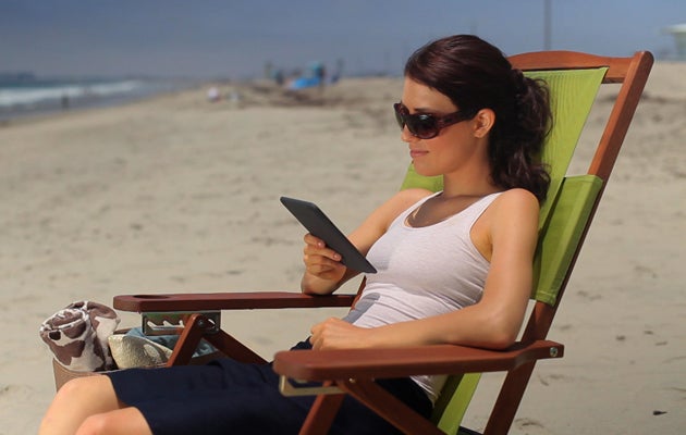
I conducted an informal experiment on holiday – though to be honest the word experiment is used here in its television sense, where it conventionally means a procedure undertaken without any form of control and employing a sample so small as to make any result unreliable. Not an experiment at all, then – but it was an activity which could boast at least one constant (War and Peace) and one variable (the medium on which I was belatedly reading Tolstoy's classic). Having reached that time in life where you can no longer feel complacent about "getting round to it one day", I'd decided that a holiday in a remote part of Greece was a good moment to fill in this gap in my reading, and to that end I'd packed the relatively new translation by Richard Pevear and Larissa Volokhonsky – a reassuringly solid sample of the bookbinders' art which makes you feel cleverer just for holding it in your hands. Then, on the night before we set off, my wife gave me a Kindle as an early birthday present and I downloaded another copy of Tolstoy's novel for 99 pence – this one translated by those doughty Fabians and sometime Tolstoyan colonists, Aylmer and Louise Maude.
The idea was that I would stick to the book when I had something to prop it against and turn to the Kindle when I headed to the beach or needed to tote it around. The choice about which format I would be using would be dictated by circumstances and I broadly assumed that, translation style aside, I wouldn't notice much difference when I switched. Moreover since I didn't plan to do any line-by-line comparisons of the two different versions I thought even the stylistic shifts wouldn't be that obtrusive. The Maudes were more Edwardian in their literary style – and translated most of the French conversations – but otherwise there wasn't too disruptive a clunk in prose styles between the two editions.
What I hadn't quite bargained for, though, was how different it felt to read the book in the two different formats. Weight, rather literally, was a factor here. The Kindle, with cover, came in at just over 400 grams; and the book added another kilogram to that. But that difference in heft turned out to be more than a merely physical question. Holding the book you can never forget that this is a great work – that it has tangible literary gravity. The Kindle homogenises in a curious way, giving a novella or a short story or an airport thriller exactly the same physical presence in your hands as one of the most obdurately substantial works in the canon. And however slight the effect is, that does something to the way you read the book. Even the experience of travelling through the work is subtly different. The physical book tells you in analogue style how far you've come and how far you have still to go. The Kindle only gives you a completion percentage – a dispiritingly digital measure of your literary consumption.
You might argue that this is an advance, though. Those elephantine candidates for the title of the next Great American Novel won't be able to impress by sheer bulk anymore, because an e-book gives you only the text and the unvarying device that serves it up. You can't easily flick ahead to find where the next chapter break is if your strength is flagging. And you can't easily flick back to check your bearings. The sentences and the prose are all you've got to go on, page by discrete page. And though there's a definite loss in texture – the instinctive knowledge of how old the edition is, and how cheap it was – there isn't the distraction of texture either. The fabric binding of the Viking Classics edition gives you a tactile connection to Tolstoy's world of materials – but you can't entirely rule out the possibility that the density of the type and the fineness of the paper are doing some of the work of conveying a sense of quality. On a Kindle everything comes in the same Caecilia font – which is serviceable (and wonderfully magnifiable if you should forget your reading glasses) but conveys very little typographical flavour. Again it's the words that are crucial. In the end I really couldn't say with any certainty which I preferred more – analogue warmth or digital severity. They both have their advantages. But War and Peace is great in either.
Fewer cliches required in Bier's Oscar winner
High art has its clichés, just as popular art does – and one that drives me faintly mad is the natural reverie moment in arthouse cinema. There's a good example in Susanne Bier's Oscar- winning movie In a Better World, a study of revenge and justice and the costs of violence. In it an idealistic doctor called Anton struggles to save his marriage after an infidelity and to teach his young son, who's been bullied at school, that it isn't cowardly to turn away from violence. And at one low moment for Anton he's filmed sitting silently in the woods, staring expressionlessly at a sunlit cobweb. Given that Anton is actually in the frame this isn't entirely typical of the natural reverie trope – which more classically interrupts the narrative entirely, cutting away from the action to gaze solemnly at a leaf, or a pebble or a line of ants marching over a twig. I take it these interludes are meant to ground the film in the natural order, or to suggest that the world at large is indifferent to our puny human concerns, or to offer a glance of redemptive beauty. Those would serve as plausible directorial justifications, anyway. But I suspect they're also there to say – "I am not just a movie, with its frantic itch to entertain. Je suis une filme. I am soulful and meditative." I liked In a Better World, but I think I would have liked it even better without the badges of high-mindedness.
Signs of the times for illustration
The sell off of Radio Times by the BBC stirred two kinds of nostalgia in me. The first, not really terribly rational, was an ancient pang of amputation connected to the closure of The Listener many years ago, which took with it a pretty good magazine, but also one of the last reminders of the one-time monopoly of radio in the broadcasting universe. The second was a memory of what a treasury of British illustration the Radio Times had been until TV celebrity and colour photography had combined to kill off the drawn cover. Pretty much everyone who was anyone in British illustration drew for the Radio Times – including Heath Robinson, Paul Nash and Ronald Searle – and even the listings pages were dotted with beautifully-drawn miniature illustrations. But although illustrations just about cling on in the radio pages of the current Radio Times, they're almost unheard of now in the television pages and I can't remember the last time I saw a drawn cover. While the magazine was still part of the corporation I never quite gave up hope that they might revive the tradition in a small way, but there seems little chance that a commercial publisher would be interested in anything other than Doctor Who alternating with pictures of Kate Middleton and Strictly Come Dancing.
t.sutcliffe@independent.co.uk
Join our commenting forum
Join thought-provoking conversations, follow other Independent readers and see their replies