The Independent's journalism is supported by our readers. When you purchase through links on our site, we may earn commission.
Your most asked interior design questions – answered by experts
How do I discover my own style? How do I make my small flat feel larger? What are some inexpensive ways I can help my space feel more luxurious? Adele Cardani finds the solution to all of these and more
Your support helps us to tell the story
This election is still a dead heat, according to most polls. In a fight with such wafer-thin margins, we need reporters on the ground talking to the people Trump and Harris are courting. Your support allows us to keep sending journalists to the story.
The Independent is trusted by 27 million Americans from across the entire political spectrum every month. Unlike many other quality news outlets, we choose not to lock you out of our reporting and analysis with paywalls. But quality journalism must still be paid for.
Help us keep bring these critical stories to light. Your support makes all the difference.
Designing a home that feels “just right” is no small feat. It’s about achieving that delicate balance of form and function, curating an environment that shows off your personal style but is also timeless and versatile. With this endeavour in mind, I’ve scoured Google and compiled a list of the most common design and decoration queries. I then asked nine of the UK’s leading interiors experts to give their sage wisdom. Read on to see if your burning questions are finally answered.
How do I discover my own design style?
Your personal style is the combination of design elements that reflect your tastes, preferences, personality, and overall aesthetic. Many of us need a bit of a hand when it comes to figuring out exactly what this looks and feels like.
Luxury London-based interior designer Naomi Astley Clarke explains: “From Instagram to TikTok, there’s no shortage of design inspiration at our fingertips, and as a result, we’re increasingly influenced by widely varying aesthetics. This can lead to confusion about what we really want our own living spaces to look like. To discover your own style, think first about your lifestyle and how you envision your home functioning to support and enhance that. Rather than fixating on achieving a beautiful aesthetic, ask yourself – how do I need this space to make me feel? For example, in your bedroom, you’ll want to be relaxed and well rested. Consider the colours, materials, and things that will help you achieve that feeling.”
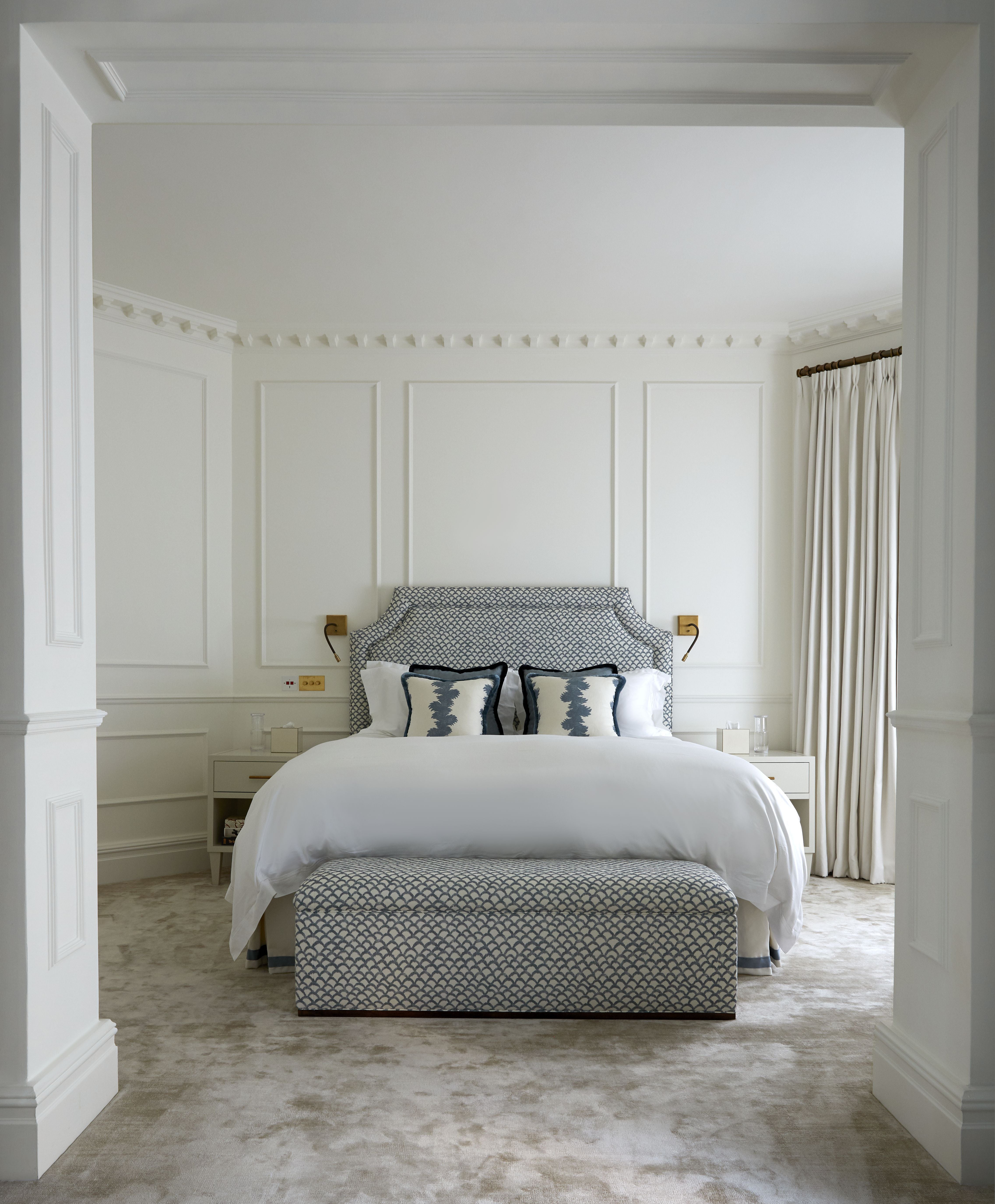
She continues, “If you are someone who has collected a lot of inspiration photos, search for common themes that standout. From there, your interior designer will be able to help you to develop those beloved motifs, colours, and styles into a cohesive, liveable space that’s entirely bespoke to you.”
What kitchen mistakes should I make sure to avoid?
Don’t force an island into a space that’s simply not big enough. Tom Howley, design director of the eponymous bespoke kitchen company, explains: “Kitchens need to be as functional as they are beautiful, and sacrificing floor space to fit an island will just give an awkward, uncomfortable look. The importance of walkway space should be a key consideration. When designing your layout, always leave a metre of walkway space on either one or two sides of your worktop, island, or peninsula counter.”
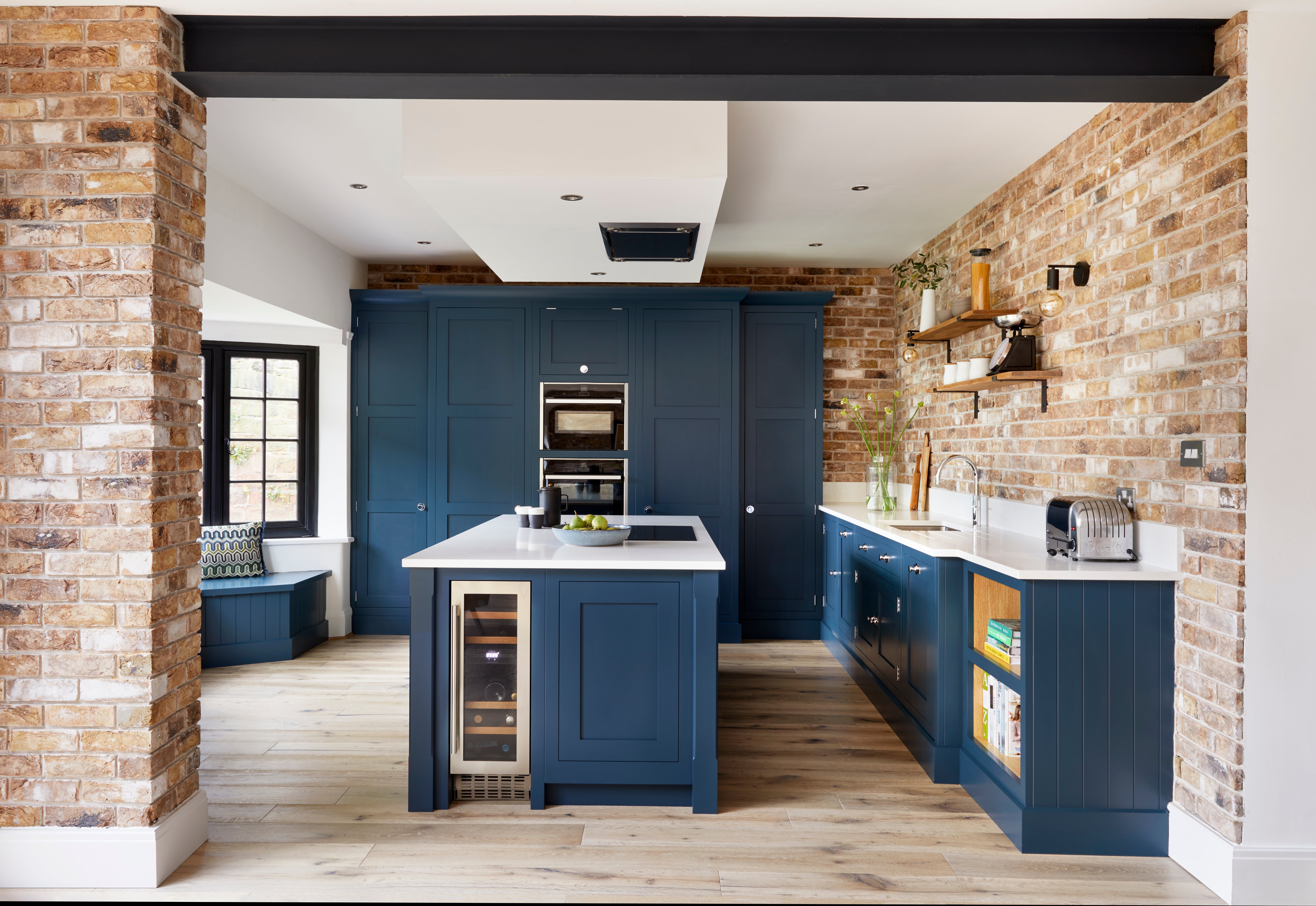
Additionally, don’t skimp when it comes to your cabinetry – environmental and quality issues often lie behind exceptionally cheap prices. Howley adds, “Invest in high-quality cabinetry as it will last a lifetime and can be easily repaired and repainted, thus extending the life of the entire kitchen and ultimately saving you money in the long run. Solid wood always looks and holds up the best.”
Which kitchen worktop material is best?
Kitchens are a busy place and the work surfaces, more than any other part, really takes the brunt of this. Astley Clarke explains, “Kitchen worktops are used constantly – from unloading groceries and chopping vegetables to serving as offices and homework hubs. They’re the foundation of all activity that goes on in the heart of a busy home. Marble is one of the most elegant and luxurious worktop options, but the drawbacks, along with the high cost, are that it is a soft, porous stone, making it prone to staining and chipping, especially in high-traffic kitchens. If you want the look of marble but with more practicality, I recommend quartz as it offers a natural stone aesthetic whilst being extremely durable, virtually non-porous, and stain and scratch resistant.”
Jonathan Stanley from Caesarstone, the engineered stone worktops pioneer, adds: “It’s important to prioritise low-maintenance and longevity when choosing a worktop for your kitchen. Natural stone, such as marble, is highly susceptible to staining, especially in a busy hub such as the kitchen. To avoid substantial damage, you would have to seal your marble countertops at least annually. Caesarstone, on the other hand, requires virtually no maintenance. A simple soap and water solution is enough to gently cleanse our surfaces, with no need to wax or seal them. We also offer a lifetime warranty across all our indoor surfaces, ensuring durability and cementing your worktop as a worthwhile one-off investment.”
How do I make my small flat feel larger?
Making a small space feel bigger is all about tricking the eye. Athina Bluff, founder and lead designer for interior design studio, Topology, advises, “Try to show as much floor space as possible. Think about how you can swap out something chunky for something wall mounted and lightweight, such as a desk on four legs for a floating one. Additionally, opt for glass and Lucite furniture. The more you can see around and through the item, the more light will travel through the room, allowing further floor space to be visible.”
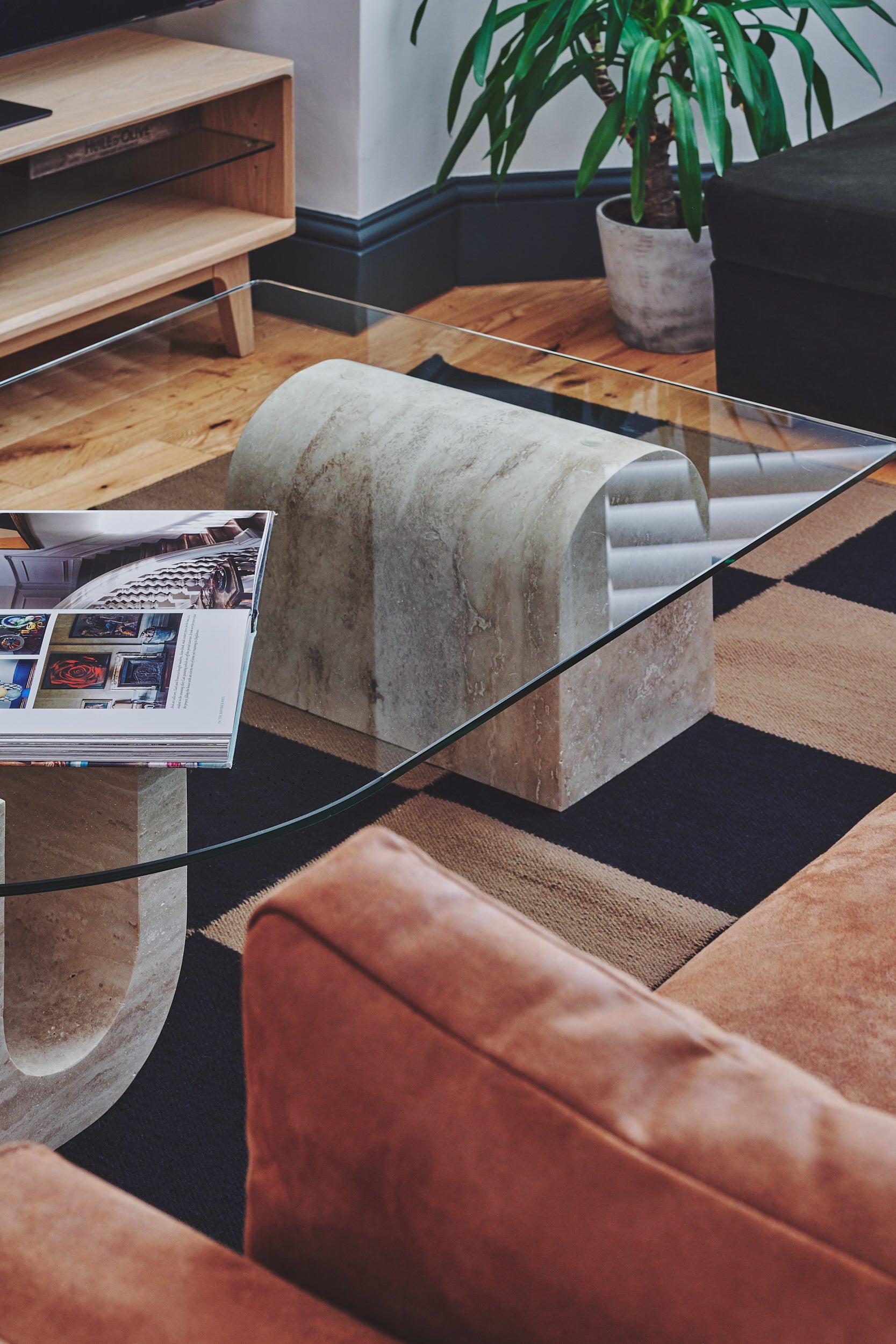
Sophie Clemson, director and co-founder of online interior design service, The Living House, adds: “Think big and opt for a large rug to help anchor your living room. Make sure this rug is large enough to fit under your entire sofa – if it’s too small, it will look like it’s floating in the middle, making the room feel disjointed and more cramped.”
Clemson continues, “Paint your ceiling the same colour as your walls – this helps blur the edges and make the room feel more spacious. Avoid a feature wall as this can make the wall feel like it’s coming towards you, causing the space to feel especially narrow. And if you have an open plan flat, use the same flooring throughout to create a cohesive flow that makes the space feel vaster.”
What is layering lighting, and why is it important?
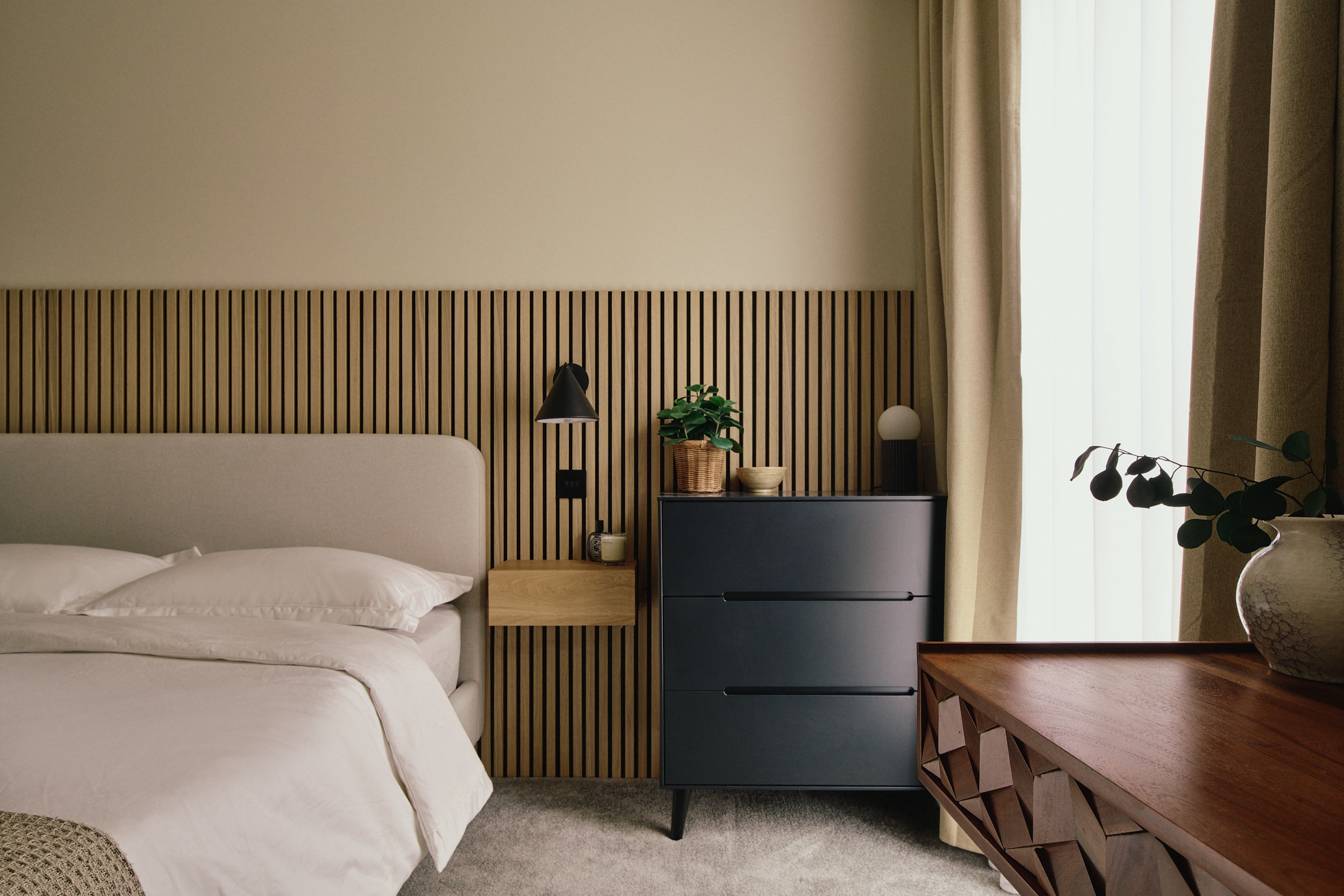
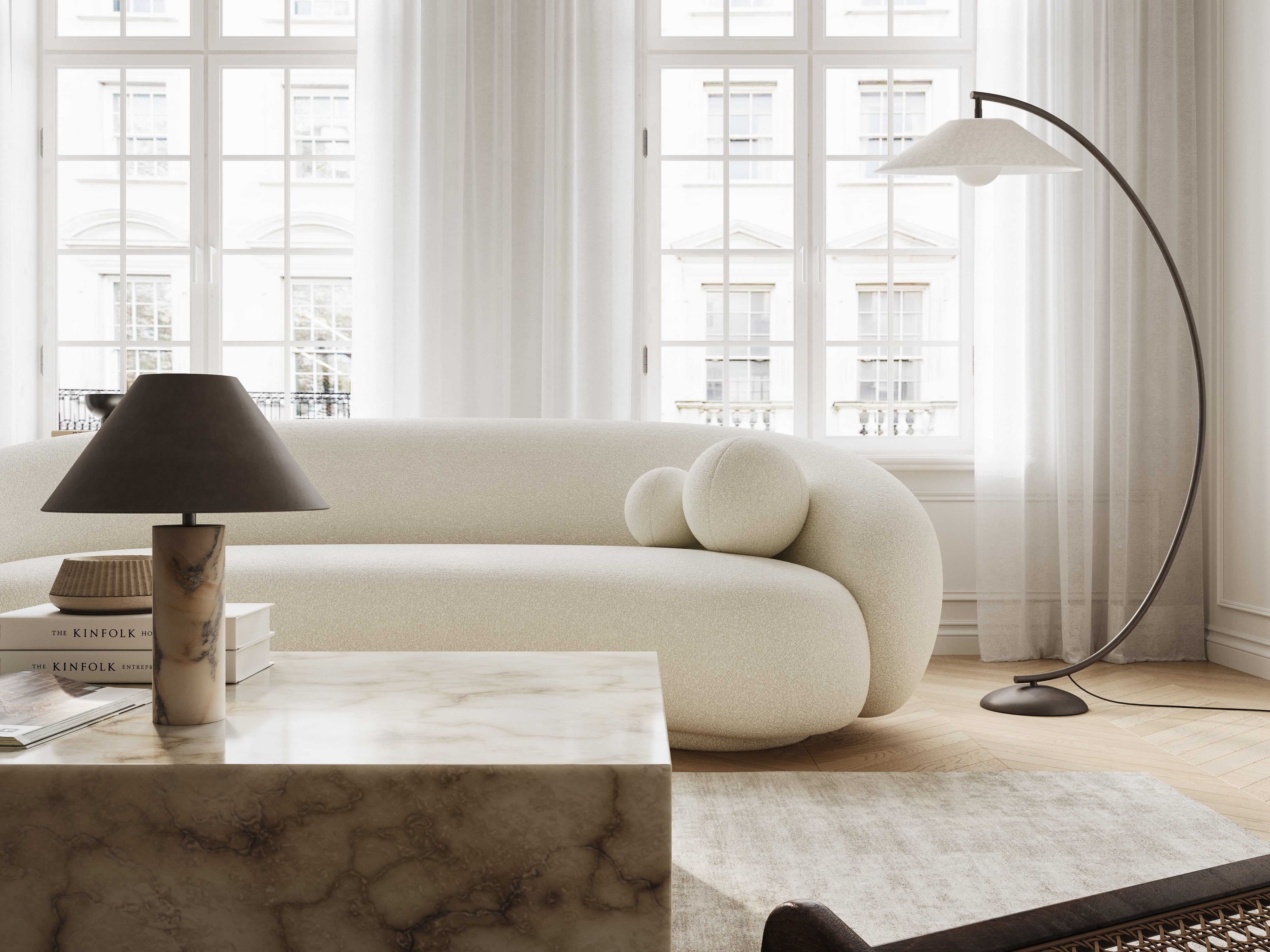
Layered lighting is the combination of multiple, varying sources of light which, when put together, cast a pleasing glow around a room. For example, these could include an ornate, Rococo-style, gilt chandelier hanging from the ceiling, combined with a couple of sconces with endearingly petite, hand-woven lampshades on either side of a mirror, and a floor lamp with a curved brass stem, which softly illuminates a dim corner.
“A layered approach allows you to adapt the lighting in your home to suit your evolving moods and needs,” explains Niki Wright, co-founder of lights&lamps, an ever-evolving curation of contemporary design-led lighting. “Think of your lighting like the sun. Big and bright in the day, then gradually becoming lower and softer by night. When ceiling lights are no longer needed to see by, you can switch to more subtle table and floor lamps. Imitating the setting sun organically transitions your living space throughout the day, bringing peace and calm before bed.”
How do I choose and style artwork to match my living space?
Award-winning British interior designer, Matthew Williamson, tells me: “When sourcing art for your own home, it’s important to bear in mind that the only person it needs to impress, touch, or inspire is you. Never buy art to impress or pander to anyone else, any trends, or because you think something would ‘look the part’ in a room. Above all, your collection needs to resonate with you, whether it reminds you of something fundamental about the way you wish to live your life, or it simply makes you smile.”
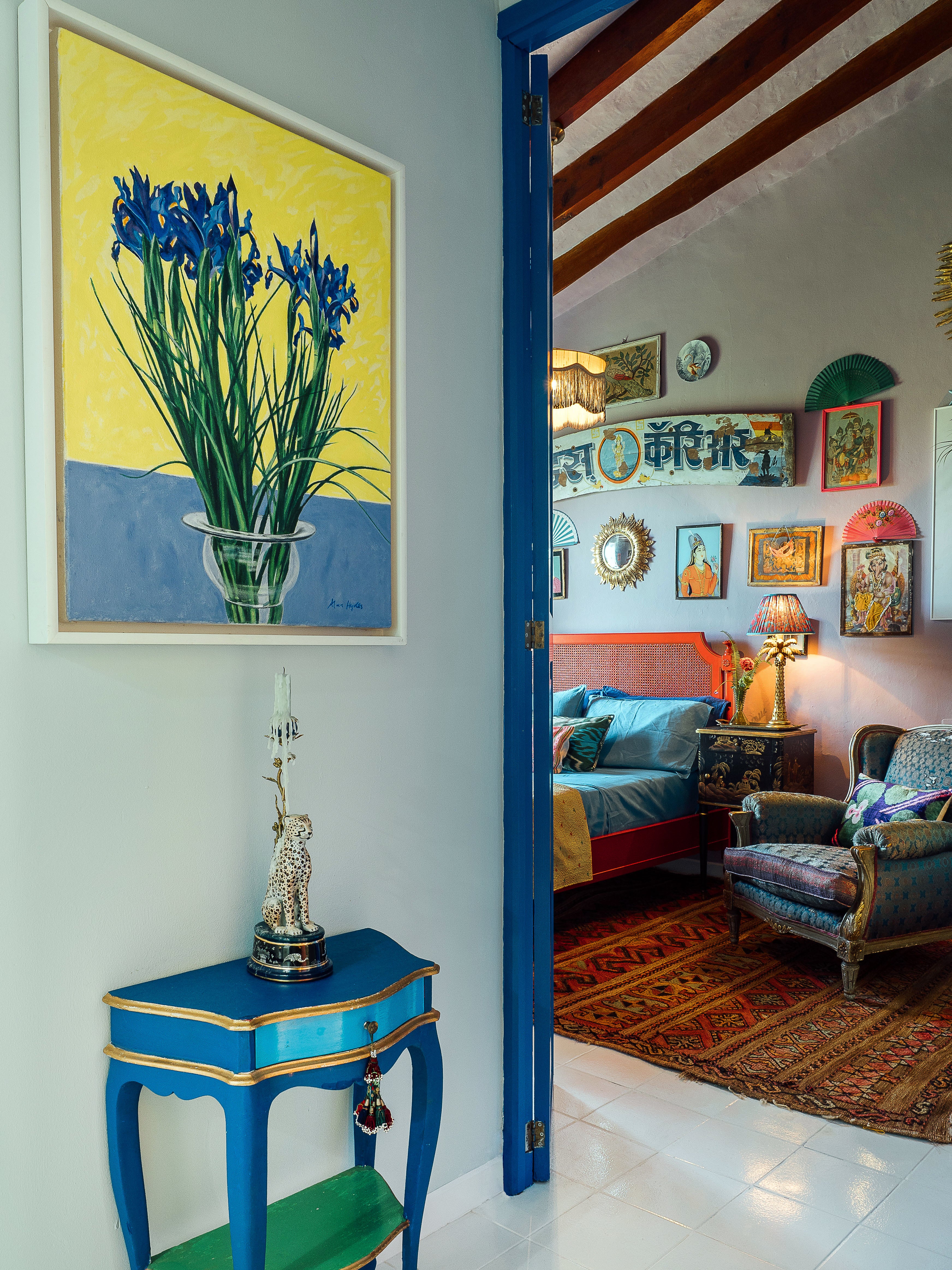
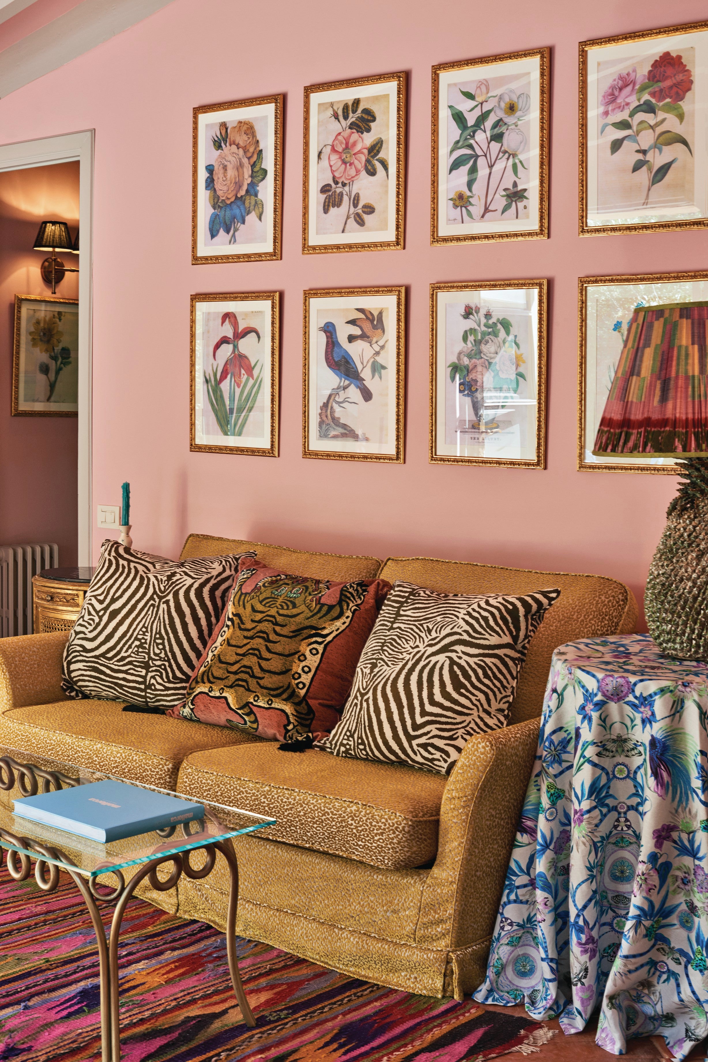
Martin Waller, founder of global design brand Andrew Martin adds, “Hang your artwork at eye level or just above, creating shapes and patterns with multiple pieces to form a cohesive gallery wall. For example, if you have two portraits, face them towards each other as if they’re having a conversation and make themes like putting all your pictures of animals together, even if they’re of different styles and eras. The important thing is to tell a story with your curation. You can also play with colour by organising a group of monochrome pieces with one vividly coloured work in the middle.”
Waller continues, “Don’t be afraid to put very contemporary art in a traditional space, or vice versa – it is often the merging of seemingly incongruous styles that creates beauty through surprise. And when considering your colour scheme, pinpoint one or two of the boldest colours in the room and reflect them in your chosen artwork. Or, working inversely, pick out a hue you love in your artwork and highlight it by using the same tone in cushions and other soft furnishings. This works similarly with shapes – you can mirror a circular shape in an image with a spherical vase or sculptural lamp for example.”
What are some inexpensive ways I can make my space feel more luxurious?
Anne Haimes, design director and founder of Anne Haimes Interiors says, “To make your home look more high-end I always recommend framing your artwork. Inexpensive prints are a great way to introduce personality into your home without breaking the bank on costly art. But time and time again I see people neglect to frame their prints, which unfortunately creates the look of posters in a teenager’s bedroom. Second-hand shops often have beautiful but cheap vintage frames that will help uplift your existing art.”
She continues, “Another trick is to swap out any branded soap bottles or washing-up liquids you may have in your kitchen and bathrooms for glass or ceramic vessels. Replacing branded plastic packaging with a dispenser of your choice will make your home appear much more cohesive. You may also be able to save some money in the long run by buying more cost-effective and sustainable refill packs.”
Athina Bluff adds, “For a small but impactful detail that will make your space feel more premium, change your switches and sockets from white to brass or a sleek black. And opt for feather down cushion inserts, removing all foam cushion pads. Foam cushions often sag and don’t age well, whereas feather-filled ones feel very reminiscent of a boutique hotel. Make sure to give them a classic ‘karate’ chop for ultimate luxury.”
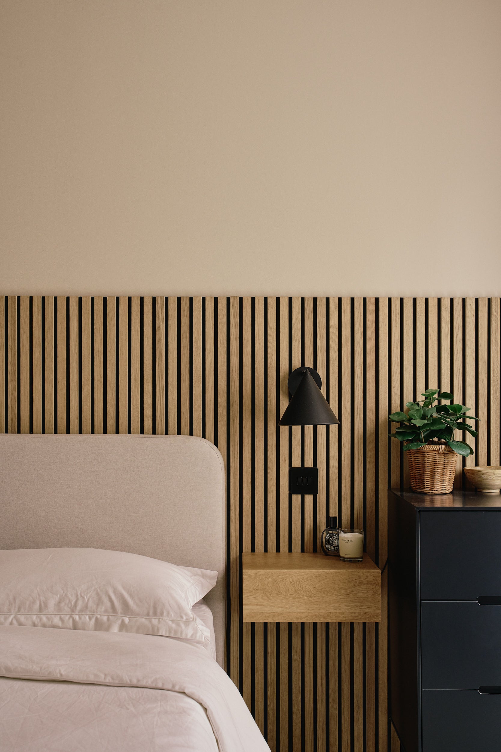
Astley Clarke finishes, “A premium scented candle in an elegant votive instantly elevates a space. The aroma-filled flicker of a candle can be both meditative and escapist, making your space extra inviting and boosting your spirit. Hotel Costes’ ‘Brown’ candle is my favourite. Crafted with an exquisite attention to detail and quality that makes it well worth the price tag, the iconic Parisian hotel’s signature scent was inspired by an ironwood piece of furniture from the Ming dynasty that emits scents of liquor, mild tobacco, and wet stone.”


Join our commenting forum
Join thought-provoking conversations, follow other Independent readers and see their replies
Comments