50 years of RCA design: David Bowie album covers, 'Big Brother' and Rolling Stones logos
Royal College of Art students have revolutionised graphic design. As a half century retrospective opens, they tell Joseph Charlton about creating works that captured the zeitgeist - and haggling with Mick Jagger

For free real time breaking news alerts sent straight to your inbox sign up to our breaking news emails
Sign up to our free breaking news emails
“The role of the graphic designer,” says Professor Teal Triggs at the Royal College of Art and Design, “is to go unnoticed. If it’s invisible as a design then it’s working. It’s effective.”
It doesn’t sound like much of an aspiration, but as we continue to look over GraphicsRCA: Fifty Years and Beyond, a retrospective of the past half century of work created on the graphic design course at the RCA (now renamed visual communication), I start to get the picture.
Take road signs. When was the last time you took a good look at the UK’s traffic signals, or the font on them? The typeface, now called simply Transport, is based on an early-20th-century German font called Akzidenz-Grotesk and was developed between 1957 and 1963. It is the classic “invisible” sans serif font and is at once instructive, impartial and unequivocally clear. Little wonder it has since has been called “the handwriting of Britain” and been adopted for foreign road signs in countries as diverse as India, Tanzania, Italy and Iceland.
50 years of the Royal College of Art
Show all 8This is the bar apparently set for design students at the RCA. Margaret Calvert, who – along with Jock Kinneir, designed Transport and the instantly recognisable symbols that accompany it on most road signs – took up a teaching post at the RCA in 1966, and later went on to become head of the graphics course from 1987-1990. The pedagogical imperative she put on clarity of design can still be felt at the college, even in her absence.
“Public services like the NHS don’t value design as much as they should,” says Abbie Vickress, a recent graduate of the course. “Margaret Calvert’s signs had to be designed clearly in order that they could be seen at high speeds on the motorway. It’s the same with NHS designs. If you pick up the wrong medicine bottle because the design isn’t clear enough, the consequences are potentially disastrous.”
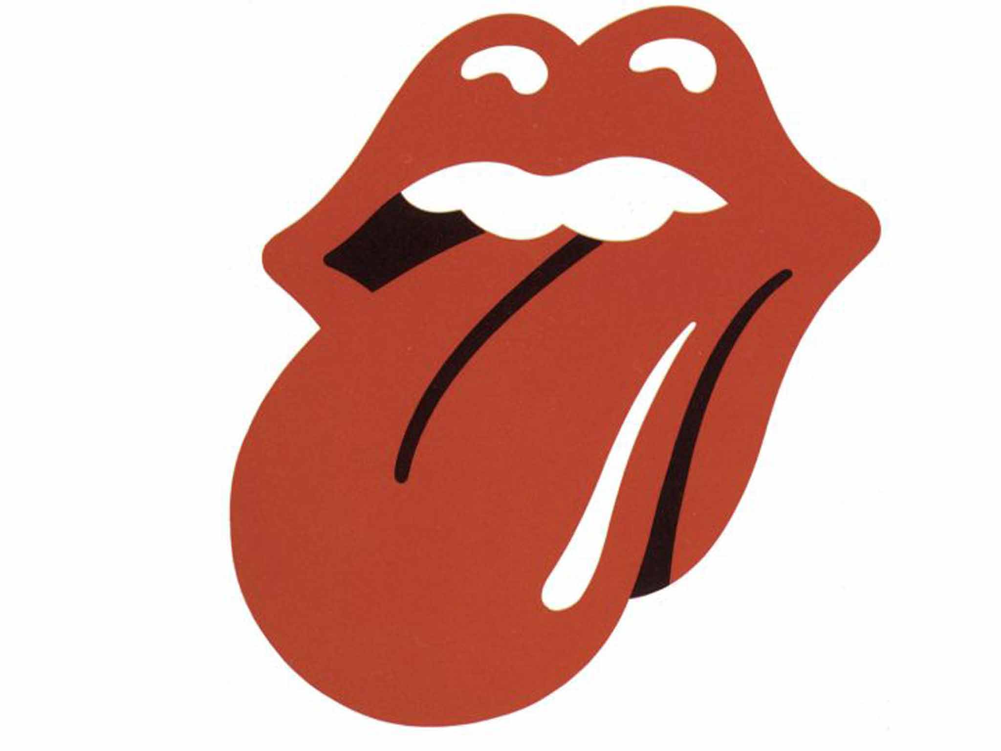
Which is not to say the college only produces designers of health and safety manuals. Indeed, the most famous single image to be included in GraphicsRCA is something less instructive: a disembodied pair of lips and protruding tongue. John Pasche’s world-recognised logo for the Rolling Stones was dreamt up while Pasche was still a student at the college between 1967 and 1970. He recalls the “incredibly lucky break” he got when the band called the school in 1970 to ask for new tour poster ideas. “Originally they were just looking for a design for their European tour, but when Mick was pleased with the work I did for their posters he asked me to design a stand-alone logo for the band,” he says.
Pasche recalls the meeting with Jagger in 1970. “He showed me this statue of the Indian God, Kali – it had all these flailing arms and a pointed tongue. Hindu stuff was very trendy at the time and he said he wanted something with an Indian feel. But when I looked at is all I saw was this tongue and mouth.” Thirteen years after graduating, Pasche sold the logo to the band in 1983 for £24,000 (about £70,000 today). “They offered me a price and my lawyer doubled it and asked for a bit more.”
Pasche continued to designed tour artwork for The Rolling Stones, as well as the cover for Goats Head Soup, before working with The Stranglers. Was the time he spent on the RCA’s graphic design course formative? “It taught me to come up with a concept and a strong idea first, and put an emphasis on a kind of… classical simplicity. It you look at the tongue you can see I tried to make it as simple as possible.”
That ethos of simplicity informs a lot of what’s on show at GraphicsRCA – a throwaway football club poster from 1971 is prescient of block colour minimalist designs to come decades after, for instance– but it’s also present in the most recognisable work of RCA students post-graduation. Who can forget the boldness of the Big Brother logo? A single female eye designed by Daniel Eatock in 2001, three years after he graduated from the South Kensington art school. The eye actually belongs to Eatock’s girlfriend of the time, whom he sneaked up on while she was brushing her teeth, in order to get a shot of her while particularly wide-eyed. The design was then traced from the photograph and became the basis of various Big Brother logos for 10 consecutive series until 2011.
Another important designer and typographer to the college is Jonathan Barnbrook, who studied at the RCA between 1989 and 1990, and went on to collaborate with Damien Hirst for the artwork associated with Hirst’s restaurant Pharmacy, and more recently designed album artwork for David Bowie. “It was an exciting time to be there,” says Barnbrook, “Computers were coming into graphics in the same way that synthesizers had entered music 30 years earlier.”
The names of Barnbrook’s fonts read like a book of unpublished Kafka stories: Exocet, False Idol, Infidel, Moron, Newspeak, Olympukes, Shock & Awe. One of his most important typefaces, Bastard was developed while he was at the RCA. “It’s called Bastard because it’s based on gothic fonts, which are typically fascist,” Barnbrook explains. “The O looks like a British fascist sign and the R looks like a goose-stepping soldier. It was a Tory government back then – the font seemed important to the spirit of the time.”
Later, Barnbrook would go on to design some of David Bowie’s most subversive album covers. The Next Day, from 2013, simply took the cover of Bowie’s 1977 Heroes and obliterated it by placing a plain white square and the new album’s title over Bowie’s face. “I was quite pleased that some people really didn’t like it,” he says. Meanwhile, with 2002’s Heathen, Barnbrook developed his Priori typeface and flipped it upside down for the text on the album’s cover: a decision that reflects the heathen’s desire to “destroy things we feel are sacred”. He is particularly pleased with the fact that David Bowie’s name makes it nowhere on to the artwork.
Did the RCA shape his later output? “I do find myself often falling back on ideas from that time. There was a lot of freedom,” he says.
I ask Julia Georgallis, a recent graduate of the design product course, if she feels that the college still fosters an atmosphere of creative independence and inventiveness. She’s not so sure. “Over my two years there, my course changed dramatically, I guess mainly to do with all the government spending cuts in education,” she says. “It seems as if a sense of creativity and limitless possibility, which was really inspiring, turned to anger quite quickly and there was a lot of resentment for the RCA as a general administrative body.” Arts austerity, it seems, has been tough on the college, with fees doubling since 2012 and student numbers growing rapidly. “The RCA, in my view, has had to become a business, not a school,” the 2014 graduate tells me. “As well as courses growing, there are more courses available with odd, corporate titles to bring in more students and more money.”
It’s a sad thought for the future of the college and the possible future of British graphic design. But for now, at least, those driven to explore the dark arts of typography and symbology in the second half of the 20th century will find GraphicsRCA: Fifty Years and Beyond something of a sanctuary. µ
GraphicsRCA: Fifty Years, Royal College of Art, London SW7 (www.graphics50.rca.ac.uk) tomorrow to 22 December
Subscribe to Independent Premium to bookmark this article
Want to bookmark your favourite articles and stories to read or reference later? Start your Independent Premium subscription today.
Join our commenting forum
Join thought-provoking conversations, follow other Independent readers and see their replies