Van Doesburg & the International Avant-Garde, Tate Modern, London
Well-chosen works show how De Stijl – 'The Style' – movement led to a revolution in European art that still resonates today

For free real time breaking news alerts sent straight to your inbox sign up to our breaking news emails
Sign up to our free breaking news emails
It is mildly ironic that Theo van Doesburg should be remembered as Mr Diagonal, although not entirely so. With his more famous countryman, Piet Mondrian, the Dutch painter fathered a movement and magazine called De Stijl ("The Style") – a utopian group that practised and preached the universal truths of abstract geometry. In 1923, Van Doesburg followed Mondrian to Paris, where, the following year, they fell out.
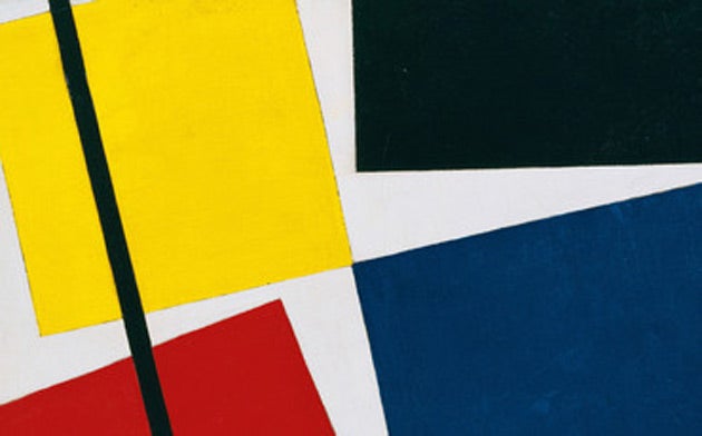
Heretically, Van Doesburg proclaimed diagonals to be better than horizontals and verticals, which he saw as classicising, old-fashioned and – worst of all – based on the human body. Mondrian, scandalised, maintained that the contrary was the case. Van Doesburg stalked off with a splinter group, the Elementarists, leaving his ex-friend to tend the flame of what he now called Neo-Plasticism alone.
All of which might give the impression that De Stijl had been a movement of unwavering (not to say nutty) rigidity, of petty boundaries obsessively observed. Actually, nothing could have been further from the truth. Room 10 of a large, complex and clever exhibition at Tate Modern called Van Doesburg & The International Avant-Garde is given over to the diagonal "counter-proposals" of the Elementarists and their few followers; Room 3 is largely hung with Mondrian's orthogonals. Between these two rooms, though, are half-a-dozen more which show the extraordinary impact Van Doesburg had on European art in the 1920s – an impact which was all to do with boundary-crossing and line-blurring, things so revolutionary that they still resonate today.
First, a little history. De Stijl had come into being in 1917, the year of the Russian Revolution and of Passchendaele and Ypres. In a world gone mad, it is easy to see why the other-worldly rationalism of geometric abstraction might have appealed. In Moscow, Kazimir Malevich and his cohorts were coming to the same kind of conclusion. But that conclusion, like Van Doesburg's, had a political element – a belief that art had to improve the lot of the masses by coming down off gallery walls and going into the streets. And not just Russian or Dutch streets, but – much of the point of De Stijl being its internationalism – into all streets.
Thus, in Room 5, we find the De Stijlists turning their attention to typography. If their entirely new message was to be read, then it had to be read in an entirely new way. Van Doesburg was having no truck with seriphs and curlicues. The point of geometry was that it was rational; letters, therefore, must be geometric. Each would fit into a square or rectangle, and to avoid complexity there was to be only a single – upper – case. To free itself from the horrors of history, Van Doesburg's typeface had also to stand outside of time. To do this, texts were printed so that they overlapped, several words thus being allowed, in theory at least, to be read simultaneously. The results are easy enough to imagine. So remorselessly simple, so extraordinarily legible is Van Doesburg's poster for a Section d'Or exhibition of around 1920 that it is pretty well unreadable. In the same way, the chairs in Room 4 by the De Stijl architect, Gerrit Rietveld, are just too rational to be sat on.
But as with the orthogonal/diagonal wars, the sum of De Stijl was greater than its occasionally inflexible parts. If few of the artists (and architects and typographers and film-makers) who followed Van Doesburg and Mondrian spawned followers themselves, then the Dutchmen did set an extraordinary precedent: they made art multidisciplinary. The current assumption that it is as likely to be found in a nightclub or an artist's book as on a gallery wall dates back to the multinational, multi-media works in Rooms 4 to 9.
Most pressingly, these rooms account for video. On a monitor in Room 7 play Composition I/22 and Composition II/22 by the German sculptor Werner Graeff – two-minute films that bring to life the motionless squares and rectangles of Mondrian and Van Doesburg. Both men had wanted their works to break the bonds of history by breaking the bonds of time: here, on 16mm film transferred to DVD, they do just that. And not just by moving about and changing. The idea that art can move – that a moving image can count as art – is a hugely revolutionary one, still vexatious nearly a century later. If the inclusion of videos in the Turner Prize show makes you frown, remember: you heard it here first.
To 16 May (020-7887 8888)
Next Week:
Charles Darwent sees Paul Nash: The Elements at Dulwich Picture Gallery – a running together of still life and landscape by the great 20th-century British romantic
Subscribe to Independent Premium to bookmark this article
Want to bookmark your favourite articles and stories to read or reference later? Start your Independent Premium subscription today.
Join our commenting forum
Join thought-provoking conversations, follow other Independent readers and see their replies