For free real time breaking news alerts sent straight to your inbox sign up to our breaking news emails
Sign up to our free breaking news emails
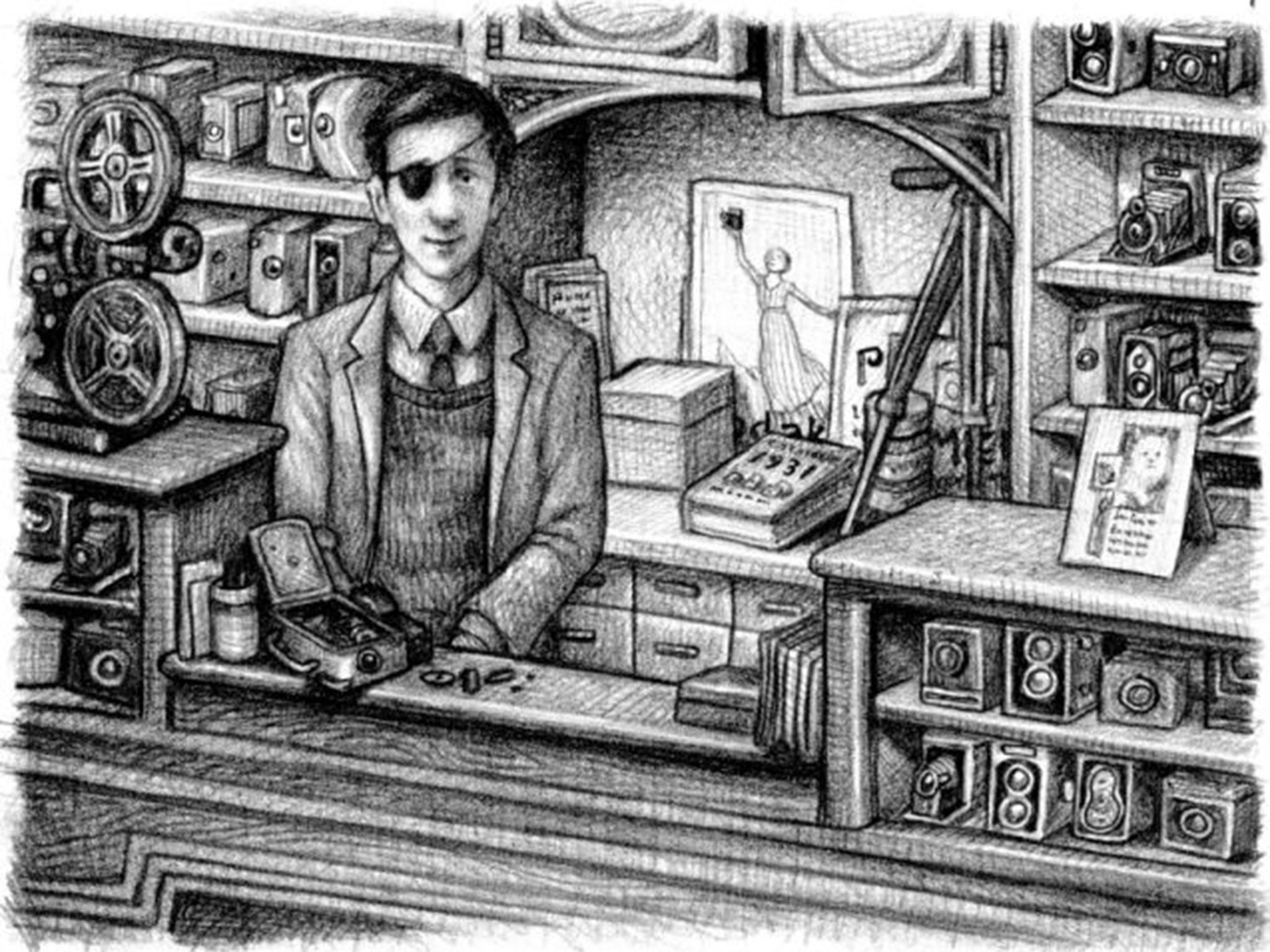
When the first fully illustrated version of Harry Potter and the Philosopher's Stone hits the nation's bookshops on 6 October, some readers might be forgiven for thinking they've seen the pictures already. The first of JK Rowling's world-conquering novels about a wizard school and its inhabitants has been given such visual solidity through the movies, the merchandising and the Potterworld website (not to mention the maturing faces of the three main characters seen on press and television), it's hard to imagine a time when they were just words on a page.
And while the illustrator of the new edition, Jim Kay, has brought a gorgeous, grainy, Rackham-ish texture to the interiors, he has stuck closely to the filmic incarnations of the characters: his Hagrid is definitely Robbie Coltrane, his Draco Malfoy is clearly related to the young Tom Felton – though Harry himself, as pictured here, is decidedly not Daniel Radcliffe but someone much more weedy and vulnerable.
Harry Potter films
Show all 47
The new edition will be tricked out with luxurious paraphernalia – illustrated endpapers, head and tail bands, a ribbon bookmark and artwork on every spread. The publisher, Bloomsbury, is vehemently presenting the book as a classic – and an old-fashioned one, from the days when all books were produced like that. It will make some readers ask: why aren't more children's books illustrated these days?
Books for babies are almost entirely primary-colour pictures. Storybooks for 5-to-8 year-olds feature jolly illustrations on every page. But look at the 9-12 selection of children's books, and – once you've got past the madly colourful covers – it's a pictorial desert inside. Like the Potter books (which fit firmly in the 9-12 age-slot) it offers pages of unrelieved grey type.
A classic plate by Tenniel in a 1907 edition of Alice in Wonderland (Alamy)
How did children's books get like this? Until the 19th century, books for young people tended to be moralistic homilies or crude chapbooks of nursery rhymes. But the late-Victorian surge of stories told just for children's pleasure – Little Women, Black Beauty, Treasure Island, Alice's Adventures in Wonderland, Little Lord Fauntleroy, Kidnapped, King Solomon's Mines – were illustrated as a matter of course, to give young readers a handrail of comprehension through the text and help them imagine what Blind Pew or the March sisters looked like.
In this golden era, some of the most dazzling artists of the century – Walter Crane, Randolph Caldecott, Richard Dadd, Edward Dulac, Rackham himself – clamoured to illustrate new story-books and new editions of Grimms' and Hans Christian Andersen's fairy tales.
The Windvale Sprites is the first book by Mackenzie Crook, the actor from The Office and Pirates of the Caribbean
It shouldn't be a heresy that books for 9-12s need pictures – not just to illuminate the plot every 20 pages, but to enliven the experience of reading. In the digital world of constant visual distraction, one cannot expect the average 10-year-old to negotiate a frozen sea of paragraphs without some visual corollary. I was glad to find, in my local bookshop (expertly steered by Janice the Children's Books expert) signs that the Potter illustrations are part of a trend.
Catherine Storr's Clever Polly and the Stupid Wolf is another of the writer’s modern favourites
The Windvale Sprites, the first book by Mackenzie Crook, the actor from The Office and Pirates of the Caribbean, is a terrific story lifted by Crook's witty and accomplished Edward Gorey-ish illustrations. Brian Selznick's beautiful charcoal drawings enliven The Invention of Hugo Cabrett like a superior Gothic graphic novel (it won every US prize going in 2007.)
Francois Place's delicate watercolours add an extra-poignant dimension to a special edition of Michael Morpurgo's War Horse. Cressida Cowell's How to Train Your Dragon books fill every spread with scales and fangs and typographical jeux d'esprit. Shane Hegarty's Darkmouth offers a gallery of hideous monsters for the nervous pre-teen to inspect.
Francois Place’s delicate watercolours have added an extra-poignant dimension to a special edition of Michael Morpurgo’s War Horse
Purists may complain that book illustrations infantilise children and stop them using their imaginations. I think back to my childhood and remember how pictures invariably embedded my imagination even further in the story until I couldn't leave it. Bring the pictures on, I say.
Whatever makes the reading experience more pleasurable for a new generation of Harry-olators is fine with me.
Join our commenting forum
Join thought-provoking conversations, follow other Independent readers and see their replies

Join our commenting forum
Join thought-provoking conversations, follow other Independent readers and see their replies