Stella McCartney, Paris Fashion Week review: Stella shies away from the Paris pomp to put focus back on Seventies simplicity
There’s a degree of refreshment to a respite from overthinking
Stay ahead of the trend in fashion and beyond with our free weekly Lifestyle Edit newsletter
Stay ahead of the trend in fashion and beyond with our free weekly Lifestyle Edit newsletter
Women dressing women – it’s hardly a revolutionary concept, yet it’s something that has particular traction in Paris this spring/summer 2015 season.
Perhaps it’s because a Frenchwoman, Julie de Libran, is newly installed at Sonia Rykiel, a label originally founded by a working mother determined to create clothes that were easy and practical for other women. Still the key motivating factors, it seems, of contemporary female designers. No fussiness, no overwhelming visual noise. Clothes for living in.
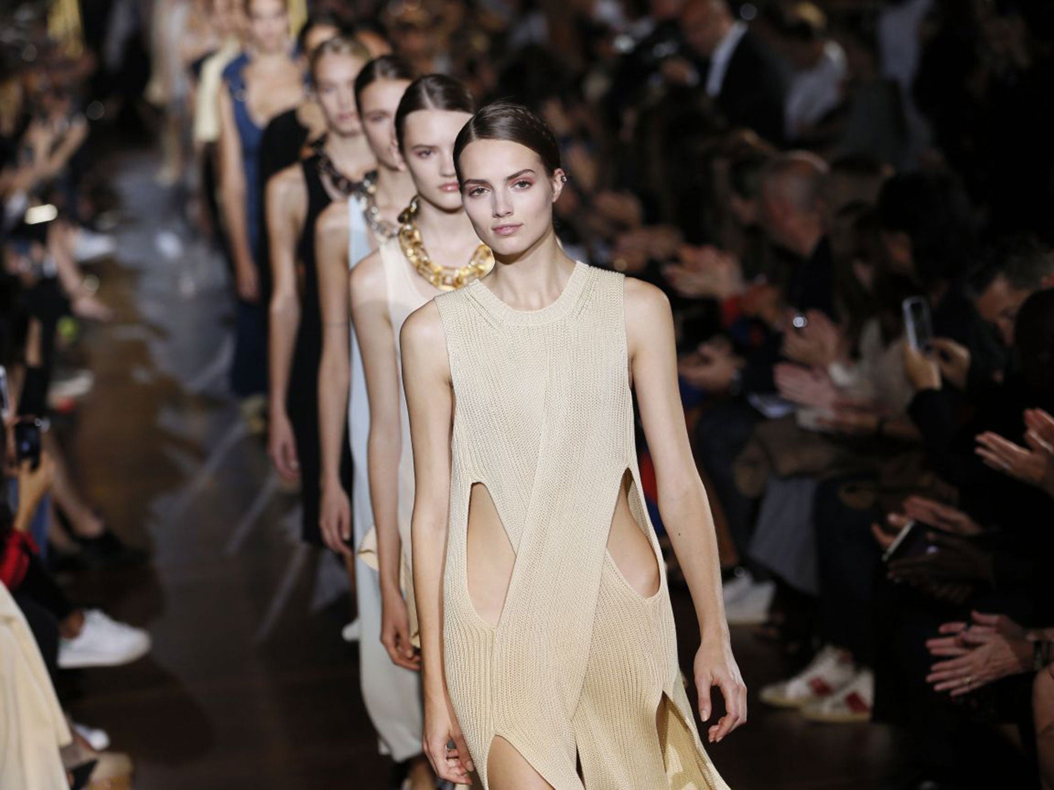
Stella McCartney’s clothes are resolutely quiet. She’s quite quiet too, despite that surname, and despite showing her collections in the grand expanse of Paris’s Opéra Garnier. It was the scene of one of Dior’s cast-of-thousands spectaculars in the Nineties: McCartney, by contrast, instals coffee urns and pastries in the foyer, giving the place the feel of a very well-dressed WI meeting as her audience files in.
A McCartney show rarely has overriding themes. There may be decorative motifs – this time, it was lozenge-shaped cutouts and giant buckles, and a bit of that patchwork that’s popping up everywhere – but there’s no hidden depth or message. Which is the point. McCartney isn’t trying to be profound. She just wants to dress women, women like her. Sometimes, that feels a little limp. However, there’s a degree of refreshment to a respite from overthinking.
The message at Sonia Rykiel was writ large. Handwritten, actually, in Julie de Libran’s own hand. “A homecoming” was her description. That feel flowed through the collection, punning on stripes – horizontal ruffles, fluttering ribbons, fringe arranged in bands – which are the label’s hallmark. That’s what this show was really about, reminding us of what Rykiel stands for – stripes, simplicity, and a certain ease to everyday dressing. It’s also about the Seventies, Rykiel’s heyday, and with the decade’s referencing running through the season as a whole; a ripe time for Rykiel’s homecoming.
Subscribe to Independent Premium to bookmark this article
Want to bookmark your favourite articles and stories to read or reference later? Start your Independent Premium subscription today.
Join our commenting forum
Join thought-provoking conversations, follow other Independent readers and see their replies