The Independent's journalism is supported by our readers. When you purchase through links on our site, we may earn commission.
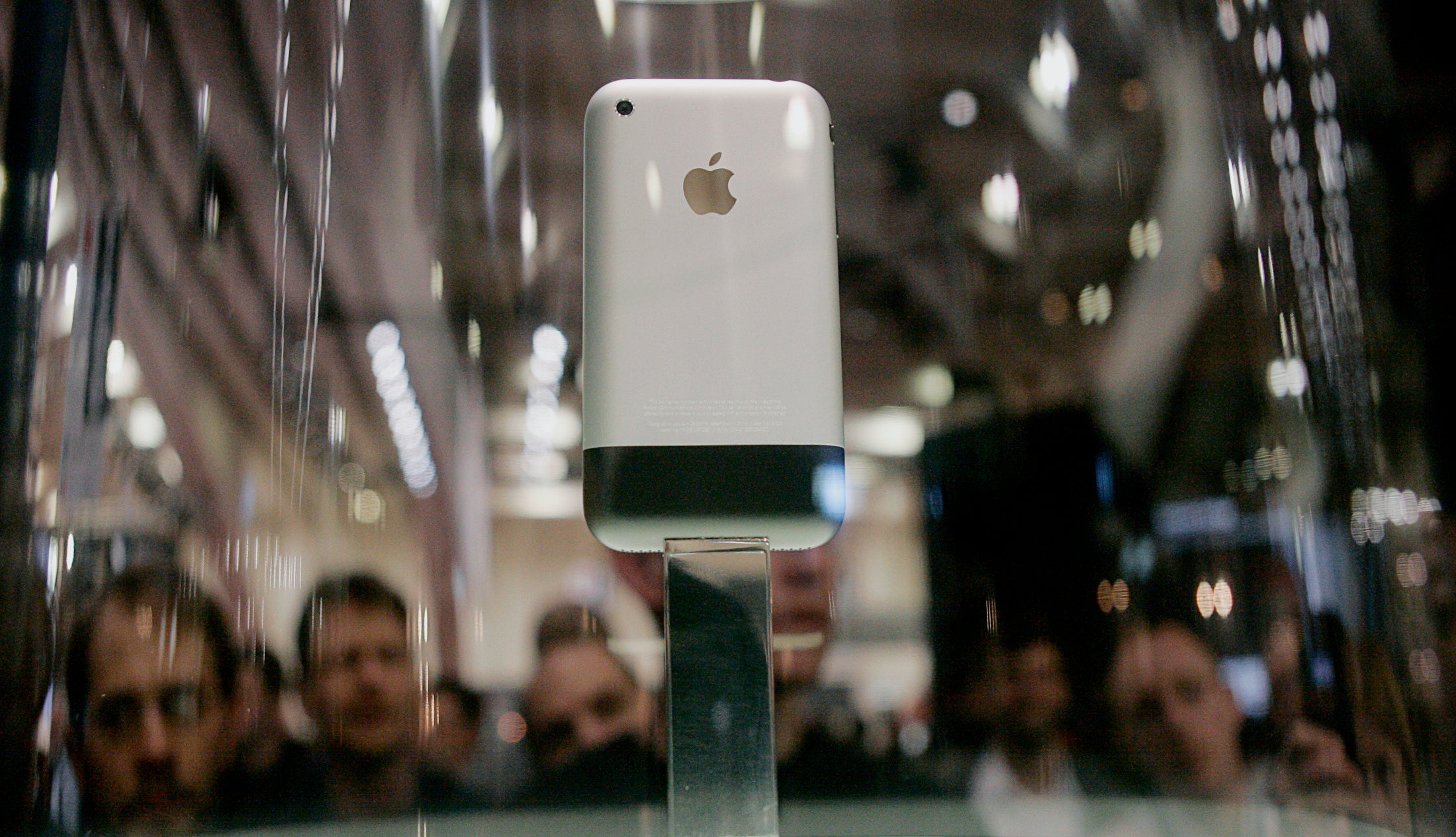
The iPhone and Picasso: What Apple's secret university teaches employees about design
Apple HQ uses a lithograph series by Picasso as an example of simplicity

Sign up to our free weekly IndyTech newsletter delivered straight to your inbox
Sign up to our free IndyTech newsletter
In Apple’s mysterious training faculty– known as ‘Apple University’ – employees learn from Picasso about the essence of good design while enjoying the company’s legendary attention to detail. “Even the toilet paper in the bathrooms is really nice,” reports one former student.
This is according to a new article from The New York Times that offers a rare look at the ‘university’ founded by Steve Jobs, using reports from three (anonymous) employees to build up a picture of the inner sanctum of Apple philosophy.
The classes on offer cover a range of topics, from advice for newly-acquired companies on how to blend in at Apple, to lectures on the history of the company that cover the most important business decisions the iPhone manufacturer has made.
Case studies apparently include the decision to make the iPod and iTunes available to Window users – something that Jobs himself hated, but that led to the dominance of the iPod, the blossoming of the iTunes Store ecosystem (including apps) and subsequently the success of the iPhone.
The Times reports that one class at Apple University even uses Pablo Picasso’s eleven-piece suite of lithographs known as ‘The Bull’ as an example of the importance of simplification in design.
The series - completed by Picasso in 1945 - begins with a detailed image of a bull which is slowly deconstructed, with shading, texture and details stripped away until only half a dozen or so lines are left: it’s an abstract image, but unmistakably a bull.
Another case study from the course ‘What Makes Apple, Apple’ stresses the same dedication to minimalism, comparing two remote controls – one from the now-defunct Google TV and the other from Apple’s own Apple TV. The former shows a total of 78 buttons, the latter only three.
The full piece is well worth a read over at the Times, but the timing is a suspiciously fortunate for Apple: nothing like reminding people of the company’s Picasso-level dedication to design with a new iPhone round the corner.
Subscribe to Independent Premium to bookmark this article
Want to bookmark your favourite articles and stories to read or reference later? Start your Independent Premium subscription today.
Join our commenting forum
Join thought-provoking conversations, follow other Independent readers and see their replies