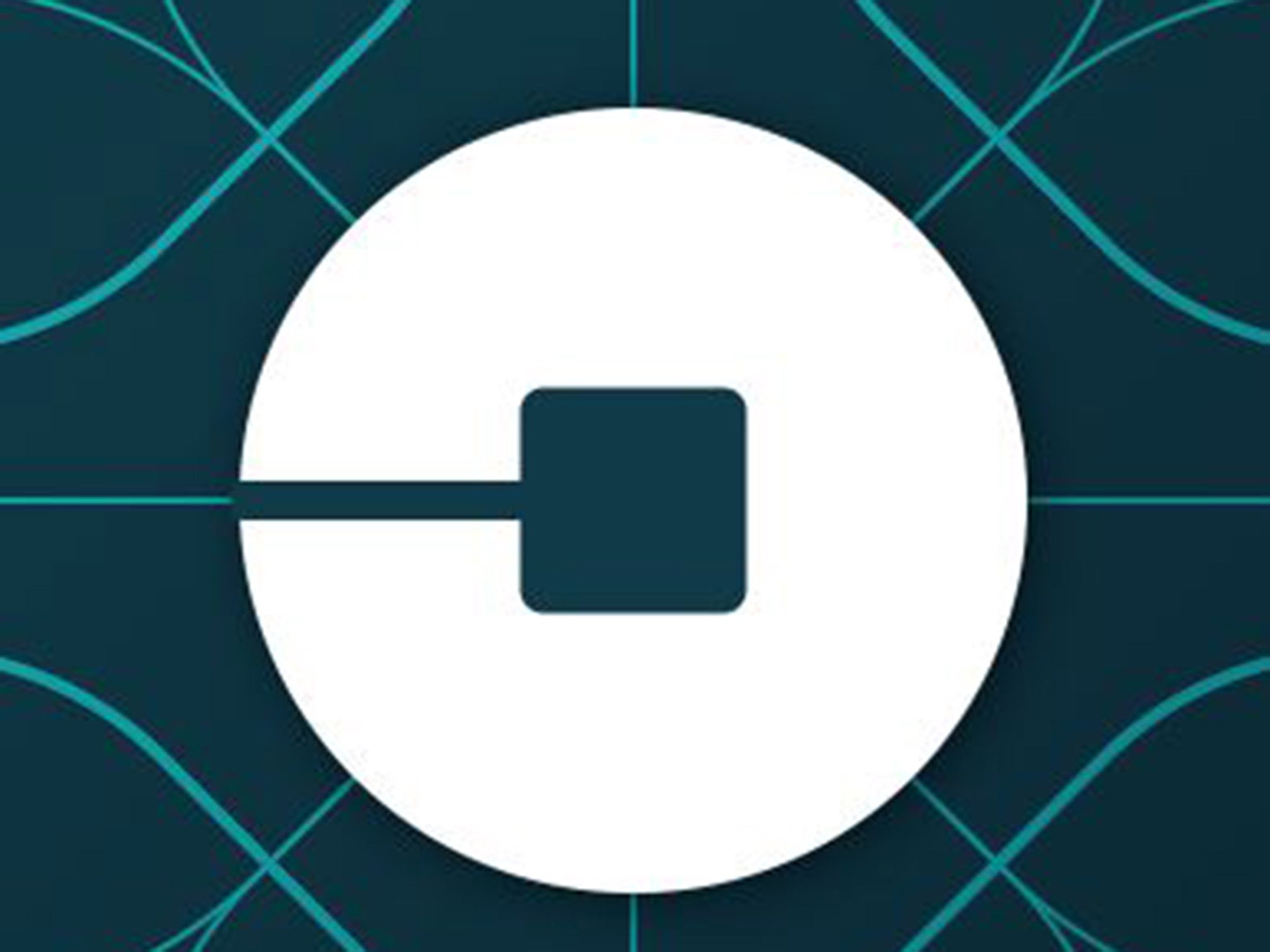
The new riders' circular design with the 'bit' inside (Uber)
Sign up to our free weekly IndyTech newsletter delivered straight to your inbox
Sign up to our free IndyTech newsletter
Ride-sharing app Uber has unveiled a new logo and brand - and Twitter users are not happy.
The app has launched a new look to replace its U logo and black and white branding with either a circle for riders and a hectagon for drivers, both with a “bit” inside.
Announcing the change in a blogpost on the company’s website, Uber CEO Travis Kalanick said the “bit” would be a key part of the new design.
He wrote: “With the potential for many apps with many app icons, we needed one approach that connected them all. So we came back to our story of bits and atoms.
“You’ll see that both rider and driver icons have the bit at the center, and then the local colours and patterns in the background. This is a framework that will also make it easy to develop different icons for new products over time”.
He said the old logo was too "distant and cold" so they wanted to overhaul it using different colours in different cities around the world.
The bit will remain the same throughout the website and on the app but the colours and shapes will change depending on where you are in the world and whether you are a driver or a user.
Gadget and tech news: In pictures
Show all 25
Mr Kalanick said: “Every city has its own character and our long term goal is to have unique designs for cities as well as countries. This will mean adding hundreds more colour palettes and patterns overtime.”
He said the design team were inspired by “the Georgian architecture and lush greens” in Ireland and the “pink and the pattern of the local tiles” in Mexico.
But Twitter users have branded the new logo “ugly” and expressed confusion about why they had made a change “for changes sake”:
The new logo comes as Uber announces plans to move into other industries.

Join our commenting forum
Join thought-provoking conversations, follow other Independent readers and see their replies