The Conversation (0)
Science & Tech
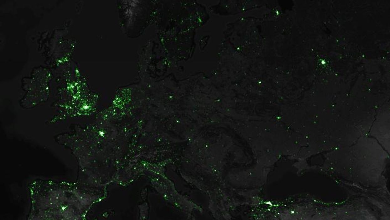
This is what Twitter looks like.
Mapbox's Eric Fischer has mapped every single geotagged tweet sent over the last three and a half years. That's 10 million public tweets a day, or around 120 per second.
Here are all those 6,341,973,478 tweets on the a map.
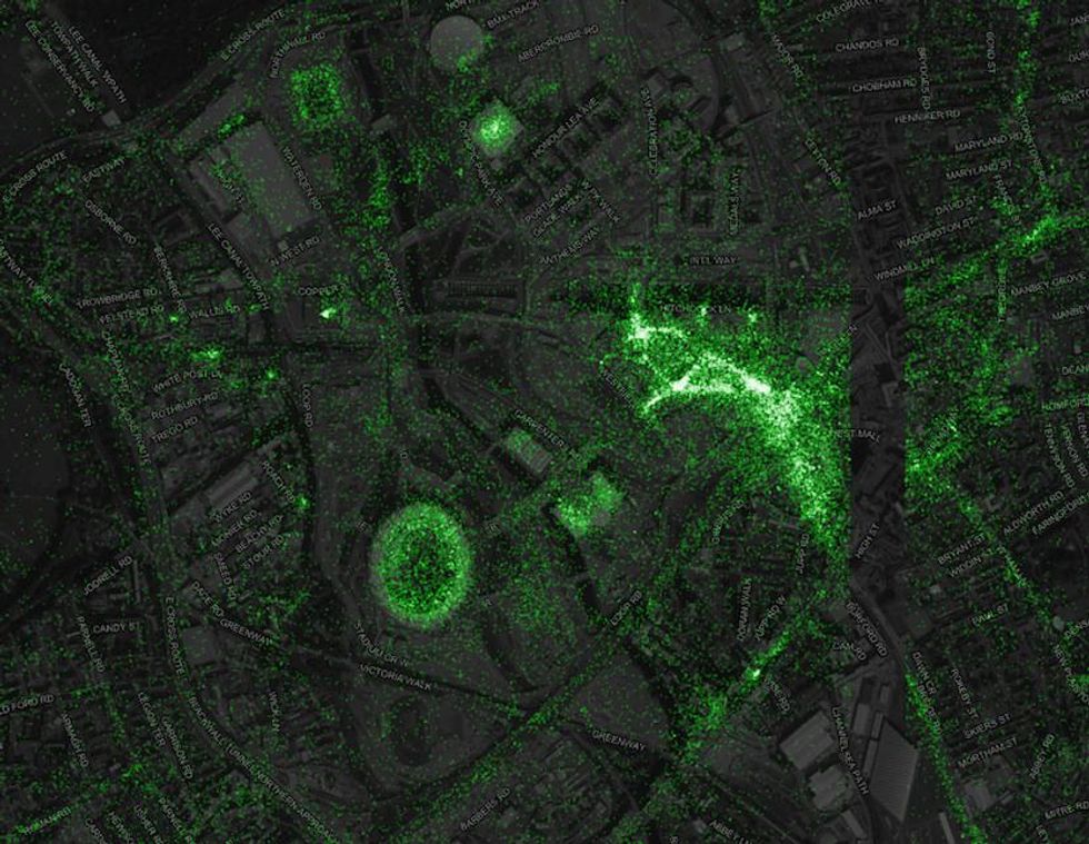
As Fischer notes, there are some odd features of the map - for example when you zoom in on London there is a visible blank strip near Chados Road. He explains it is not a bug in the data as "the same stripe also shows up in the unfiltered tweets, so it must be Twitter that is filtering them out".
More: The global happiness map