Pantone colour of the year announced and it's a shade of green
The firm's choice refelects the zeitgest in fashion and design

For free real time breaking news alerts sent straight to your inbox sign up to our breaking news emails
Sign up to our free breaking news emails
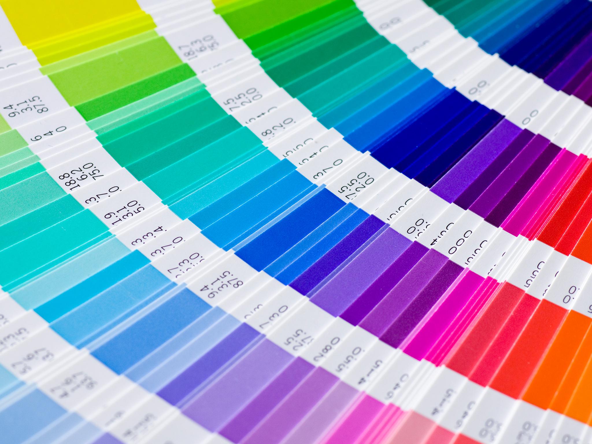
Pantone has announced that a "fresh and zesty yellow-green" will be the colour of 2017.
The highly influential colour-matching firm said that "Greenery" will be the dominant shade in fashion and design for the next 12 months - in a nod towards the turbulent global political climate.
“Bringing forth a refreshing take, Greenery is a tangy yellow-green that speaks to our need to explore, experiment and reinvent,” said the firm, adding that it is suggestive of "flourishing foliage" while its "fertile attributes signals one to take a deep breath, oxygenate and reinvigorate."
Last year, Pantone declared dusty pink Rose Quartz and baby blue-ish Serenity as the colours of 2016, describing them as “welcoming colors that fulfill our yearning for reassurance and security.”
“While Serenity and Rose Quartz expressed the need for harmony in a chaotic world,” said Leatrice Eiseman, Executive Director of the Pantone Color Institute, “Greenery bursts forth in 2017 to provide us with the hope we collectively yearn for amid a complex social and political landscape."
Pantone determines the colour of the year by studying trends in fashion and design in existing products and those set to be released.
The firm’s prediction in turn influences the hues chosen by mainstream retailers and their designers eager to keep on trend.
In 2015 brown-hued Marsala was the shade of the year, while 2014's was a purple Radiant Orchid. 2013 marked the last time a green shade had been colour of the year, with Emerald.
“It has become like Hoover – it is almost an alternative name for colour. “Choose a Pantone”, is regularly heard in design studios,” Adrian Shaughnessy, a senior tutor at the Royal College of Art school of communication told The Independent.
What to wear now: AW16 Trends
Show all 6However he argued that designers on the cutting edge may shy away from using a Colour of the Year in a bid to avoid following the herd.
“I’d argue that for graphic designers wanting to make innovative colour choices, knowing that a colour has been made Colour of the Year would be a reason not to use it. If there’s a chance that you will see this colour everywhere, that’s a good reason to avoid using it.”
Subscribe to Independent Premium to bookmark this article
Want to bookmark your favourite articles and stories to read or reference later? Start your Independent Premium subscription today.
Join our commenting forum
Join thought-provoking conversations, follow other Independent readers and see their replies