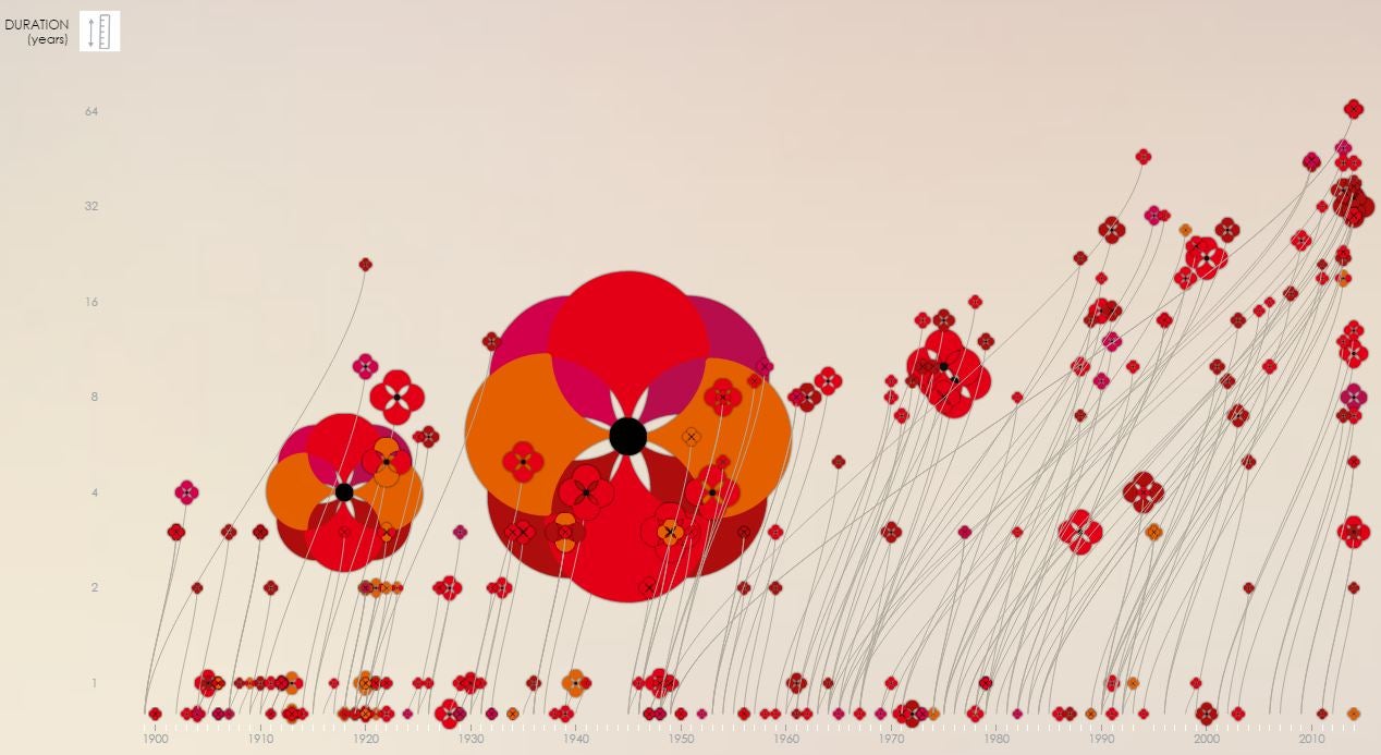
An infographic at poppyfield.org shows what an entanglement of wars we find ourselves in, bringing together the chronology, duration and cost to human life of conflicts in the 20th century to present day.
"The First World War was initially dubbed the war to end all wars," the website states. "Sadly, the world has witnessed more than 200 conflicts in the 100 years since.
"Poppy Field reflects on the human cost of war from the beginning of the 20th Century."
While the First and Second World Wars were the conflicts that by far killed the most, the graph also highlights how more modern wars tend to drag on as the politics involved becomes more complicated and the opposing sides less defined.
In pictures: Remembrance Day around the world
Show all 11
The infographic was designed by Valentina D'Efilippo and Nicolas Pigelet, with poppy stems growing from the year when the war started and flowering in the year the war ended.
Join our commenting forum
Join thought-provoking conversations, follow other Independent readers and see their replies

Join our commenting forum
Join thought-provoking conversations, follow other Independent readers and see their replies