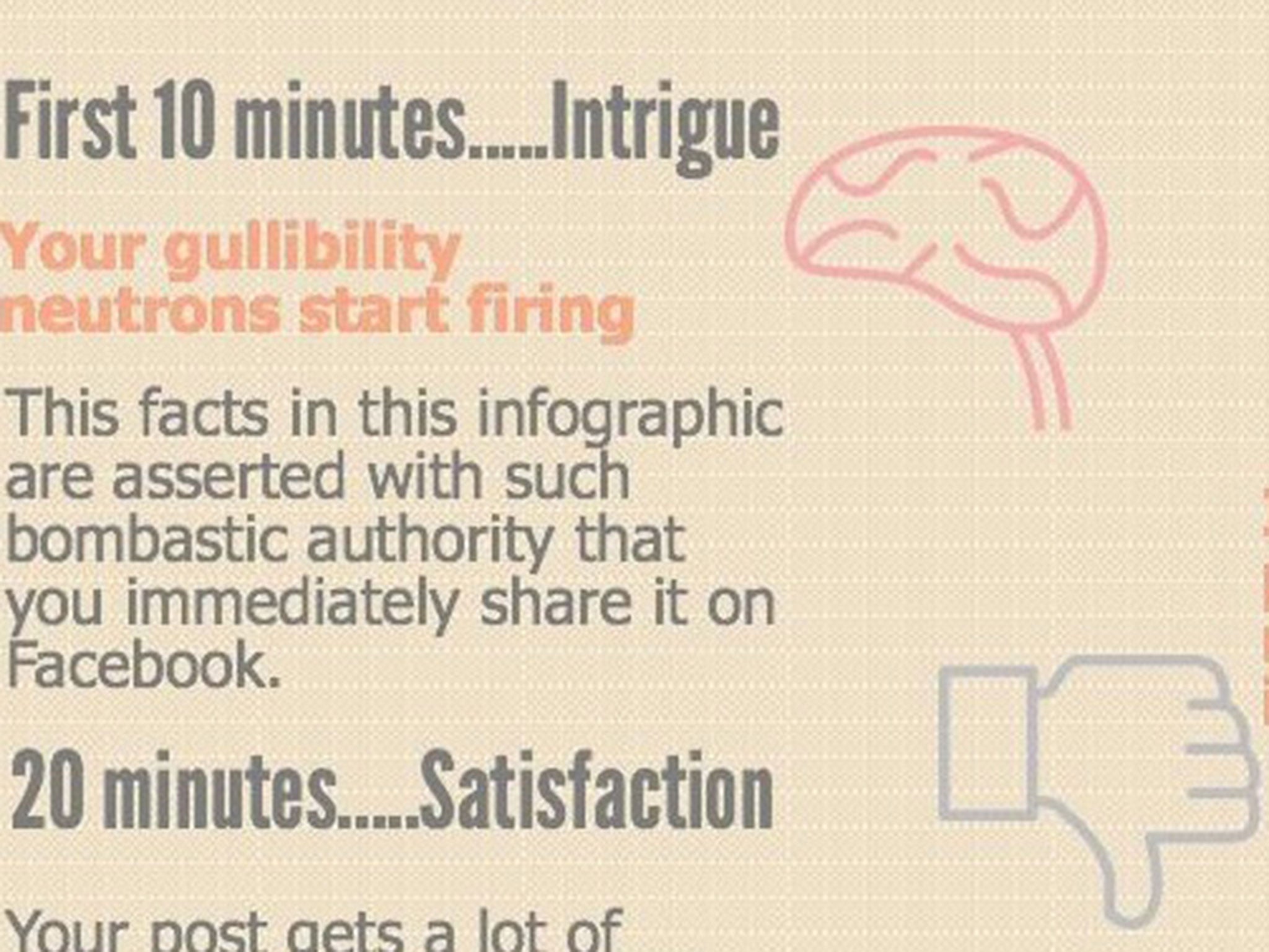
Infographic shows what happens to the brain in 60 minutes after seeing a dodgy infographic
Recent infographics have gone viral - despite making unchecked claims

For free real time breaking news alerts sent straight to your inbox sign up to our breaking news emails
Sign up to our free breaking news emails
Infographics can be a great way to convey lots of information in an interesting way – but looks can be deceiving.
Recent viral infographics that ended up not being quite as they seemed have prompted one online agency to act.
Sean O’Mara, founder of marketing agency Essential Content, created an infographic to show what happens to the brain in the 60 minutes after seeing a dodgy infographic.
The basic principle is that some visualisations can be so eye-catching that you’ve shared it on social media before thinking to check out the claims it makes.
It’s also an issue that most sacrifice solid references to sources in favour of a cleaner design or simpler wording.
“Infographics are a great way to present complex information in an easy-to-understand format,” Mr O’Mara said. “The London Tube Map and The Periodical Table are two fine examples of this. Unfortunately, they're also a great way to mislead web users into believing something that may not actually be true using un-attributed exaggerations.
“It's a shame, data journalism is brilliant but the more we use it for factually-questionable scaremongering, the less people will like it.”
See if you can spot the unchecked claims made in Mr O’Mara’s own infographic.
Subscribe to Independent Premium to bookmark this article
Want to bookmark your favourite articles and stories to read or reference later? Start your Independent Premium subscription today.
Join our commenting forum
Join thought-provoking conversations, follow other Independent readers and see their replies