Hadrian's balls-up: University of York red-faced after it uses the wrong Roman emperor in new logo

For free real time breaking news alerts sent straight to your inbox sign up to our breaking news emails
Sign up to our free breaking news emails
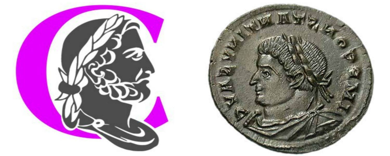
The University of York has been embarrassed after it emerged that the logo of its new Constantine College features the head of the wrong Roman emperor – Hadrian.
The mistake was revealed in an interview with Jane Hawkes, a professor in the History of Art department, and a specialist on Constantine.
“As far as I can see this is definitely Hadrian,” she told student paper Nouse. “It was much more common for Constantine to be depicted without a beard.
“I suspect the decision was made, somewhere, to farm out the design project to some firm not really specialising in such niceties as getting the portrait right!
“It would have been very easy for the university to consult the History of Art Department.”
The Constantine College crest will now be redesigned as Jane Grenville, deputy vice chancellor of the university, admitted that despite being an archaeologist herself, she hadn’t spotted the mistake.
“As an archaeologist I should have spotted this when the logo came back from the designers. We shall re-design the logo to feature a more accurate depiction of a beardless Constantine.”
She added: “Many thanks to the vigilant student body. I am proud that they are interested and engaged enough to notice this and confident enough to challenge us.”
Students have also responded to the news. York's union resident Kallum Taylor said: “Even if you do a quick Google image search it does look more like Hadrian.”
Helena Parker, an English Literature student said: “Classic York uni trying to get in on a heritage which doesn’t really belong to us and then getting it wrong.”
George Hesselgren, a History student, said that the mistake “reeks of amateur hour”.
He added: “It reminds me of something stuck up on the front of a frat house, designed by 12-year-olds. It’s not very impressive for a university trying to add prestige to its image.”
Subscribe to Independent Premium to bookmark this article
Want to bookmark your favourite articles and stories to read or reference later? Start your Independent Premium subscription today.
Join our commenting forum
Join thought-provoking conversations, follow other Independent readers and see their replies