5 maps that will change how you see the world
From music preferences to the countries with the highest divorce rates

Sign up to Simon Calder’s free travel email for expert advice and money-saving discounts
Get Simon Calder’s Travel email
Vargic's Miscellany is a phenomenal collection of charts and infographics that sees the world mapped out by stereotypes, statistics, culture and technology.
We've picked 5 of our favourite maps to show the world in a different way,
1) The music enjoyed by different countries around the world
People in the UK love a bit of rock and pop, and Americans go big on country music. But what about the rest of the world?
Martin Vargic’s map shows us where in the world different genres of music are most popular.
Most countries appear to favour pop music, which is unsurprising considering the genre name originates from the word "popular".
Those in Eastern parts of the world especially are shown to prefer pop music over other genres, while people in Canada, Russia and certain parts of Western Europe (including the UK) favour rock.
Oddly enough, music taste seems to correlate with geography. The nearer you are to the South East, the more likely you are to enjoy pop music. If you live in the North West, rock or country is more likely to be your thing.
2) The average weight of adults around the world
The obesity crisis has been an important topic of debate around the world, with health experts raising particular concern about the UK and the US. But how do we really compare with everyone else?
Unsurprisingly, countries in the West, along with Australia, are the heaviest. The average weight of an adult in the UK is between 160-170lbs (about 11.5-12 stone).
This is slimmer than the US and Australia but significantly chunkier than almost all of Africa, Eastern Europe and Asia.
As one would expect, poorer countries have a lower average weight, with many East African countries having a national average of lower than 125lbs (9 stone).
India’s national average is also below 125lbs, despite its net national wealth being above places like Mexico and Argentina.
3) The level of public debt for different countries
In the "age of austerity", all we seem to hear about is public debt. Most people have grasped by now that the UK government owes rather a lot of money. But how do we compare to other countries around the world?
Like many countries, the UK debt equates to between 75 per cent and 100 per cent of their GDP. Canada and the majority of the Western European are in the same boat, with France, Spain and Germany owing a similar amount.
The map seems to show that most countries in the world are in rather a lot of debt, with most of them owing more than 40 per cent of their GDP.
4) The countries that produce the most heavy metal bands
Which countries are the most metal? Fans of heavy rock can now expand their musical horizons using a map showing which countries have the highest number of metal bands.
The Rolling Stone readers’ poll of the 10 best heavy metal bands revealed that favourites were all of US or UK origin with favourites including Metallica, Dream Theatre and Black Sabbath.
Scandinavia and Western Europe are also well known for producing successful metal bands like HIM, Rammstein, Nightwish and Opeth.
However, this map shows that fans might be missing a trick, with a high concentration of metal bands playing out from South America, Australia and East Asia.
African countries are the least prone to rocking out, with the majority of the continent having no metal bands at all.
You’ll find the most metal in the US, Germany and Italy - all of which have over 5000 bands. The map shows the UK as having between 1501 and 5000 bands to choose from.
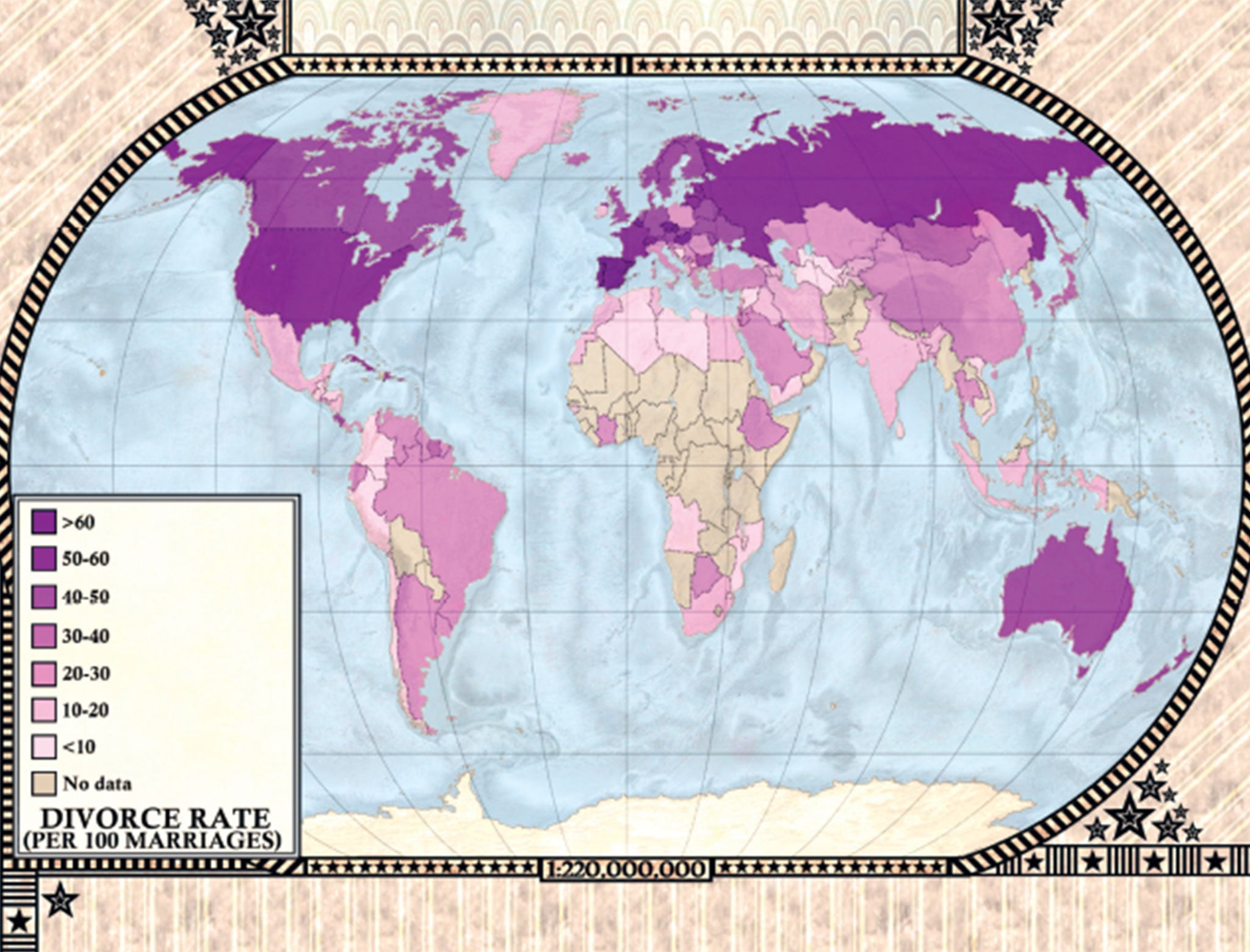
5) Divorce rates around the world
Relationship stats are thrown at us all the time, with one of the most prevalent being that around 42% of marriages in the UK end in divorce.
However consider yourself lucky that you don’t live in Belarus, which has a higher divorce rate than any other country, at 68%.
In the US, around 80% of all divorces are filed by women. On average, first marriages that end in divorce last for about 8 years.
These maps were published with kind permission from Penguin/Random House. Vargic's Miscellany of Curious Maps: The Atlas of Everything You Never Knew You Needed To Know is available now
Subscribe to Independent Premium to bookmark this article
Want to bookmark your favourite articles and stories to read or reference later? Start your Independent Premium subscription today.
Join our commenting forum
Join thought-provoking conversations, follow other Independent readers and see their replies