Beauty store psychology: How shops convince you to spend
Somehow, the stuff you don’t need always ends up in your basket
However hard you try, the temptation to splurge on beauty products you might not necessarily need is ever-present but it turns out, this might be down to more than a severe lack of restraint.
According to Kit Yarrow, a consumer psychologist, every sight, sound and touch in a retail environment is engineered for one purpose; to get you to spend.
We’ve all been there - you walk into a beauty store looking to replace a concealer that’s on its last legs and, bam, you’ve left with half the store.
Retailers have devious ways of getting you to fork over more of your money without you even knowing it but just how does it work?
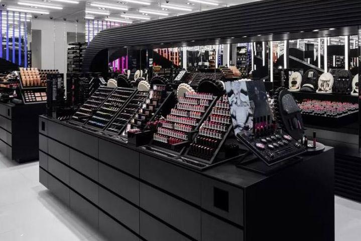
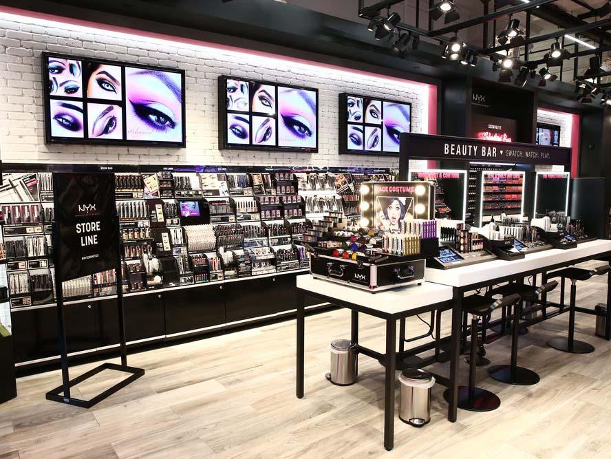
When you consider stores like Mac, NYX, Sephora and Nars they all strike a sense of Déjà vu. Black and white, shiny all over and accented with bright neon lighting, nowadays beauty stores have a very clear design aesthetic.
“Black is an elegant, sophisticated color, but it’s also a great backdrop. Anything just looks a bit better against a black backdrop. Things feel more exciting and more exclusive and more elegant,” Yarrow tells Racked.
It makes sense. Lots of colour in a space already teaming with a wish-wash of multihued cosmetics would be an eyesore but it’s actually a lot more technical than that. Using black means that sight lines are easier to navigate and, since beauty stores stock so many small products it’s a minimalist, practical and albeit sophisticated solution.
The same goes for the sheen. From a consumer’s perspective, something shiny often corresponds with something clean and expensive.
“The look and feel of the display elevates the merchandise itself. It’s not like you’d go to a showroom for fancy cars and expect to see them on concrete. They’re always on really shiny floors,” Yarrow says. “Even in movies, the street where the couple falls in love, it’s always shiny. Shiny just makes everything seem more magical.”
It’s these non-verbal cues and veiled associations with colour that dupe us into parting with more cash than we expected to. Black lacquer really is the height of sophistication; it represents money and prestige, and who wouldn’t want to buy into that?
Of course, not all stores fit this perennial beauty store aesthetic. Instead, some are feeding off the recent boom for natural beauty and adding homier, more relaxed touches to their décor.
Don’t be fooled though, it’s all still one massive marketing trick. White furnishings, lots of wood and even throw rugs reflect a warm, welcoming and residential vibe made to make you feel right at home. They’re approachable and they get you; so give them all your money.
Whether a space is super slick and shiny or amiably informal it doesn’t really matter. In-store décor is all about making the customer want to shop there and somehow, no matter how hard you try, the stuff you don’t really need will always end up in your basket.
Join our commenting forum
Join thought-provoking conversations, follow other Independent readers and see their replies
Comments
Bookmark popover
Removed from bookmarks