How Sir David Attenborough's voice has inspired a new typeface
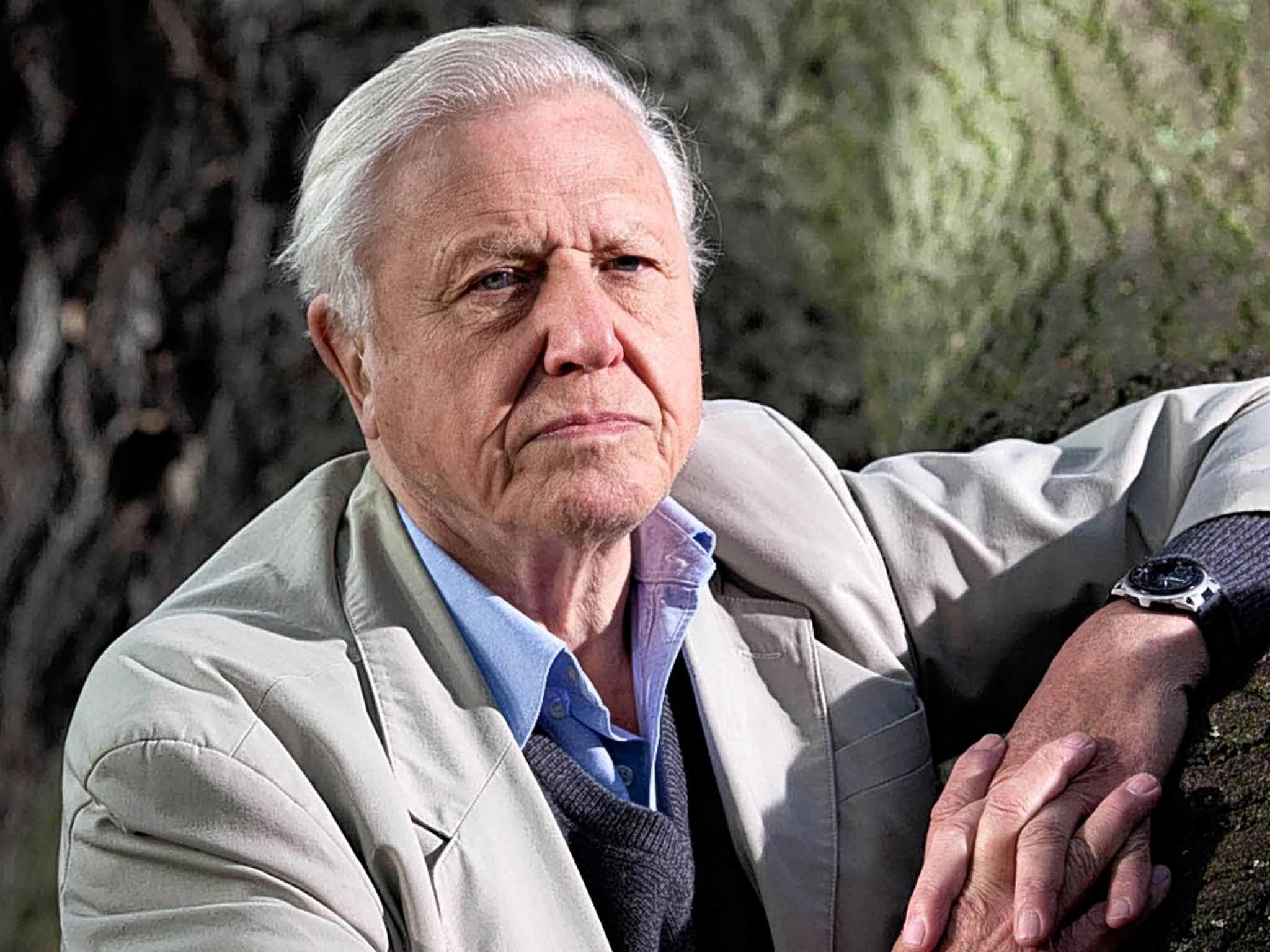
The nation's favourite naturalist is loved for his way with words and now a designer has created a typographic tribute to his voice

The voice of the great broadcaster Sir David Attenborough has been seducing us as a nation since the 1950s. It has been much imitated but never bettered, and the implicit wisdom of its gentle and measured BBC tones has become a byword for the sort of quiet authority you would expect from Auntie.
Now imagine if you had all of those qualities at your own fingertips. Imagine if, as you typed, your words reflected the brilliant mind, razor-sharp acuity and friendly demeanour of Sir David himself. Well, come January, you can – with the launch of TP Atten, a new typeface inspired by the naturalist himself.
TP Atten is the creation of Miles Newlyn, a type and logo designer whose previous work you may know - he's behind the design of popular logos for such brands as Honda, Tate Modern, EE, Unilever, Sky, Three and the National Trust. He is also responsible for a dozen other bespoke fonts including TP Hero (which conveys “loyalty, duty and service”) and TP Zen (“cultured, cool and comfortable”). And of TP Atten, he says: “While watching one of Sir David's programmes, it struck me that his voice has precisely what I wanted to convey with a typeface. As a typical British person brought up on Attenborough's natural history programmes, he and his voice have become integral to my love of the English language.”
Newlyn adds: “I'm from Leicester, a city with close links to the Attenborough family. And when I was young, my paper-round took me past the very pond at which I was told Sir David discovered his love of nature.”
But back to the drawing board. “I designed the typeface using classical proportions,” says Newlyn, “but unlike most classical typefaces, it's a sans serif [without serifs – the twirly bits on the tops and bottoms of letters]. Furthermore, the terminals [the tops and bottoms] are rounded, which lends the design an approachable warmth. The upper case has proportions that are based on the Roman capitals of the inscription at the base of Trajan's column in Rome.
“Gill Sans, the house font of the BBC, is also inspired by these proportions, so Sir David's long career with the BBC made the use of these proportions a natural choice. And I based the lower case on simple geometry, to reflect his clear and unmannered elocution. The goal of TP Atten is to bring to the reader a great degree of charm and personable tone without undermining the integrity of the text.”
The Independent had to find out what Sir David thought of all this, but when we rang him – although he was as affable and unruffled as always – he was somewhat flummoxed by the news (even though a butterfly was also named after him last week, so he's used to such tributes). When we explained that the typeface was based on his own characteristics, he joked: “I don't know what characteristics. It is blunt? Is it elegant?!” We told Sir David that Newlyn had said he “wanted to combine a warm familiarity with a sense of established authority”.“Gosh, authority? Well, that's nice, isn't it? It's a great compliment. Thank him very much!”

So, Miles – thanks from Sir David, the latest convert to font fandom, a pursuit that has much to recommend it. Take Gary Hustwit's 2007 film Helvetica, which told the story of the eponymous typeface in such a fresh and engaging way that the unlikely documentary became a breakout hit. And he may be interested to know that in November, Gill Sans – one of the typefaces Newlyn mentions as inspiration for TP Atten, originally designed by the artist Eric Gill in 1928 – was given a fresh new look in Gill Sans Nova, by Steve Matteson of the London design studio Monotype.
Not that all new typefaces are celebrated, though: Google updated its fonts this year, to a lukewarm reception. And if you think that typefaces aren't worth getting too bothered about, then imagine the effect on great works of literature: printing The Unbearable Lightness of Being in a jaunty Comic Sans might slightly alter the experience of reading it.
But if Comic Sans signals silliness, the most popular typefaces – such as Times New Roman, Arial and Helvetica – convey more seriousness. But how can a font have a real personality? “A typeface shares many formal attributes with handwriting, and handwriting can describe a person with exceptional precision – if you know how to read it,” argues Newlyn. “The study of graphology is the deciphering of personality traits in handwriting and, just as the muscles in our face express the fleeting aspects of our personality, the muscles in our wrists and hands reflect the more invariable aspects of ourselves in handwriting.”
Those in our throat and mouth perform the same function. But, while Newlyn explains how “designing a typeface based upon one person's voice is entirely subjective”, he adds: “That is not a problem in any way; the point was to crystallise the idea of the design of TP Atten. Paul Klee said, 'One eye sees; the other feels'. With type, we might say that 'one eye reads; the other feels'. I tried to put into TP Atten the feeling I get when hearing Sir David's plummy yet warm-toned voice.”
IF THE FACE FITS…

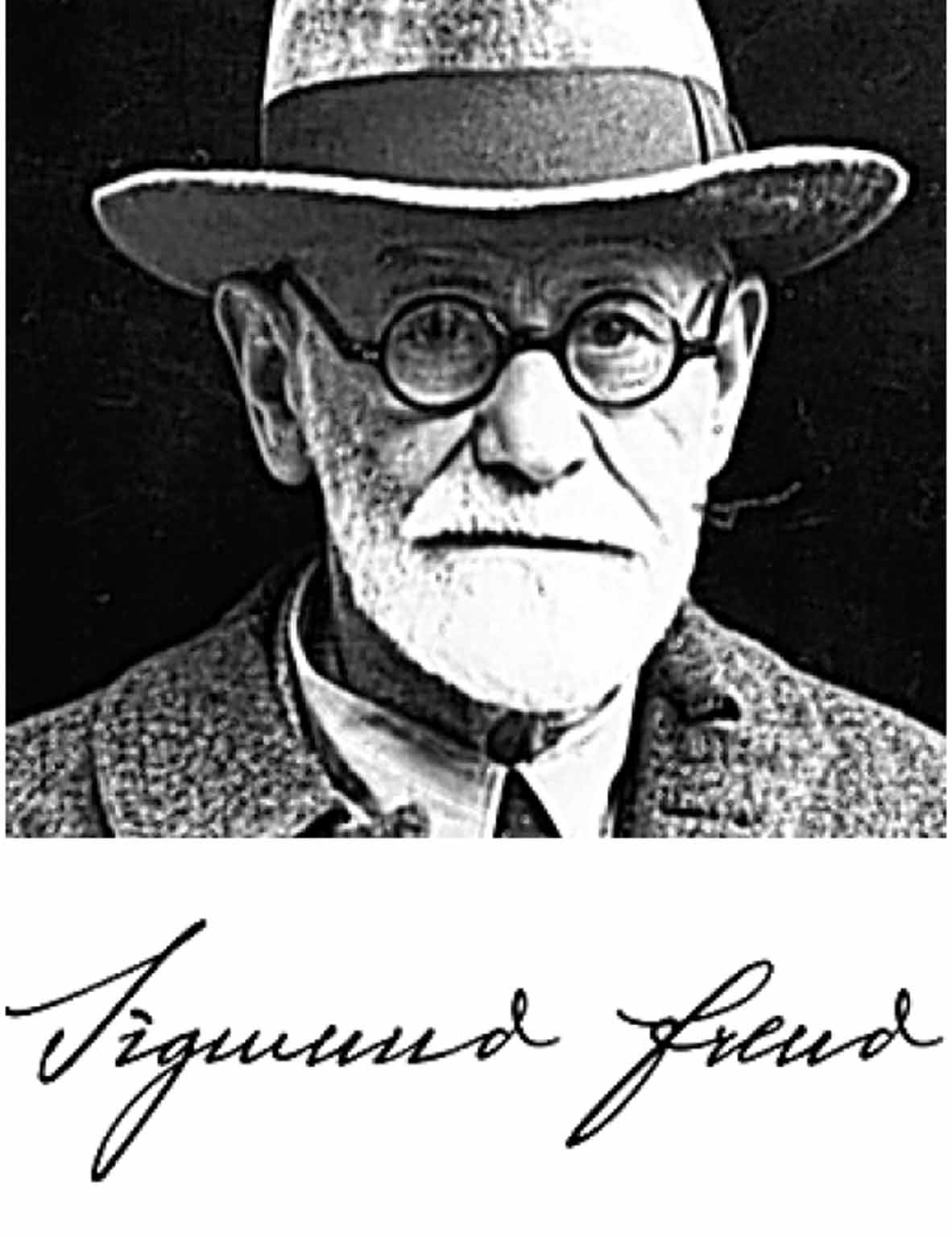
Sigmund Freud
Harald Geisler, a Frankfurt typographer, traced magnified manuscripts of Freud's writing to develop a typeface befitting the inventor of psychoanalysis. He has now embarked on a similar project to do the same for Albert Einstein.

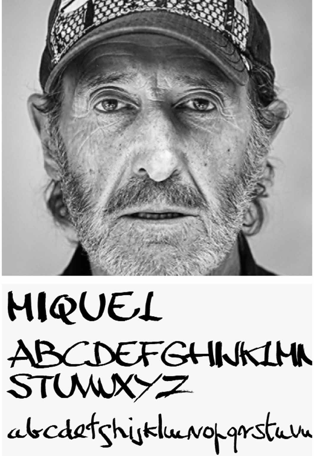
Homeless Spaniards
In Barcelona, typefaces inspired by the city's rough sleepers have been launched. The idea is that the fonts – based on the handwriting of such indigents as Luis, Loraine and Francisco – will be adopted by different brands and companies, with the resulting licence revenue ploughed back into charities helping Spain's large homeless population.

Hillary Clinton
In Philadelphia, designer Rick Wolff has come up with Hillvetica, a kooky font for Hillary Clinton's presidential bid. The font, whose name is a play on Helvetica, is defined by its bolshy arrows, which are presumably supposed to represent the idea of progress, though they make the whole thing look a little like a bunch of road signs.
TP Atten will be available at TextPref.com early next year
Join our commenting forum
Join thought-provoking conversations, follow other Independent readers and see their replies
Comments
Bookmark popover
Removed from bookmarks