Starbucks unveils its new logo (and it doesn't say Starbucks or coffee)
New design suggests a fresh drive to conquer other markets
What's in a name? For the world's largest coffee chain, Starbucks, it would seem the answer is "not very much". A multi-million pound revamp of the 18-year-old logo has been applauded by branding experts but left loyal customers aghast.
The absence of the words "Starbucks" and "coffee" from the new symbol, unveiled yesterday after nearly a year of painstaking design work and consumer testing, was described by the Seattle-based corporation as an "evolution" of the previous logo, allowing it to expand into a range of new grocery products from instant coffee to ice cream.
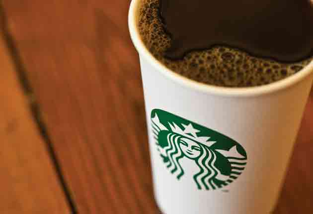
From March, customers at the chain's 15,000 coffee shops around the world will find themselves sipping their caramel macchiatos from cups that feature only a stylised version of its original bare-breasted Siren – the half-human Greek mythical temptress whose dulcet tones lured sailors to their deaths. The name Starbucks has been relegated to the back of the cup, alongside the tick boxes used to show the type of coffee ordered.
The decision to remove the white lettering on a green background which had encircled the Siren image since 1992 was greeted with horror by some devotees, who made clear their disapproval on a website set up by Starbucks to publicise the makeover.
One customer wrote: "What a total waste of time, energy and money. Do you honestly think changing the logo matters?"
Another said: "I have been a big supporter since the early days, taken expensive rides in taxis to get my morning coffee, even waded through two feet of snow in my business suit. But I do not see the logic of your Business Development folks for the removal of the Starbucks name."
Executives offered a haughty explanation for the new design, which attempts to follow the likes of oil giant Shell, burger chain McDonald's and computer company Apple by allowing the company name to disappear from its branding.
Howard Schultz, Starbucks's talismanic chief executive, who recently returned to the company to halt sliding sales blamed on over-expansion, said: "We've allowed [the Siren] to come out of the circle in a way that gives us the freedom and flexibility to think beyond coffee."
Retail experts said when translated into commercial reality, and meaningful English, this meant Starbucks wants to move beyond its core business into new products, which already include ice cream in its core American market.
The new logo will be launched on 8 March, the company's 40th anniversary, and will coincide with the introduction of a new range of "more elegant" porcelain mugs and cups to replace its clunky crockery and different styles of shop, including a "walk through" store on London's Borough High Street.
Branding consultants were divided about the name disappearing.. James Gregory, of CoreBrand, said: "I think it's nuts. What's it going to be – the coffee formerly known as Starbucks?"
David Roberts, of brand design consultants Fitch, said: "If they believe as an organisation they can release the name from the symbol, that's a pretty enviable and strong position to be in."
There was no immediate sign that the company will react to the outcry; clothing retailer Gap two months ago abandoned a new logo for its internet operations after widespread protests.
One observer said the new Starbucks symbol meant its stores and merchandise would at least no longer be defaced by protesters colouring in the logo letters to reveal a widely-used expletive.
Join our commenting forum
Join thought-provoking conversations, follow other Independent readers and see their replies
Comments
Bookmark popover
Removed from bookmarks