Instagram gets new logo and re-designed app
Auto-updates meant that many people received the new look without their knowledge – and were thrown into complete confusion
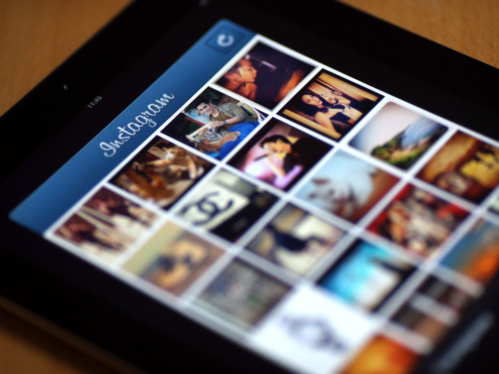
Instagram has rolled out a new look for its logo and a complete re-design for its app.
The new logo has thrown many people who have woken up to find a sunset-coloured, flat-looking image on their screen. It has replaced the realistic polaroid camera that made up Instagram’s old logo, and which had gone mostly unchanged since the app was launched in 2010.
As well as its new logo, the app showed off a completely re-design of the app. While it keeps its traditional arrangement of a long feed of pictures with writing underneath, it has stripped away the traditional blue and replaced it with an almost completely black-and-white design.
The new look caused a combination of joy and terror on social media. Because of auto-updates, many people found that their phones had updated before they woke up – when they found the new, gradient-based app icon on their home screen.
Instagram’s old logo was always relatively non-flat when compared with most of the other popular social apps. Facebook and Twitter, for instance, are both white logos depicted on blue backgrounds.
That re-design had been long rumoured and comes as just one of a range of rumoured flatter, black and white re-designs that also includes the updated Apple Music scheduled for release this summer. That could partly be an effort to get ready for the “dark mode” that is expected to come to iOS and allow the phones colours to be turned black at night time.
As well as helping the app fit in with the look of other products, the new design helps people see more of their pictures, according to the company. “The simpler design puts more focus on your photos and videos without changing how you navigate the app,” Instagram said in a blog post.
It said that it had made the design in response to the way that people were using the site. The new look “reflects how vibrant and diverse your storytelling has become”, it said, apparently in reference to the extra space that it allows for photos and videos.
Join our commenting forum
Join thought-provoking conversations, follow other Independent readers and see their replies
Comments
Bookmark popover
Removed from bookmarks