Council shells out £86,000 on new logo as part of 'more than just a place' re-brand
Haringey in north London claims overhaul "communicates who are today"
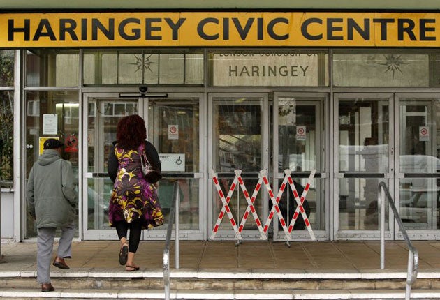
A town hall making huge cuts to services has shelled out £86,000 on re-branding itself to demonstrate it is “more than just place. It's an attitude”.
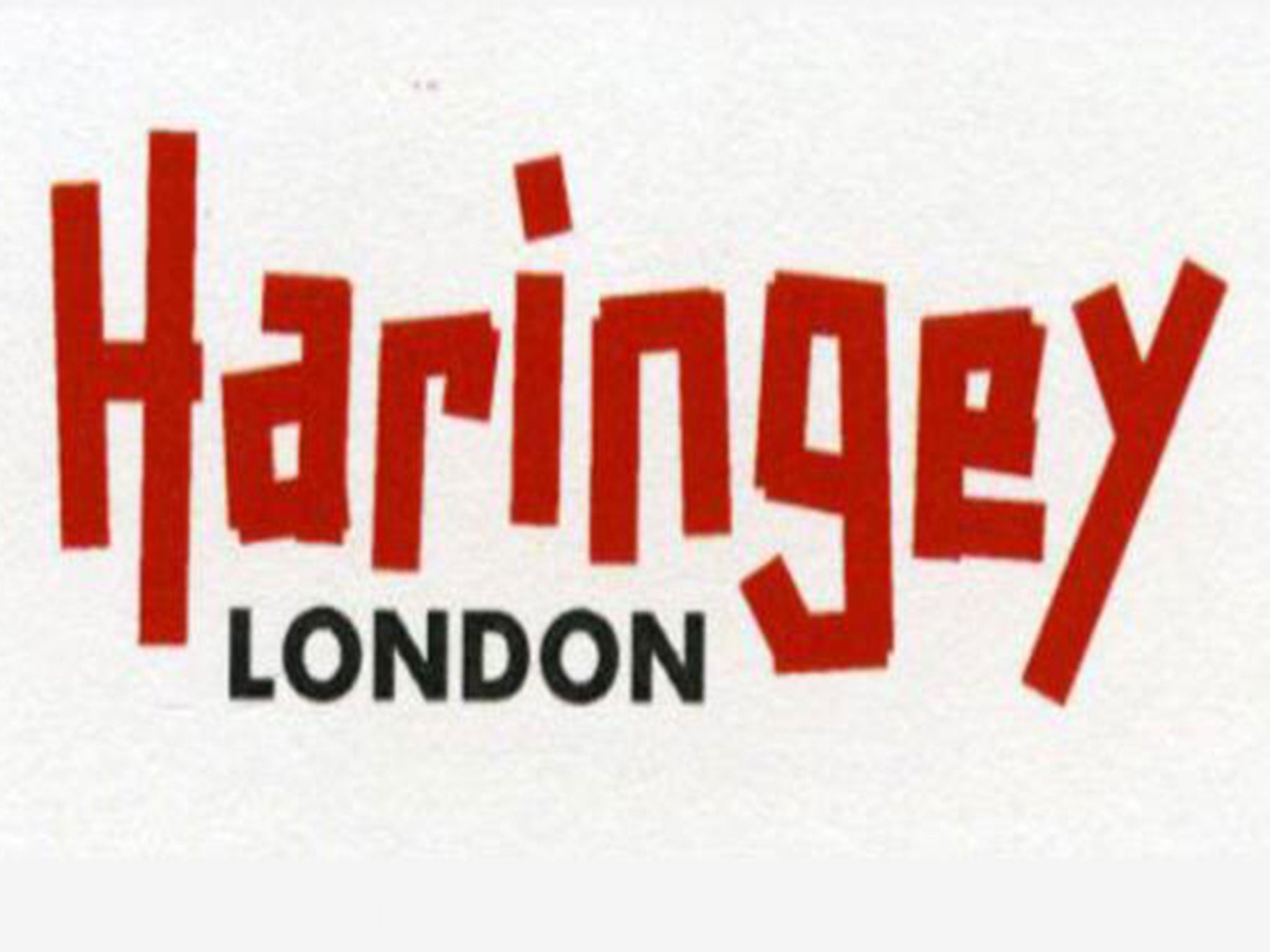
People living in Haringey, in north London, have reacted with fury to its quirky new red logo, part of an overhaul that the borough claims “communicates who we are today”.
The new draft logo, leaked to the Evening Standard, replaces the present logo – adopted just eight years ago – whose ‘crackle’-style logo celebrates the broadcasting heritage of Alexandra Palace in the borough.
Haringey, which must make £70 million in spending cuts by 2018, including to services used by vulnerable people, defended the re-brand, and refused to confirm if the leaked letter were the final design.
Council papers give a list of justifications for the re-brand, sentences beginning with “I am in because…” The final reason reads: “I am in, because Haringey is much more than just a place. It’s an attitude. Are you in?”
A launch event for a campaign to promote the borough’s values – which it says include using “taxpayer money as carefully as we would our own” – is planned for Monday.
A film, that cost £20,000 to make, promoting the borough’s strengths, will be shown. An additional £40,000 was spent on ‘brand strategy’ by the council, which gained notoriety in 2008 over the Baby P scandal.
Resident Martin Bell, 48, told the Standard: “It’s disgusting for the council to waste money on branding at a time when it’s cutting vital services for vulnerable people.
“The logo looks like it was made by a child with a marker pen.”
Others vented their frustration on Twitter.
Cllr Joe Goldberg, cabinet member for economic development said in a pre-launch statement: “The new brand identity is there to tell Haringey’s true story, and foremost to tell the stories of the people who live and work here.”
Join our commenting forum
Join thought-provoking conversations, follow other Independent readers and see their replies
Comments