Gerardus Mercator: 3 ways influential cartographer changed the way we look at the world
The famous 1569 map is one of the most influential in the world - but it isn't entirely accurate
Google has today celebrated the birthday of Gerard Mercator, a 16th century cartographer, with a Doodle on its homepage.
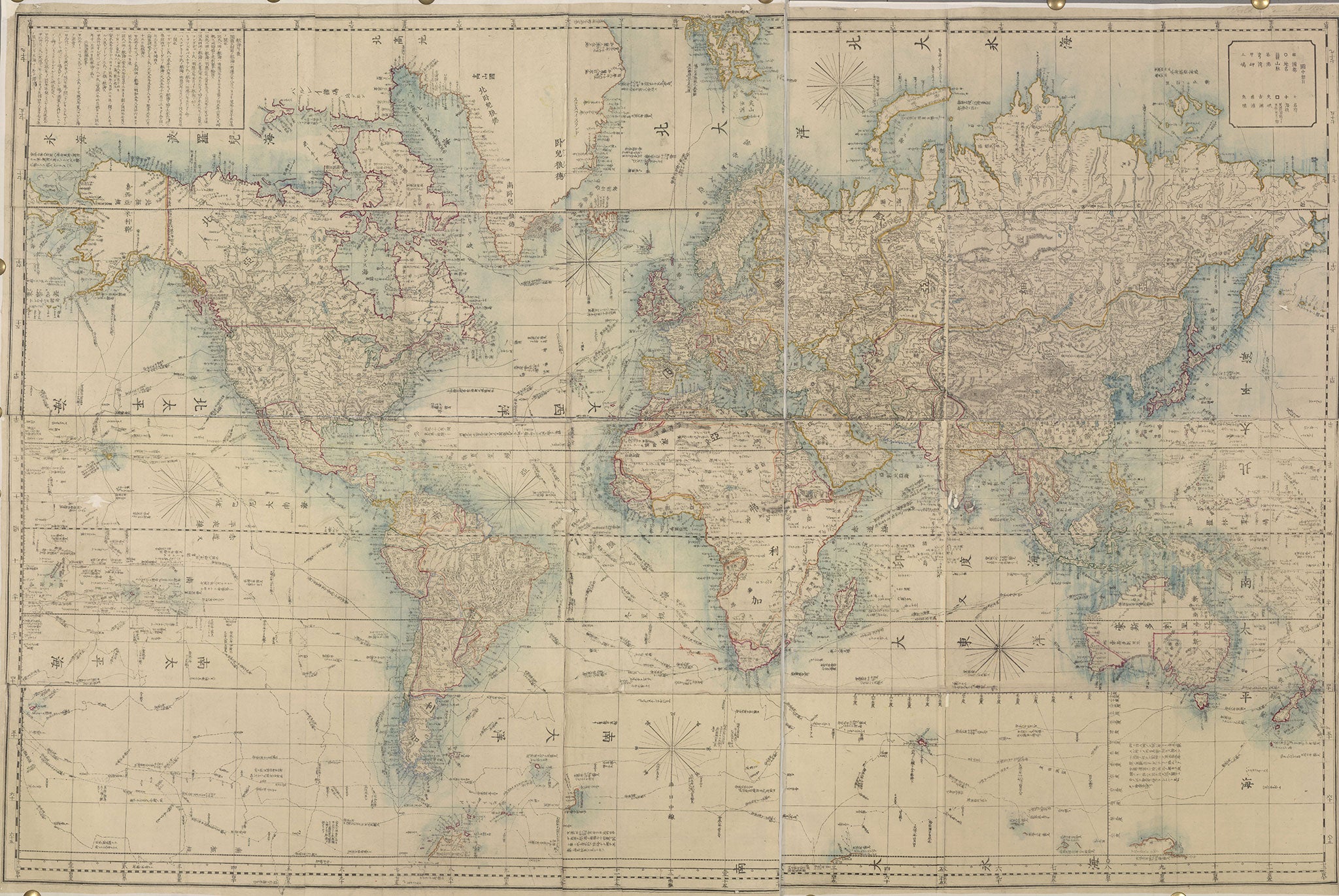
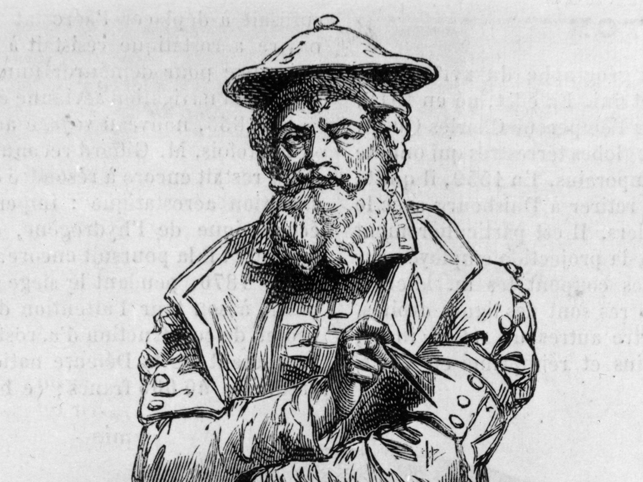
The Flemish map-maker is behind one of the most influential depictions of the globe ever created. His 1569 Mercator projection became the standard map projection for nautical purposes.
It accurately depicts the shapes and directions of landmasses, which made the map very useful for sailors before the invention of complex navigation systems.
Parallels and meridians are rendered as straight lines spaced, so as to produce at any point an accurate ratio of latitude to longitude. This enabled seamen to precisely plot a course from one place to another, as well as see where the coasts meandered in and out.
And the map is still commonly used today. In fact, there was probably a version of it on your classroom wall and even Google Maps uses a close variant of the Mercator projection.
However, a few problems with the model have been raised over the centuries:
It distorts the size of countries and continents
The distortion increases as you move further away from the equator on the map, making landmasses nearer the poles appear larger.
For example, Greenland appears the same size as Africa, while Europe looks as though it is only slightly smaller than South America.
In fact, as Business Insider pointed out in a series of graphics, Greenland can fit in Africa around 14 times, while South America is roughly three times the size of Europe.
It props up a specific world view
Due to the above inaccuracies, Mercator’s map makes Europe and North America seem far larger than they are, which critics have said reinforces the colonialist view that they are superior.
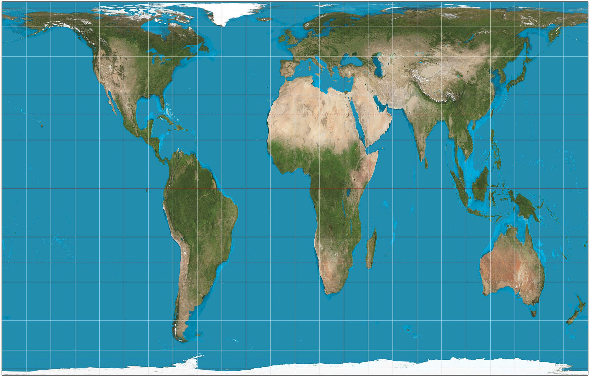
An alternative map, the Gall-Peters projection, shows the truer size of countries in relation to one another, thereby making Europe seem less significant. It was originally presented by clergyman James Gall in1855, but became widely known when re-presented by Arno Peters in 1973 as a replacement for the Mercator projection.
The North is at the top
It is only convention that places the northern hemisphere at the top of the map. This practice has again been said to support the idea that countries that side of the equator are in some way better.
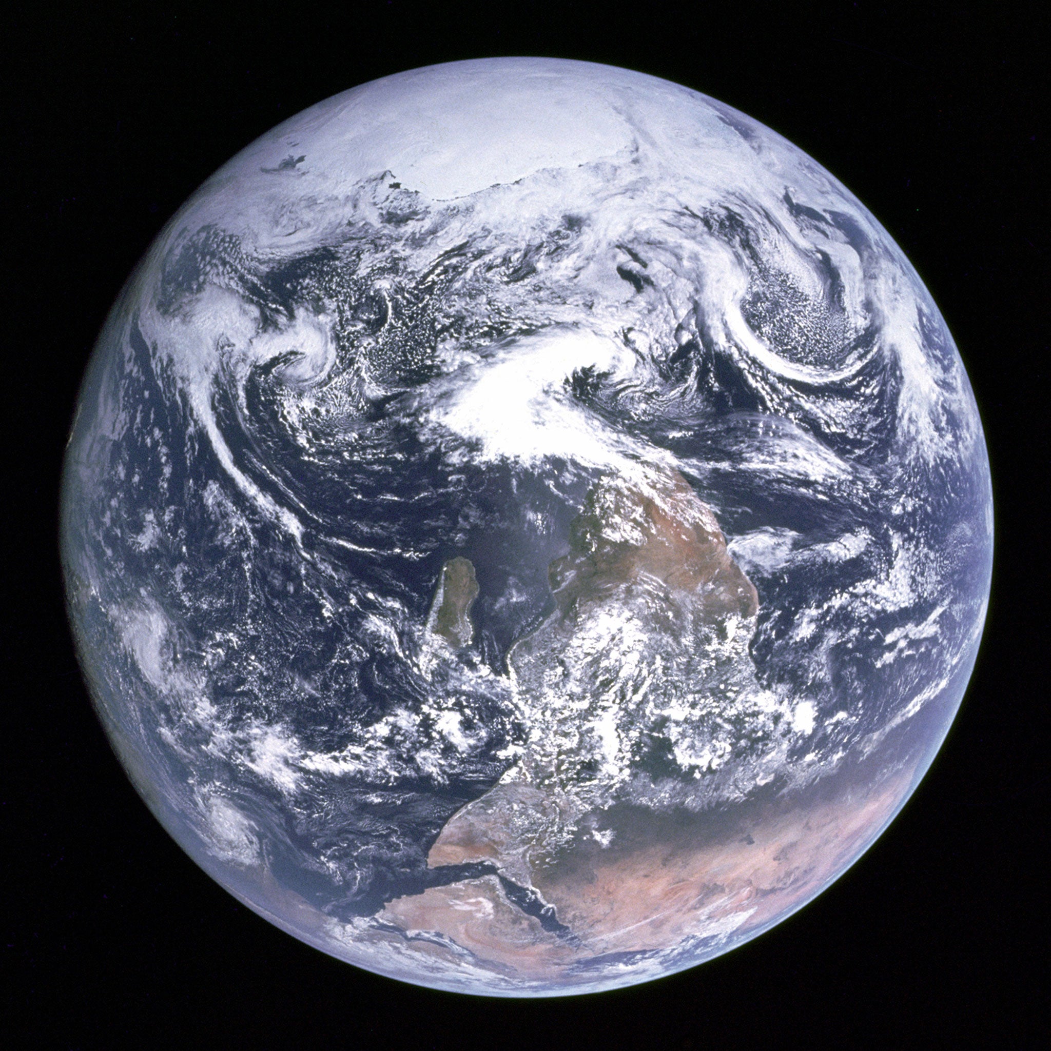
In 1972, a photograph taken by the crew of the Apollo 17 spacecraft, entitled Blue Marble, showed the South Pole at the top, rather than the bottom, of the world. However, Nasa rotated the image 180 degrees to keep in line with the standard map design.
Join our commenting forum
Join thought-provoking conversations, follow other Independent readers and see their replies
Comments