The workforce is rising in some countries and falling in others. Why? Economists are puzzled …
These inactive folks stand ready to return to the labour force if jobs become available

The Fed on Wednesday did taper lite. The markets had expected tapering in September and they didn’t get it; the Fed wasn’t expected to taper in December and did. The Federal Open Market Committee (FOMC), the equivalent of our Monetary Policy Committee, is going to cut its monthly bond purchases to $75bn from $85bn. Nine members voted for, and one, my friend and colleague Eric Rosengren, president of the Boston Fed, voted against, arguing that changes were “premature” given an elevated unemployment rate and inflation well below the target.
Beginning in January, the FOMC will add to its holdings of agency mortgage-backed securities at a pace of $35bn per month rather than $40bn per month, and its holdings of longer-term Treasury securities at a pace of $40bn per month rather than $45bn per month. The committee collectively improved their outlook for the US labour market, but made it clear that they expected interest rates to stay lower for even longer than they previously expected. The committee also lowered their expectations of inflation over each of the next three years.
Stock markets rallied on the fairly dovish news, with the Dow rising nearly 300 points after the decision, and gold fell through $1,200 an ounce.
So there was none of the market panic after the Fed failed to taper in September, or in May, when they first suggested they were preparing to run for the QE exits.
Just to be clear though: this is a slowing in the rate of increase of the Fed’s asset buying programme. Ben Bernanke, at the subsequent press conference, his last as chairman, made clear that labour market developments were central – including what happens to labour force participation and wages, which have started to rise in real terms.
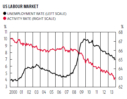
The chart on the US labour market puts this in context. From a low point of 4.4 per cent in May 2007, the unemployment rate rose steadily through to October 2009, when it reached 10 per cent. Since then the unemployment rate has fallen back to 7 per cent, with the number of unemployed down by 4,475,000 since May 2009.
But that isn’t the end of the story, as is clear from the chart, which shows that there has been a fairly rapid fall in the activity or participation rate. This is calculated as the proportion of the 16-plus population that is employed, or unemployed; the sum of the two constitutes the workforce. The activity rate has fallen from 66.2 per cent in January 2008 to 63 per cent in November 2013. If these folks hadn’t dropped out of the labour force then unemployment would have been a lot higher.
There is evidence that these inactive folks are pushing down on wages, as they stand ready to come back into the labour force if and when jobs become available. The danger then is that employment would rise without the Fed’s announced target, the unemployment rate, falling.
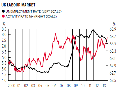
The story is quite different in the UK, as the second chart makes clear. The UK saw a much smaller rise in the unemployment rate, up from 5.2 per cent in February 2008 to a high of 8 per cent in February and March 2010, to 7.4 per cent in the latest data release. Of particular note is the fact that the participation has risen recently.
We don’t have a good story for the difference between the two countries. It is not explained by gender differences; for example, in the US, the participation rates of women and men have both fallen over the last year, whereas it has risen for both men and women in the UK. In both the US and the UK participation rates of older workers, for both men and women, have risen, as they have had to put off retirement due to the fall in their pensions. In the UK we know that these older workers would like to work fewer hours, whereas younger workers, who are under-employed, would like to work more hours.
The pattern of falling participation rates between 2010 and 2012 is repeated in Belgium, Denmark, Germany, Greece, Ireland, Japan and Portugal. In contrast, participation rates have risen in Australia, Canada, France, Italy, the Netherlands, Spain, New Zealand and Switzerland.
Labour economists are struggling to explain these differences across countries. Greece and Spain both have high unemployment rates, and the former has falling participation rates while the latter has rising rates. It may have something to do with availability of welfare, and especially disability benefits, but we aren’t sure.
So here is the puzzle. The US had a doubling of the unemployment rate and a big fall in the participation rate, while the UK saw a smaller rise in the unemployment rate along with a rise in the participation rate. Beside which, the US only had a drop of output of GDP of 4.3 per cent in the down phase of the Great Recession, compared with 7.2 per cent in the UK, and the US is now 5.5 per cent above starting output, whereas the UK is still 2 per cent below. GDP per capita in the US rose between 2010 and 2012, but fell in the UK. Based on a bigger drop in output, we would have expected the UK to have experienced a bigger rise in unemployment than we have seen.
Unexpectedly, UK real wages have been more flexible than US wages, which have now started to rise again, while those in the UK continue to fall. This means that the US has had rising productivity, while the UK has had falling productivity. Why? Economists aren’t sure.
It’s probably too early to celebrate. This thing isn’t over by a long way. This really is the crisis that keeps on giving for economists. Sorry all.
Join our commenting forum
Join thought-provoking conversations, follow other Independent readers and see their replies
Comments
Bookmark popover
Removed from bookmarks