An uncontroversial art show
The entries for the Turner Prize usually excited heated debate; but not so much in 2003
29 October 2003
The media still doggedly holds to the fiction that the Turner prize is controversial. Of course, this was always the deal. You give us publicity, we’ll give you controversy. And each year, by hook or by crook, controversy is extracted. It seems amazing to me. But then my problem, perhaps, is that I just don’t have an eye for these things.
For example, at the weekend I went to see this year’s prize exhibition at Tate Britain. I’d been looking at Death, a sculpture by Jake and Dinos Chapman – two inflatable sex dolls having sex on a lilo, cast in bronze. I’d been thinking how extraordinarily, bafflingly feeble their work can be, and how even taking this piece as an act of deliberate oafishness didn’t make much difference. But a description of it that hadn’t occurred to me was controversial.
I suppose I may be inured. Hanging around contemporary art too much, or reading too many copies of Viz magazine, or being a schoolboy once... I don’t know, something or other deadens my response. But having left the gallery, almost at once I bumped into a newspaper article describing Death. The author had clearly not seen it, but he knew something about it that had eluded me – that this work was highly controversial. And when I read that, I thought: oh, of course, it’s controversial, why don’t I notice these things?
Controversy in the arts is a strange phenomenon. What usually happens is that one person declares that something is controversial, and then someone else comes along and warmly agrees that yes, it is indeed, and gradually a solid consensus materialises. Thus controversy rages – and not a cross word from anybody. Being controversial is like being perfectly round: it may need a bit of an eye to spot it at first, but once it’s pointed out everyone can see it.
I leave these things to the experts. To my untutored eye, this year’s Turner prize exhibition, which opens today, is an averagely disheartening spectacle. It’s not quite as dull as last year’s, but I wouldn’t bother to go and see it. If you have a free afternoon, it would be better spent doing almost anything else. Three of the four short listees are artists of very limited gifts. The fourth – the Chapman brothers – have put up a show that’s well below their game.
But at any rate, they have finally been short-listed. This seems to coincide with a general decision in the art world to stop seeing the brothers as nihilistic sickos and start seeing them as black jokers. In a way that’s clearly true. But the striking thing about their work, often so inventive in its blasphemies and gross-outs, is its lack of comic oomph. The comic impulses are clear, but the laugh never arrives.
That’s how it is with another of their works in this exhibition, Insult to Injury, a complete (though inferior) set of Goya’s Disasters of War prints, which the brothers have defaced with cartoon-like clown and bunny heads. You can see how it ought to work: the additions should seem to be both a hideous piss-take of Goya, and strangely true to his visions of helpless human awfulness. But the brothers’ intrusions just aren’t funny enough to take effect.
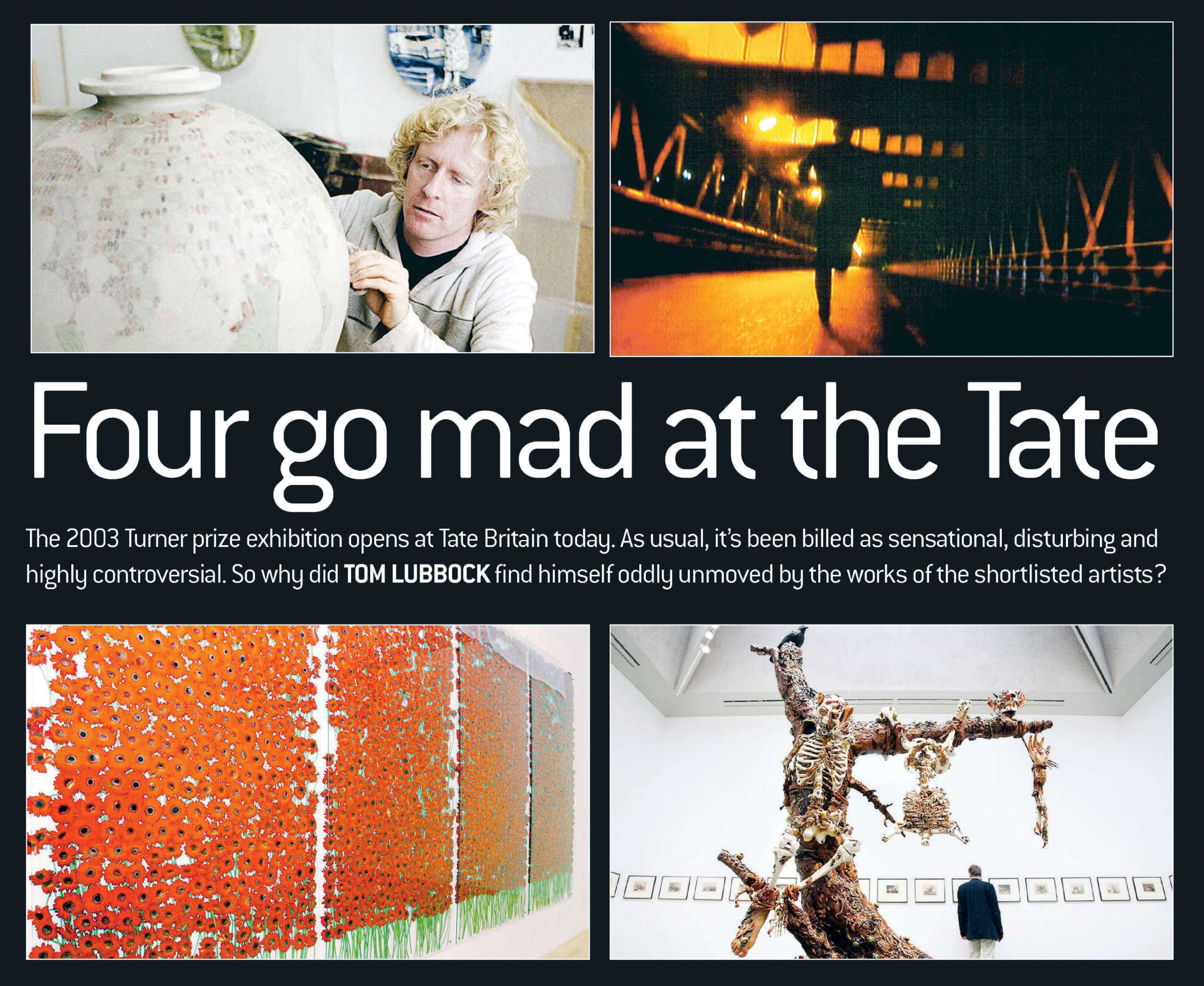
But I’ve no doubt they should win the prize, on the basis of a work they first showed about a year ago, Works from the Chapman Family Collection – a series of superbly crafted pastiches of tribal artefacts, as if from an anthropological museum, with a weird twist: that each object was strangely fused with the imagery of McDonald’s. It was a perfectly pitched clash of values, one of the most original and startling conceptions to come out of British art for some time. Unfortunately, the Tate cannot display it. It is currently on view (along with several other large Chapman artworks) at the Saatchi Collection. Now to the other artists.
Anya Gallaccio stays loyal to her themes of preservation vs perishability, the natural versus the artificial. Her works never really have anything to say, but you always know where they’re coming from, and after a while you could make them up yourself. They tend to use organic materials and their main quality is an overt prettiness. And if anyone thought there was no demand for overt prettiness in contemporary art, Gallaccio’s success should make them think again.
So, in preserve ‘beauty’, you have two big, oblong wall pieces in which hundreds of gerboas are held pressed under sheets of glass. Currently they are intensely scarlet. But over the course of the exhibition these flowers will fade and wilt. In other words, they will move from one state of loveliness (fresh) to another (decayed). Simple – and not much more than simple. It’s about transience? Oh yes, definitely about transience.
Gallaccio’s work can also be a little bit disturbing, with mildly discordant combinations of the organic and artificial. Because nothing has changed looks quite like an apple tree that’s been severely pollarded and clipped, but actually it’s a bronze cast of a tree. Around the joints of this unreal tree, bunches of real red apples are hung, threaded on string, clustering like berries or maybe a sort of fungus. The effect, though attractive again, is, as I say, a little bit disturbing; beyond that, it is pointless.
Willie Doherty is a Northern Irish artist whose art usually arises from his homeland’s political situation. People like his work because at least it’s kind of about something definite and difficult, not just some abstract themes. True – but Doherty himself has a very abstract imagination. His pieces, using video and still photography, are drawn continually to motifs of repetition, frustration, impossibility, deadlock. You might think his political analysis was pessimistic. But it could equally be that artistic form is making the running. Repetition, deadlock and all that are much safer forms to work in than breakthrough and progress. Doherty has never been afraid of boredom.
He has a single piece in the show, a two-screen projection. Re-run is a repeater. On one screen a man is running across a bridge at night, towards the camera, with the action edited in a way that keeps him running and running but never really advancing. The other screen, directly opposite, shows the same sequence, but shot from behind, with the same man running and running away from the camera. The relative positions of the two screens mean that the first man seems to be in pursuit of the second man. Over and over it goes, and of course it could be about anything, not just some scene of terrorism. It’s a kind of open metaphor of inescapable endlessness, but it’s done so blatantly, it’s so readily comprehended, that whatever it’s about, it doesn’t feel worth attending to for long.
Grayson Perry works with ceramics, and makes large and entirely run-of- the-mill pots, brightly and attractively decorated with drawings, found imagery and words. But when you get up close you see that the images and the words are often obscene or violent, and sometimes concern disturbing subjects such as child abuse or fascism. You might say that Perry works with that well-known riff – at-first-sight-nice, on-closer-inspection-nasty. Or you might say that he makes perfectly pleasant pots, with the minimum necessary to make them artistically respectable. It is always mentioned that Perry is also a transvestite, who feels a deep psychological need to dress up as Little Bo Peep. I’m not sure what relevance that has.
But even I can see that it’s controversial.
Join our commenting forum
Join thought-provoking conversations, follow other Independent readers and see their replies
Comments
Bookmark popover
Removed from bookmarks