Great Works: Hoop-La (1965) by Jeremy Moon
Tate, London

For free real time breaking news alerts sent straight to your inbox sign up to our breaking news emails
Sign up to our free breaking news emails
Comic abstract painting? There's tragic and sublime abstraction. There's lyrical and mystical abstraction. There's rational and mechanical abstraction. But comic? How would that go? Could an entirely imageless picture be funny? What would a joke about shapes and arrangements and colours be?
It would be a painting by Jeremy Moon. He does it, and he shows how it's done. His paintings were made of pure forms, but you're never allowed to contemplate a resolved composition. They have something else: a twist, a teeter, a fault-line, a false note. There are patterns hidden in seeming randomness. There are apparent schemes that collapse. Look at Hoop-La, and learn.
Granted, a detailed description of an abstract painting is often intolerable. And a description designed to demonstrate that it's a funny one: that sounds suicidal. But Moon's paintings are often explicable. Their tricks may be subtle. Their elements are clear. His visual wit is worth an analysis.
First point: his edges are sharp. Abstraction has come in soft and hard edges. It did so from the beginning. Kandinsky's forms bleed and blur. Malevich deals in geometrical shapes. Hard edges aren't automatically comic. (They aren't in Malevich or Mondrian.) But hard edges are hospitable to comedy. They introduce abruptness. They establish definite relationships between things – which are then susceptible to definite wrong notes.
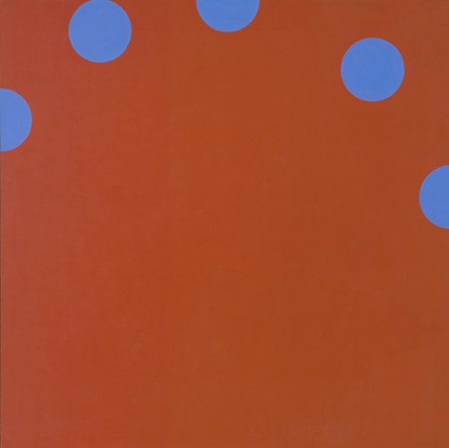
The basic relationship in Hoop-La is explicit enough. The painting has two components, in two colours. There are five identical blue discs. They lie on a red background. This background, the whole picture, is a perfect square. The discs lie in an arcing formation flying across its top.
But already it's presumptuous to say discs. After all, three of them are sliced off by the picture's edges. Their roundness is only implied – implied by the other two, which are visibly circular. Delete those two, and we wouldn't see the three as circles. We'd see them as semi-circles, little bites or tabs or cheese holes, taken out of the picture's sides.
The composition strains our eyes - between what we actually see, and what we might deduce. Is this a group of two circles and three semi-circles, laid out within the frame of the picture? Or is it an arc of five full circles, which has partly strayed off-picture, out of view?
There are tendencies each way. Those three sliced-off discs are perfectly cut in half. That gives them a stable identity as semi-circles. We don't need to see them as circles manqués, but as what they actually are. And we don't need to imagine a wider arcing formation of which they might be part.
Other things weaken the arc. The discs are spaced unevenly around its curve. And they relate neatly to the picture's edges in further ways. See how the second disc precisely touches the top edge, and the third one lies exactly halfway across. The picture's frame, not the implicit arc, rules their positions.
Yet the arc formation can't be ignored. It has its own identity too. It curves firmly across the top of the picture. It recalls the dial of an old telephone. And not all the discs relate so neatly to the picture's edges. Look at the fourth one, the most visible circle: you might think it was perfectly cornered, equidistant to top and right side. It isn't. It's nearer the top. Its position lies in the arc's orbit, not the frame's framework.
There's the fundamental oscillation in Hoop-La. What motivates the placing of the five blue discs – the arc or the frame? They might be set at evenly intervals around their arc, and randomly related to the frame. Or they might all be neatly related to the frame, with no arc formation at all. As it is, they're a bit of both. Each way they raise expectations of more regularity, each way fail.
And do the discs themselves lie on a perfect round? Is their arc the section of a circle? That's the question lurking in this composition, and the answer is: almost certainly, yes. That conclusively strengthens the identity of the arc. And it sets up the terms of the picture's final mismatch: the arc's circle against the picture's square.
It's the decisive wrong note. Circle, square: regular shapes, but they don't meet properly. It's as if one had mislanded on the other, aimed but missed. The design is frustrating. Expectations again are raised and failed. You shake your head. You never feel those five discs are all where they ought to be.
Meanwhile, the colours are at work too. This violety-blue and the orangey-red are opposite colours, complementaries. They intensify each other. And as your eyes play over these spots, you get spots before your eyes. Your staring engenders after-images, optical discs bouncing around the real discs, keeping things moving.
But in a paradoxical way. After-images take on the complementary colour of the images that engender them. So the after-images engendered by these blue discs are red like their background. These secondary discs flicker, red on red, in a most fleeting, vanishing way, as the faintest brightening. It's a touch of lightness. It's a literal winking.
A show of Jermey Moon's "late" work, from the early 1970s, can be seen at Rocket Gallery in east London until 25 July (020-7729 7594; www.rocketgallery.com)
About the artist
Jeremy Moon (1934-1973) was a British Sixties painter, a contemporary of Bridget Riley and Patrick Caulfield. He read law, and took to painting as a hobby. His originality emerged immediately. He devised a unique form abstraction. The flat fields of paint, hard edges and geometrical shapes are a little bit Pop Art (in their sweet shop hues) and a little bit Op Art (in their eye-jumping surfaces). But their ideas are extremely various. They have subliminal real-world echoes and off-kilter arrangements. They play a twist on the purity and solemnity of the Modernist abstract. They're exuberant and witty. The effect is more than fun, though. His works are light, but firmly heartening. They're pictures about living well in an unpredictable world. Moon was killed in a motorbike accident in his late thirties. After a posthumous retrospective, his name faded away. In the last few years, he's been reviving.
Subscribe to Independent Premium to bookmark this article
Want to bookmark your favourite articles and stories to read or reference later? Start your Independent Premium subscription today.
Join our commenting forum
Join thought-provoking conversations, follow other Independent readers and see their replies