Tangerine Dream - spring/summer 2016 is looking golden
Orange is the power colour of spring/summer 2016, thanks to a whole bunch of designers favouring the fruity hue. Approach with caution, advises Sarah Young - but use it right, and you’re guaranteed to make an unforgettable impact.
An all-orange getup hasn’t always called to mind the most stylish of images - instead conjuring apparitions of bygone nineties Tango ads or ‘Hot Mugshot Guy’ Jeremy Meeks - but this season it looks like orange really is the new black.
For spring/summer 2016, it has quietly become a favourite shade among designers who looked to a bright sunset palette to capture the twilight feeling of a hot summer eve. Once avoided for fear of clashing this juicy palette has progressed to far more stylish ground. Maybe it’s the influence of Hermès, who have established their signature satsuma shade as the dernier cri of luxury, by association with their faultless, waiting list-generating leather goods. Interestingly, the colour was a fluke: during the Second World War, scarcity of materials meant that the brand’s packaging supplier has run out of the hitherto Hermès hallmarks shades - a brown-trimmed beige box. Orange was used as a substitute, and the eye-catching shade stuck. Today, Prabal Gurung, Altuzarra and Paul Smith are at the top of a very long list of creatives that have teamed up to make zesty hues the must-have shade of the season. What’s more, they all stand united in their adulation for a fiery orange floor or calf-length dress.
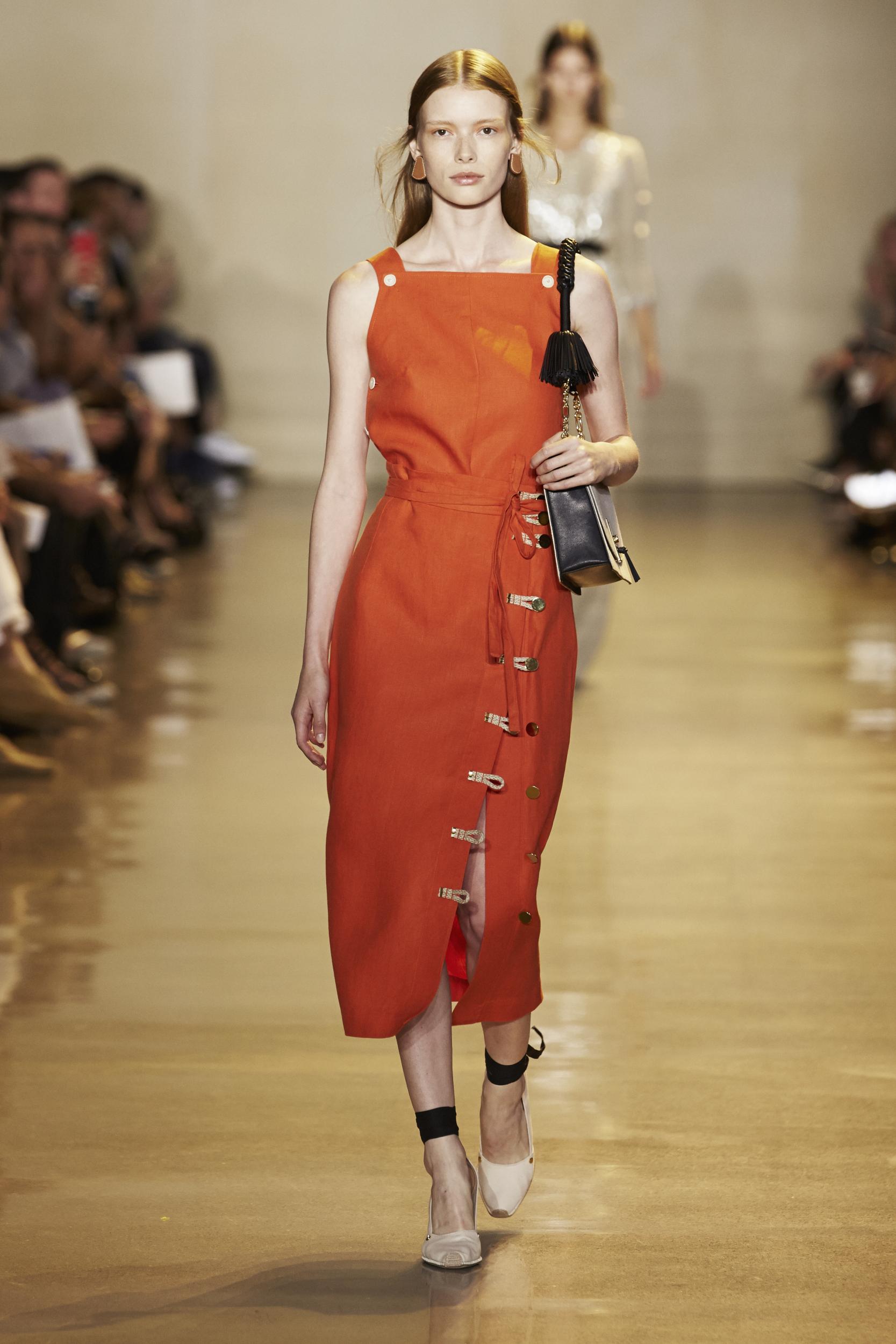
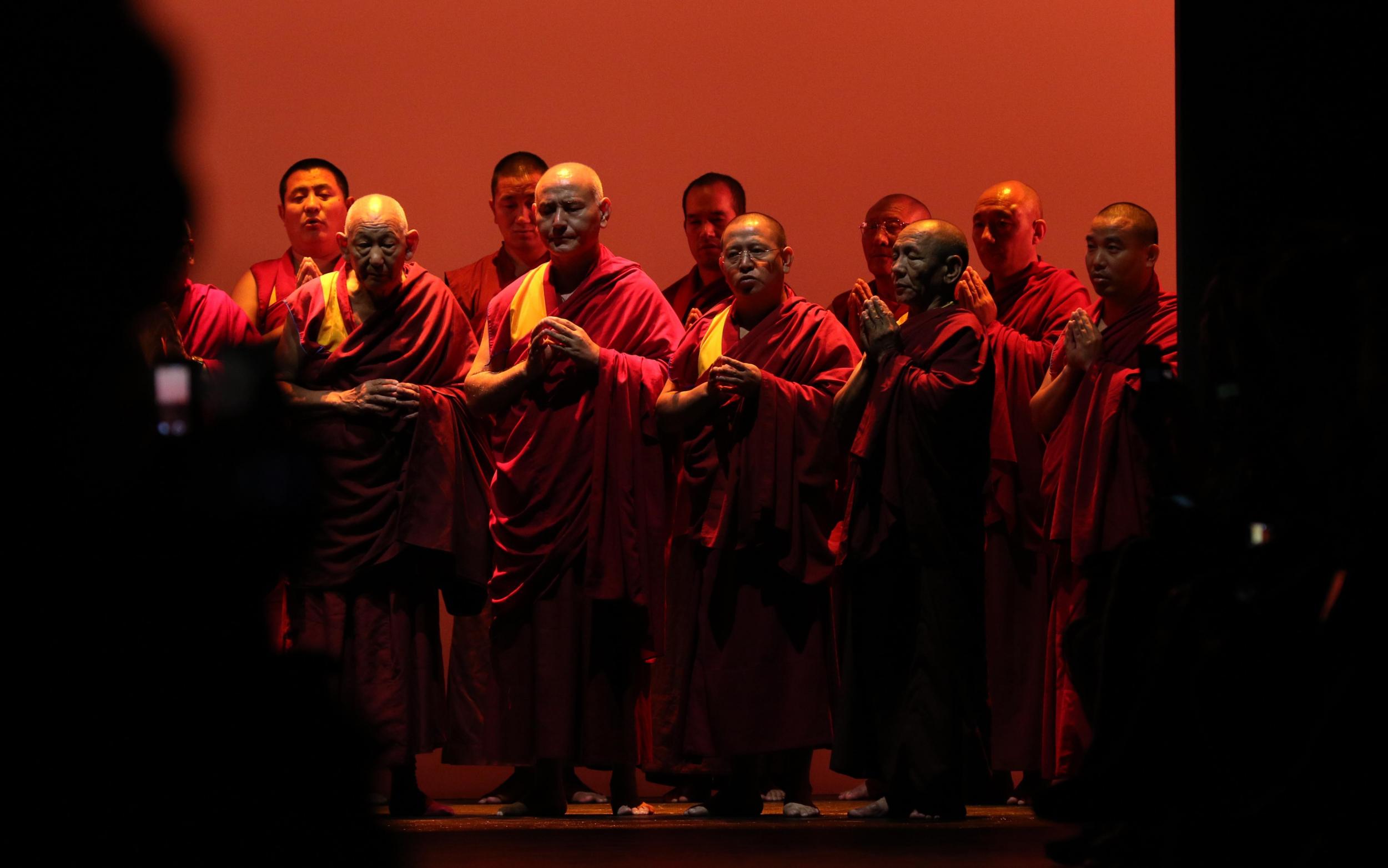
For Prabal Gurung, his collection laid roots in his native home of Nepal in light of the April 2015 earthquake - a chanting phalanx of Buddhist monks opened the show, the hues of their gowns reflected in a series of fiery orange evening dresses, fluidly draped round the body. So too, Altuzarra seized an opportunity to reconnect with his Basque heritage through a scheme of dusky, burnt amber and vermillion. As if the shade wasn’t enough of a statement on its own, orange and blue combos prevailed for the likes of Jil Sander and Victoria Beckham (who has made the shade a signature hue), with Paul Smith leading the way through clashed blocks of scarlet, orange and turquoise blue.
Wearing navy and orange together may seem a little daring, but it actually makes the colour far more wearable. Opposites attract. Don’t be afraid to mix and match prints and textures too, clashing is in and sometimes you just need to break away from convention. If however, you’re more peachy keen than Sunset Boulevard, take baby-steps with this one – a bag, shoes or even a slick of tangerine lippy is a great way to include the colour without feeling like a jailbird...While this sunny palette is perfect for getting you in the summer spirit the great thing about it is that it transcends seasonal confines depending on what you pair it with; try a crisp white shirt for hotter climes and warmer tones of merlot and olive for autumn. Orange is without doubt this season’s new power colour and as an investment piece guarantees to inject your wardrobe with a much needed dose of Vitamin C all year round; look on the bright side and make sure you invest in spring/summer’s juiciest trend yet.
Join our commenting forum
Join thought-provoking conversations, follow other Independent readers and see their replies
Comments