New Google logo had been hiding in plain view on Alphabet website
Styling brings search giant’s icon in line with its newly-created parent company
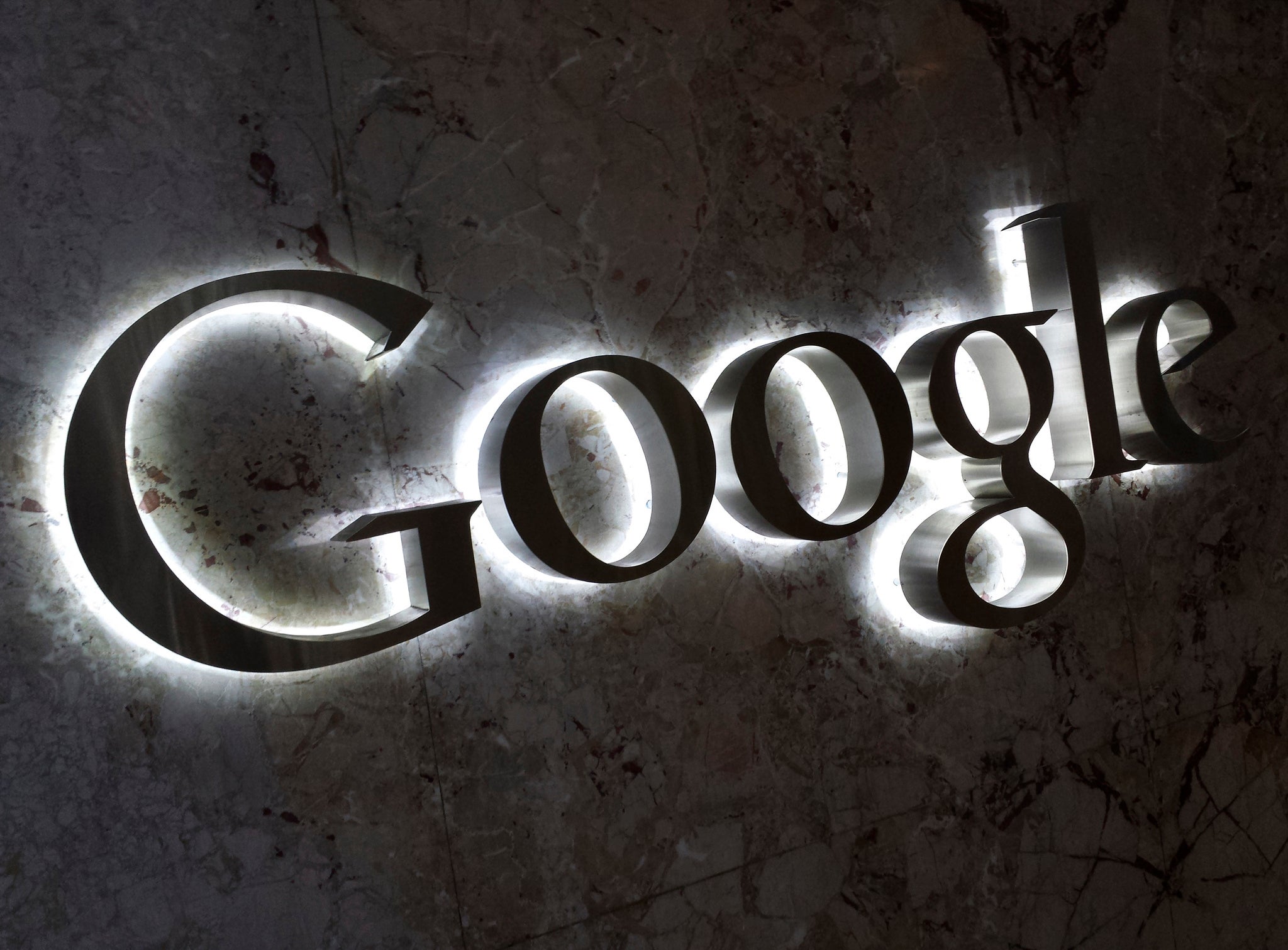
Google’s shock new logo had actually been hiding in plain sight for weeks.
The site unveiled its new icon – with the serifs on the letters taken away and the colours made much lighter – on its website last night. But the styling had actually been part of a redesign that was unveiled when Google changed its name to Alphabet earlier this year.
That reorganisation – which saw what was Google become Alphabet, and the search operations keep that name – came with a new website for the parent company. That site, abc.xyz, caused controversy because Google didn’t own the more obvious choice of Alphabet.com.
But the very first thing that users saw on that site was a note saying “G is for Google”. And while it went mostly unnoticed at the time, that Google was written exactly like the new logo.
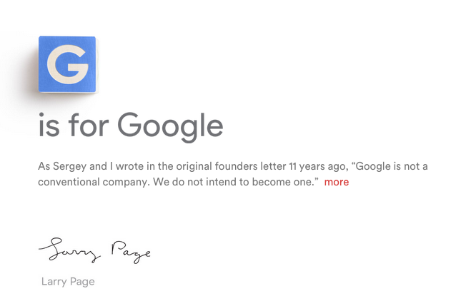
At the time, some noticed and speculated that the Alphabet website’s design was an indication of things to come for Google.
“Google has created a new parent company - but does it give clues to a bottom-up rebrand?” wrote design site Creative Bloq in early August, when the reorganisation into Alphabet was announced. It noted that Google's logo hadn't been changed for years, and that a shake-up might be overdue.
Unveiling its new logo, Google said that it had chosen the design so that it would look good on any screen – particularly the tiny mobile screens that many visitors to the search engine now look at it through.
But it also brings it into line with the cleaner, more simple look that Alphabet has been developing.
Join our commenting forum
Join thought-provoking conversations, follow other Independent readers and see their replies
Comments
Bookmark popover
Removed from bookmarks