
Stay ahead of the curve with our weekly guide to the latest trends, fashion, relationships and more
Stay ahead of the curve with our weekly guide to the latest trends, fashion, relationships and more
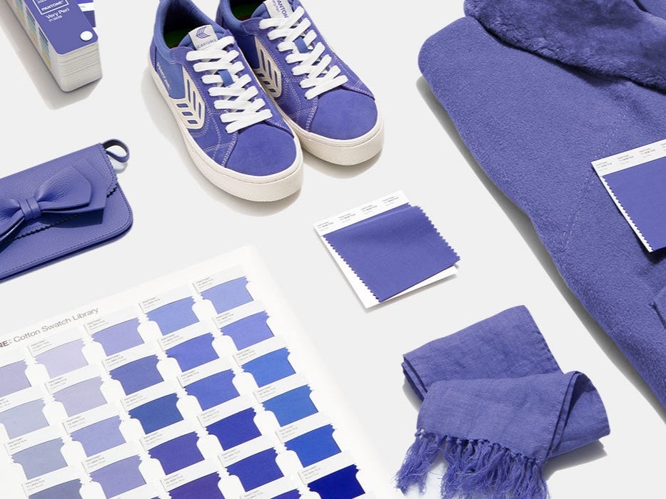
Pantone has revealed its Colour of the Year 2022 to be a new periwinkle blue that symbolises “a carefree confidence and a daring curiosity”.
The colour is a blended blue hue with violet red undertones to create the “happiest and warmest of all the blue hues”, said the global colour authority.
It comes as the world has lived through almost another year of the coronavirus pandemic, which has seen the way people live change dramatically.
According to Pantone, the new colour – called PANTONE 17-3938 Very Peri – is a “symbol of the global zeitgeist of the moment and the transition we are going through”.
“As we emerge from an intense period of isolation, our notions and standards are changing, and our physical and digital lives have merged in new ways,” the brand said.
It also marks the first time Pantone has created an entirely new colour for 2022. Previously, the company would select a colour from its pre-existing archive to be Colour of the Year.
Leatrice Eiseman, executive director of the Pantone Colour Institute, described the hue as “[displaying] a spritely joyous attitude and a dynamic presence that encourages creativity and imaginative expression”.
“The Pantone Colour of the Year reflects what is taking place in our global culture, expressing what people are looking for that colour can hope to answer,” she added.
“Creating a new colour for the first time in the history of our Pantone Colour of the Year educational colour programme reflects the global innovation and transformation taking place.”
Last year, the colour authority chose two colours, Ultimate Gray and Illuminating, a bright yellow shade, to encapsulate the resilience and optimism the world showed during the first year of the pandemic.
Pantone partnered with Microsoft, as well as ARTECHOUSE, a technology-driven arthouse, and blockchain network Tezos to launch the Colour of the Year.
Microsoft incorporated Very Peri into custom Team backgrounds, Windows wallpapers, a new Edge theme, and a PowerPoint template.
Meanwhile, ARTECHOUSE worked with the company to produce a “visually and audibly compelling immersive digital experience” to unveil the colour in its New York space. An exhibition of the colour will be opened to the public in 2022.
Pantone also partnered with Tezos to “explore the world of colour in the digital art world”, and collaborated with Paris-based multidisciplinary artist Polygon1993.
The artist creates non-fungible token (NFT) artwork, which are supported by blockchains like Tezos. NFTs are one-of-a-kind digital tokens, often represented as art, that cannot be copied, but can be traded for a different token.
Pantone said: “Digital design helps us to stretch the limits of reality, opening the door to a dynamic virtual world where we can explore and create new colour possibilities… Very Peri illustrates the fusion of modern life and how colour trends in the digital world are being manifested in the physical world and vice versa.”
Subscribe to Independent Premium to bookmark this article
Want to bookmark your favourite articles and stories to read or reference later? Start your Independent Premium subscription today.
Join our commenting forum
Join thought-provoking conversations, follow other Independent readers and see their replies