Kinneir and Calvert: Graphic designers behind Britain's road signs to be celebrated 50 years after revolutionising our highways
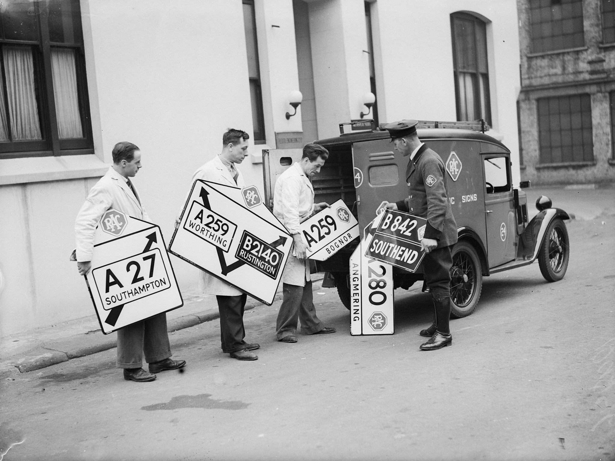
In 1965, The New Traffic Signs leaflet was sent to homes around the country
Britain was going places 50 years ago – just not necessarily in the right direction or towards the right places.
Yes, the first new-fangled motorways were being built, cars were becoming more affordable, and Britons were able to get from A to B quicker than ever before.
But the road signs to direct them there were a mess.
They broke the Geneva Convention – of 1931, the one “Concerning the Unification of Road Signals” – which stressed the need for the visual over the verbal.
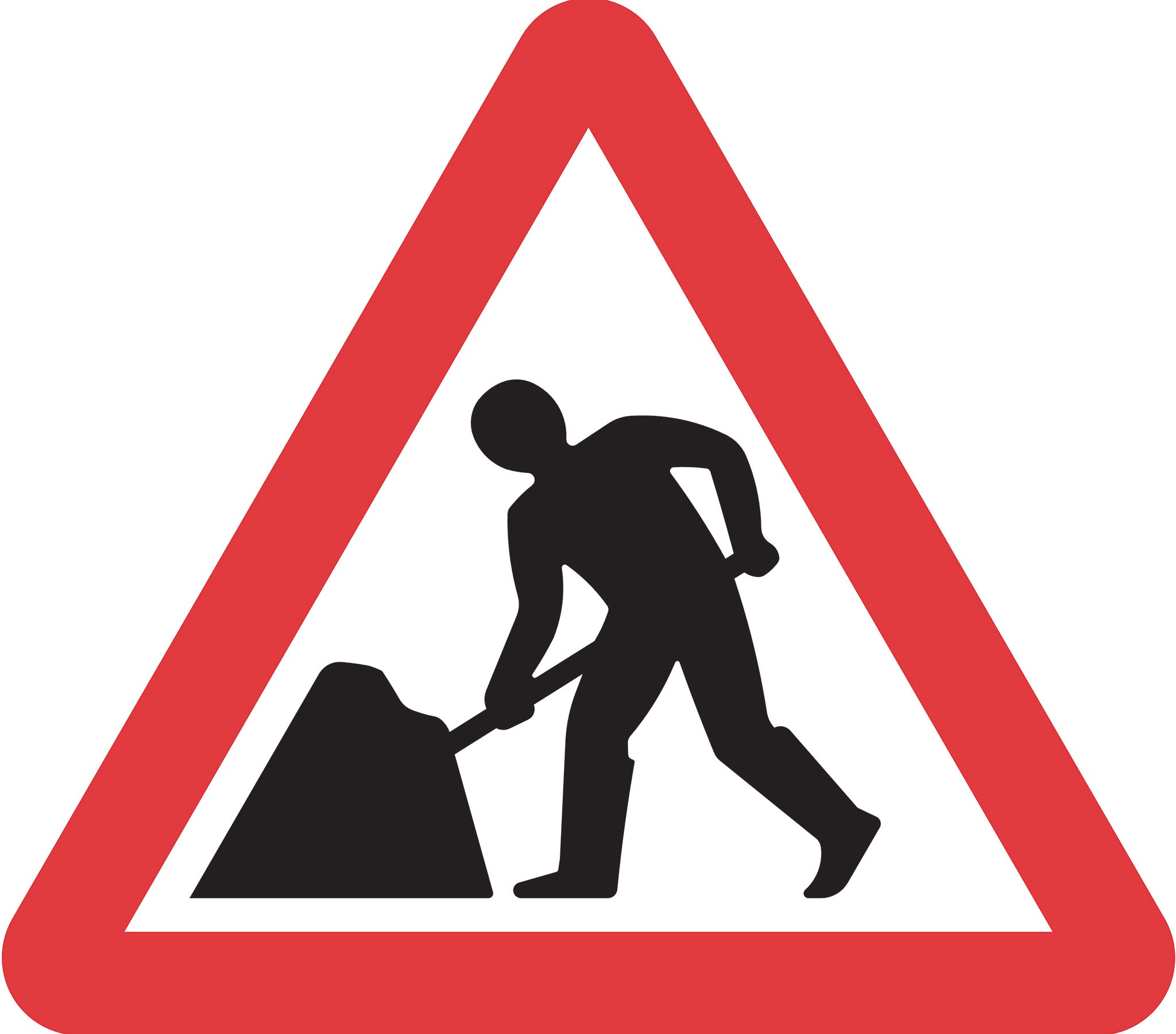
Britain’s signs, involving wordy captions with occasionally cryptic pictures, some of them dating from 1919 (like the torch supposedly denoting a school) may have worked in the years immediately following the time when men walked ahead of cars waving red flags. They were far less readable at speeds possible in the era of the “white heat of technology”.
The men from the ministry had taken note. At their behest, in a small studio in a mews near Hyde Park, new signs were being created by a team led by the graphic designer Jock Kinneir and Margaret Calvert, his young pupil turned assistant and later business partner.
And in 1965, a leaflet entitled The New Traffic Signs was sent to homes around the country. Subtly British, and subtly nudging Britons towards modernity, the Kinneir and Calvert designs have survived pretty much unaltered to the present day.
Their 50th anniversary will be marked next month by an exhibition in London’s Design Museum. And according to Phil Baines, professor of typography at Central St Martins, London, they represent “a staggering achievement.”
Kinneir and Calvert, he said, created “a house style for Britain”. “On a project of that scale, you have to get it absolutely right. The fact it has lasted so long is testament to how right they got it.”
Yet Margaret Calvert was just 21 when the project began in 1957 with Sir Colin Anderson’s committee on motorway signs, and still under 30 when it finished with The New Traffic Designs, provided for the Worboys Commission, which reformed signage on all Britain’s other roads.
At the very start, Kinneir, her former teacher at Chelsea College of Art, had told her: “If this takes off it’s going to be the biggest job any graphic design team has ever tackled.”
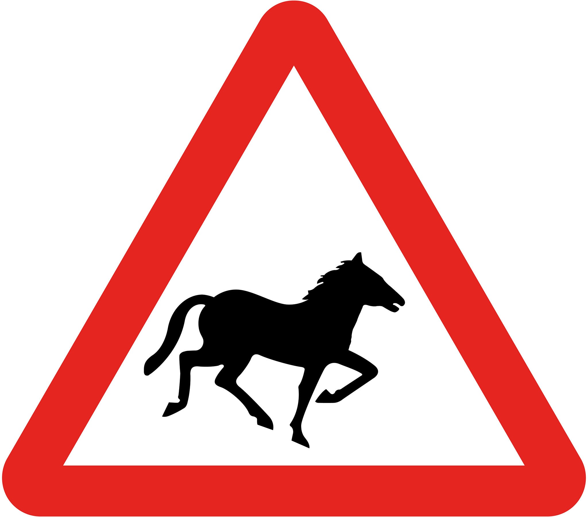
Some influences, though, remained decidedly homely. Patience the cow, which lived on Calvert’s cousin’s farm, has been immortalised in the sign warning of farm animals crossing the road.
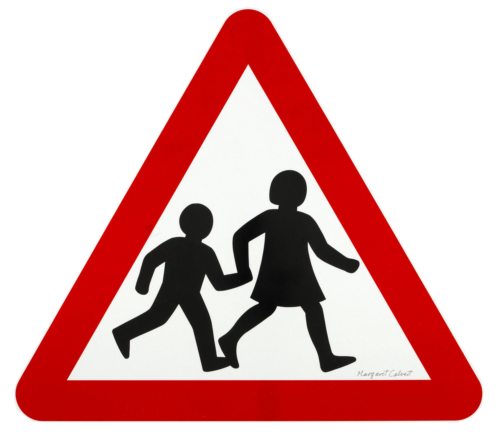
The “schoolchildren crossing” sign was based on a photograph of Calvert as a girl. The change from its predecessor, showing a cap-wearing boy leading a girl, could be described as a sign of the times. Calvert dropped the grammar school signifiers – the boy’s cap and book, the girl’s satchel. It was, she told The Times this week, “more inclusive.”
She also had the girl lead the boy. That, though, was not intended as a nod to feminism. “I thought it looked more caring,” she said. The elderly people sign, where the man once more leads the woman, was not one of hers.
Professor Baines, who has analysed Kinneir and Calvert’s work in the leading graphic design journal Eye, told The Independent it was characterised by pragmatism, attention to detail and lots of testing.
At the Government’s Road Research Laboratory in Slough, Professor Baines said, “Full-size signs were mounted on top of vehicles and driven towards observers in a grandstand to determine at what distance they could be seen clearly.”
The signs had to be legible from at least 600ft.
Other considerations, said Professor Baines, were: “Size of sign equals cost, and could the country make enough steel to install the signs in time?
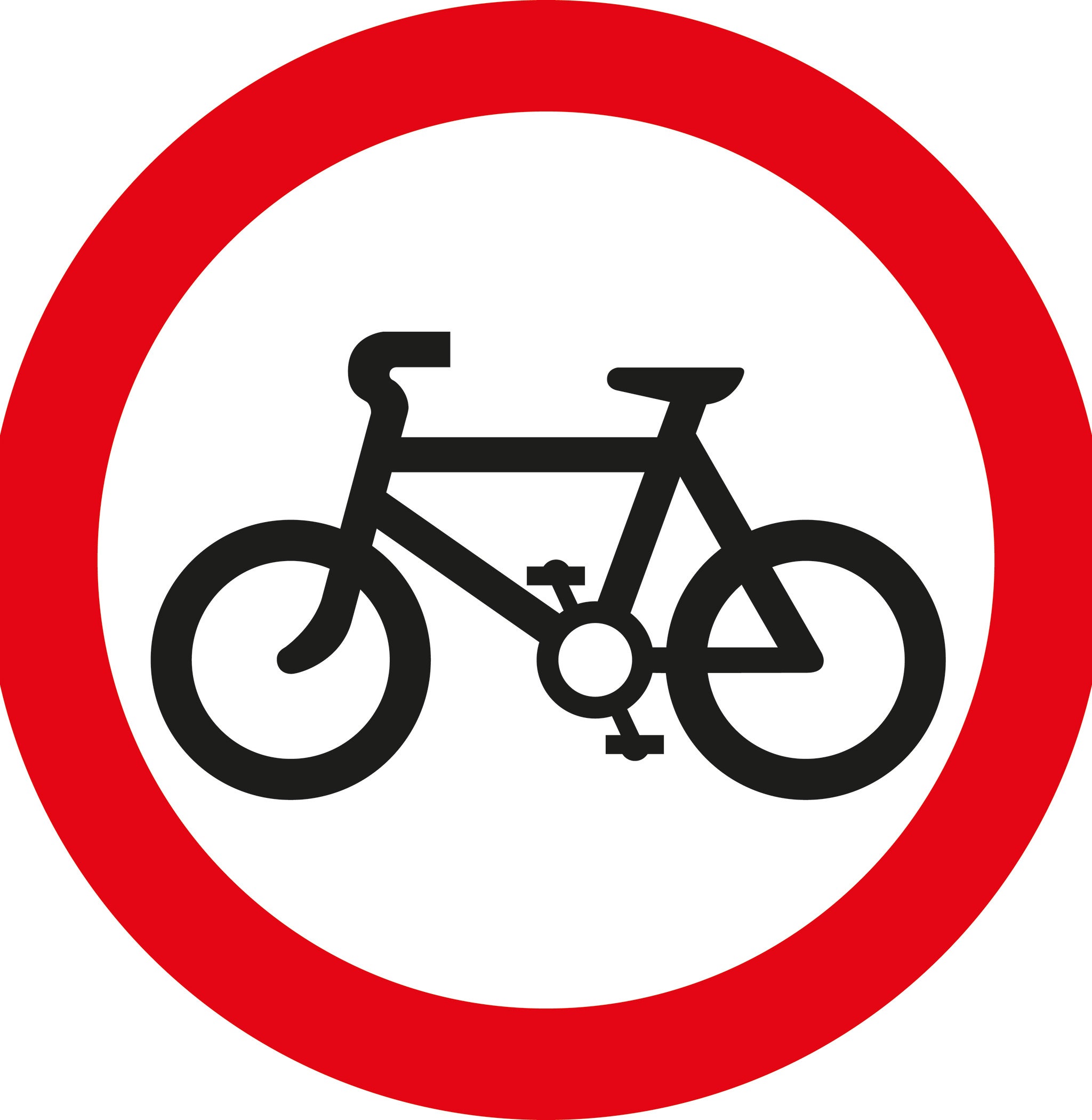
“They found that America’s diamond shaped signs were more recognisable, but had to be bigger than the triangles and circles of the European examples.”
The decision to go with the European shapes, it has sometimes been claimed, wasn’t wholly about cost and steel supplies – Britain’s eagerness to enter the European Economic Community may have added a political incentive.
Kinneir, though, rejected suggestions about using German Din lettering, on aesthetic grounds. Instead, he and Calvert designed their own, highly legible, British font: Transport.
There were compromises. Kinneir wanted a bright green background for direction signs. Anderson Committee member Sir Hugh Casson, ex-director of architecture at the Festival of Britain, preferred a darker green, “like the colour of old dinner jackets”. The final shade allowed both men to meet halfway – a gentlemanly solution compared to some other struggles.
David Kindersley, who had previously helped the Ministry of Transport design street nameplates, and Brooke Crutchley, the university printer at Cambridge, launched ferocious attacks. There were letters to The Times, even a debate broadcast by the BBC.
According to Chris Marshall, an amateur historian of Britain’s road network: “Kindersley had managed to corner Ernest Marples, the Minister for Transport, at a society function, and very nearly got him to agree to install a test sign [of Kindersley’s design]. But senior civil servants... intervened.”
“There was a little bit of the old versus the new going on,” said Professor Baines. “Kindersley and Crutchley represented the printing tradition; Kinneir the emerging profession of graphic design.”
It was, said Professor Baines, possible to quibble with some of the post-1965 tweaks to Calvert and Kinneir designs, and with “the clutter caused by local authorities erecting more signs than necessary”.
And it was probably sign positioning, rather than inherent design, that once prompted the Bridget Jones author Helen Fielding to observe, in this newspaper: “During the war, Britain’s signposts were taken up to fox invading Germans. Were we to try to fox invaders today it might be better to leave the signposts up.”
But, said Professor Baines, there was a reason why the system had survived: “There may be inconsistencies and quirks, but it works.”
50 Years of British Road Signs is at the Design Museum from Sep 15-Oct 25 (020 7403 6933, entrance free)
Join our commenting forum
Join thought-provoking conversations, follow other Independent readers and see their replies
Comments