Road signs: Why Britain's designs rule
A professor of typography at Central St Martins examines three key features
The typeface
Dissatisfied with existing typefaces, the designers set about drawing their own, now known as Transport.
The decision was taken to use lower-case words with initial capitals instead of the all-capital practice that was most common up to that time. The idea was that this created more distinct word spaces, which could therefore be read more quickly and from a greater distance.
Great care was taken with the forms of particular letters. The terminals of “c” and “e” are kept wide apart, with the ends cut perpendicular to the stroke. This simplifies the form and makes them clearer; “a” and “l” have small tails to their right – a nod to London Underground’s Johnston typeface perhaps – and this again helps reinforce their identity, and in the case of the “l”, makes it unequivocally different from capital “I”.
Also important from the point of view of legibility is the space between letters. In Transport the spacing is slightly open, or wide. This helps with distance recognition of the letter shapes.
Direction signs
Signs before 1965 were colour coded for purpose: yellow backgrounds for through routes, blue for local, and black for rural areas. Legends, however, were set in all capitals within a white rectangle.
The post-1965 signs built on the (blue) motorway signs, and continued the colour coding with dark green for primary routes and white for all others. Local direction signs were distinguished by having a wider blue border.
The dimensions of the signs are governed by the class of road – which determines the size of type to be used. The size of all roads and borders, and the spaces between those and the type is then in units – each the width of capital “I” in the type size used. Therefore every sign is as big as the information it has to convey.
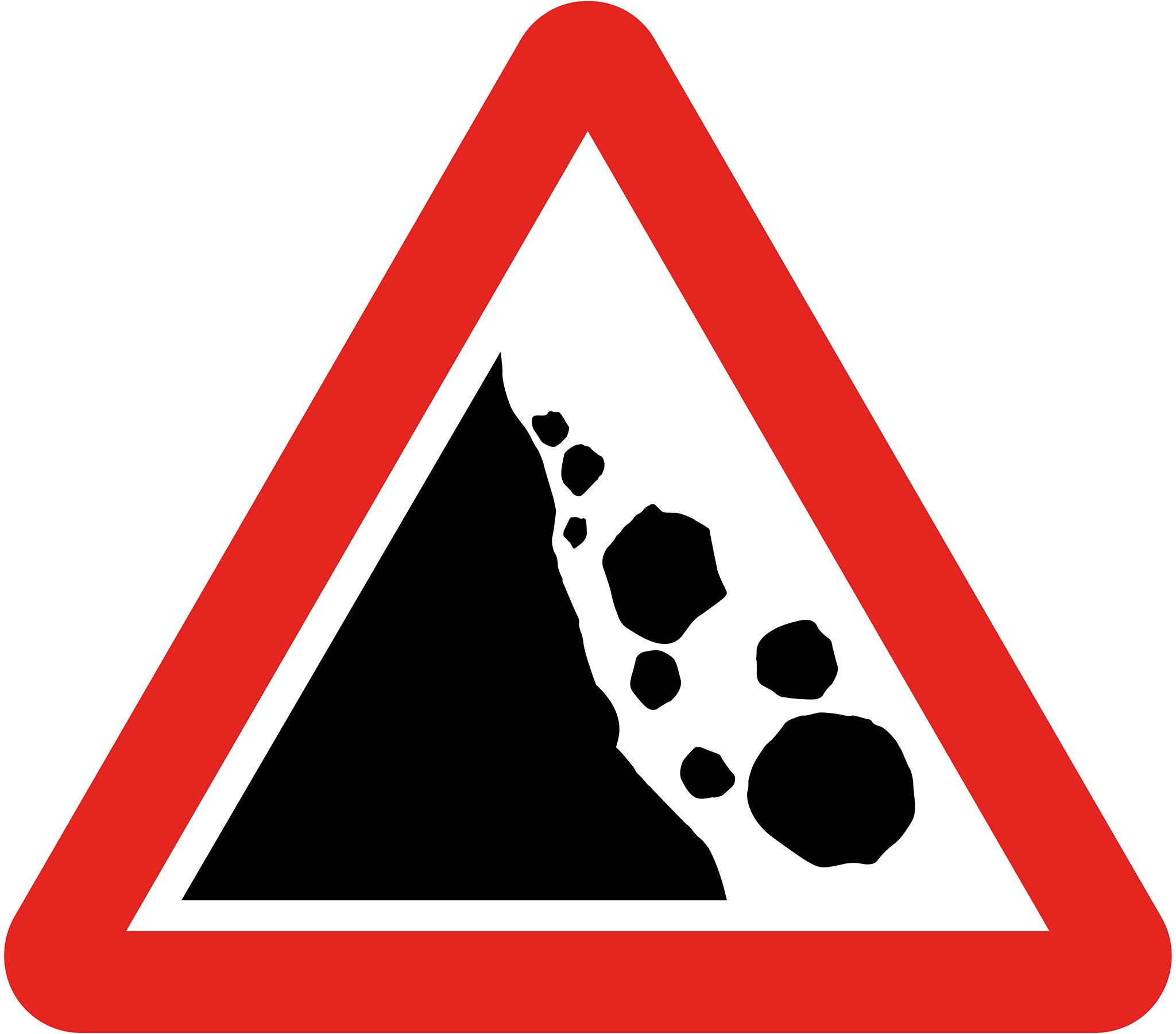
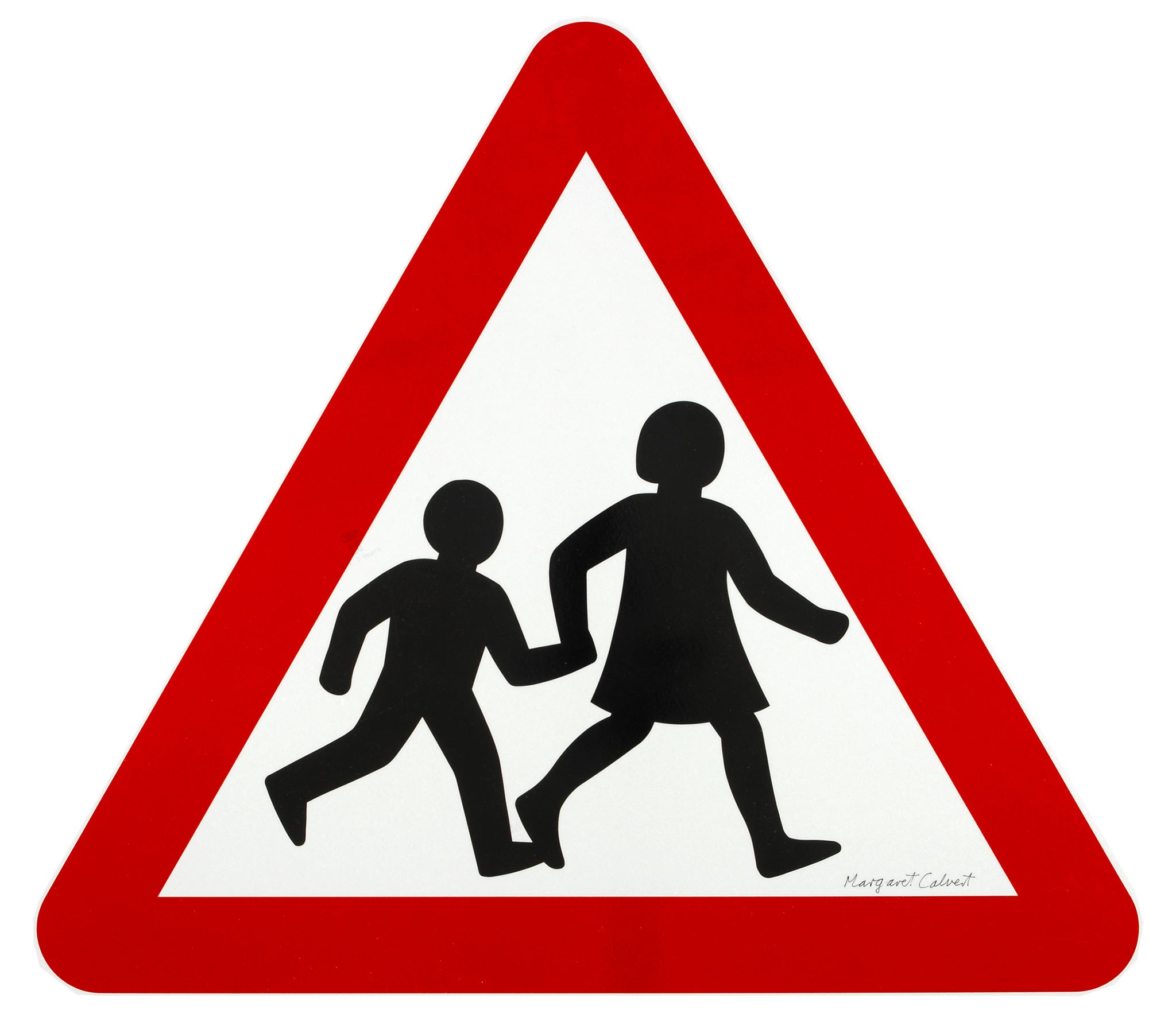
Warning sign: children crossing
The Worboys committee looked at all aspects of signing. Production costs were discussed as well as the visual aspects. The two most widely used diagrammatic sign systems – the United States’s diamond pattern and the 1949 Geneva Protocol – were tested to see which was the most effective for the same area of sign.
The protocol was found to be most effective at a greater distance, and was therefore adopted as the basis for the “mandatory” (mainly blue circles), “prohibitory” (red bordered white circles), and “warning” (red bordered white triangles) signs.
The protocol stipulates the contents for the various signs, but not the exact rendering, so there is a considerable variety in the drawing of the various signs. Margaret Calvert was responsible for drawing the “children” sign which is notable for having a girl leading – that girl is a portrait of her younger self.
Where the Worboys committee did not find the Geneva Protocol to be as effective as it could be, they were not afraid to replace the designs with their own versions. “other danger” in the protocol is a vertical bar. Post-1965, this becomes the more arresting exclamation mark.
Join our commenting forum
Join thought-provoking conversations, follow other Independent readers and see their replies
Comments