Emily Jenkinson: Beige or bold - what’s the best way to decorate your home?

For free real time breaking news alerts sent straight to your inbox sign up to our breaking news emails
Sign up to our free breaking news emails
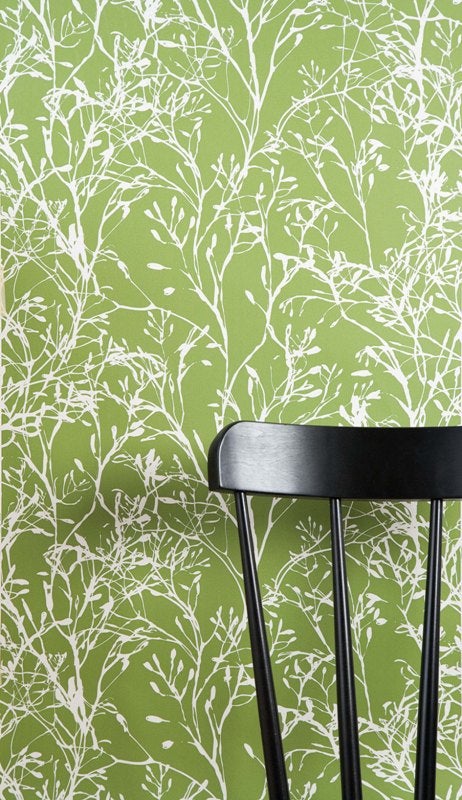
I’ve just bought a flat and am keen to jazz up the currently all white space with painted floorboards, bright accent walls and colourful tiles. I’m no longer in the minority in my desire to add colour to my interior with more homeowners than ever choosing to abandon the muted creams, pale greys and beiges of recent years in favour of decoration that reflects their personality.
While the Dulux Design Service reports a “huge upturn” in the use of bold print wall coverings and strong colour over the past three years, the change in tastes is also evident in many of the new home collections coming to the market. Note Zara Home’s Colour Collection, Anthropolgie’s bright patchwork throws, and how Laura Ashley, once known for its quiet country pastels, now offers bright colours, stripes and big damask florals on walls and furniture. Kim Dohm, designer and MD of 95% Danish comments: "Five years ago there was absolutely no market for brightly coloured wall paper such as the Fairy Flower red or Wild Flower. People were playing it safe with white or cream walls - the ubiquitous canvas to 'stamp your own mark'. In the past couple of years however, we have seen sales of the bold and colourful wallpaper rise and rise.”
So what has caused this shift? Kim reckons that it has a lot to do with the recession: “From personal observation and talking to customers, I’d say the move to bolder, brighter home décor is totally down to people not being able to afford to move. If you’re not moving, you can be bolder and do your own thing – it’s actually one of the positives about what’s happening financially. We can finally be ourselves again!”
Some designers are right behind the shift towards colour – think Kevin McCloud and his mission to wean ‘colour shy’ Brits off magnolia and beige, or Laurence Llewellyn-Bowen, who remarked in my interview with him last year: “‘No taste’ is dreadful. It’s all about clashing magnolia and hideous shades of snot and bogey that look really, really unappealing together.”
Not all designers are supporters of the craze for colour. Kelly Hoppen, who no-one could accuse of having ‘no taste’, believes that a neutral colour pallet is the key to a calm and enduringly stylish home. “I’m a huge believer in using neutrals and muted colours as these can offer a calm and harmonious backdrop for the decoration of any of your rooms,” she says, adding, “Brighter and bolder colours can be used to express your personality and how you live and feel, but these should be used in moderation or it may become overpowering.”
Interior designer, Joanna Wood agrees that “beige is a fantastic base when decorating,” but points out that calling it names such as ivory, fawn, café au lait, bone, mouse’s back or even elephant’s breast give the colour “much more punch than the word beige.”
So what do the estate agents think? People might be staying in their homes longer, but what about when it comes to selling? Does self-expression lead to the unsellable? And do buyers really want to see beige? According to Mark Hordern of Glasgow Solicitors Property Centre, yes, “Beige is neutral; it won’t offend and it’s easy to change,” he says, “It also tends to make rooms seem lighter. No buyer is going to think ‘that beige has to go as soon as I move in’, but that’s exactly the sort of thinking that strident colours prompt.”
Others agents, such as Rob McLaughlin, Regional Director for Kinleigh Folkard & Hayward, would disagree. “Gone are the days of floor-to-ceiling magnolia being a shrewd sales move,” he says, “colour and pattern give rooms personality and trends shouldn’t go out the window when you come to sell your house. With the influx of properties coming on to the market, it’s actually more sensible to differentiate your home from other house as by shrouding it in white or beige you’re just making your home forgettable.”
While using neutral base colours in a decorative scheme allows you greater flexibility – it is after all easier to change a cushion or throw than re-paint and re-carpet – there is no hard and fast rule about what buyers are looking for decoration-wise when they come to buy a flat. Meanwhile, who’s to say that you’re going to tire of red walls any faster than you are of ‘elephant’s breast’ ones? The way that you choose to decorate your flat is really down to what feels right for you. Choose your colours carefully, but don’t be afraid to experiment. Now where’s that red paint pot?
Emily Jenkinson is interiors writer for furniture and interior design website mydeco.com.
Subscribe to Independent Premium to bookmark this article
Want to bookmark your favourite articles and stories to read or reference later? Start your Independent Premium subscription today.
Join our commenting forum
Join thought-provoking conversations, follow other Independent readers and see their replies