Jeremy Langmead: 'I've avoided the minimalist approach to interior design'
As a former editor of the interiors magazine 'Wallpaper', people expect Jeremy Langmead to decorate his home in minimalist style. That's why he's done quite the opposite

For free real time breaking news alerts sent straight to your inbox sign up to our breaking news emails
Sign up to our free breaking news emails
Primrose Hill is like its own little village. The square I live on is very green and full of pretty coloured houses. I moved to this part of north London three years ago with my ex-wife [the journalist India Knight] and kids, who now live three doors down. The kids can plod back and forth whenever they like usually to whichever house has the most biscuits. It's all very friendly and convenient.
When I was planning the interior for this place, I bought loads of those wonderful old David Hicks books from the 1970s as a reaction against the minimalism of the past few years. He was my main inspiration. Because I used to edit Wallpaper magazine, I think everyone expected me to have a white apartment with beige furniture which is one of the reasons I went in the opposite direction. Basement flats can be dark, so rather than pretend that it isn't, I went for darkish wooden flooring and dark-brown leather Minotti seating islands, to make it quite warm and cosy. The 1970s-style wallpaper from Cole & Son along one wall gives the flat some pattern, without overwhelming it.
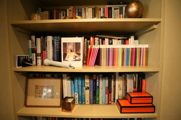
I hate really sterile environments; I like objects and environments that reflect where you've been, that tell a story. I love books; they are beautiful objects and reading them is such an extraordinary way to pass your time. I keep everything I've ever read, because they represent the time you've spent, the places you've been and the person you are. I'm running out of space, but I can't bring myself to throw them away.
My other weakness is buying paintings. I have so many now that I've run out of wall space, which is probably a blessing because it stops me spending any more money. I love the raw quality of fashion illustrations, and have a lovely Dior sketch of an outfit designed for Elizabeth Taylor, with the original swatch of fabric attached to it. There are also some modern sketches by Julie Verhoeven, alongside a David Hockney lithograph dedicated "to Cecil Beaton", from A Rake's Progress. I like the mixture of old and new the contrast between the Augustus John self-portrait that my grandfather gave me next to a Tracey Emin doodle and a classical sketch of a male nude and the same applies to furniture: my dining table, which is a contemporary design from the Aram Shop, sits alongside original black Panton chairs from the 1960s.
The grapevine candelabra is from a church, but it is perched on top of a solid and contemporary object. I like the juxtaposition of something simple with something more ornate; it surprises you.
The lovely thing about this room is having early-evening drinks parties in the summers. The double-doors open at the back of the room and you can step right out into the garden, so it becomes one big space. This summer we had a cocktail guy set up a bar in the kitchen, which was great fun. I'm only just learning to cook, so I don't have too many dinner parties the saucepans are just for show. But now I'm at Esquire there is generally far less pressure on my flat to look perfect. I can have it how I want it to be, rather than how people expect it to be.
Subscribe to Independent Premium to bookmark this article
Want to bookmark your favourite articles and stories to read or reference later? Start your Independent Premium subscription today.
Join our commenting forum
Join thought-provoking conversations, follow other Independent readers and see their replies
Comments