Everyone wants to know what their club will look like when they play their first game of next season.
Some clubs are lucky enough to have a colour scheme so iconic - Juventus, AC Milan, Real Madrid - that a home kit rarely goes wrong.
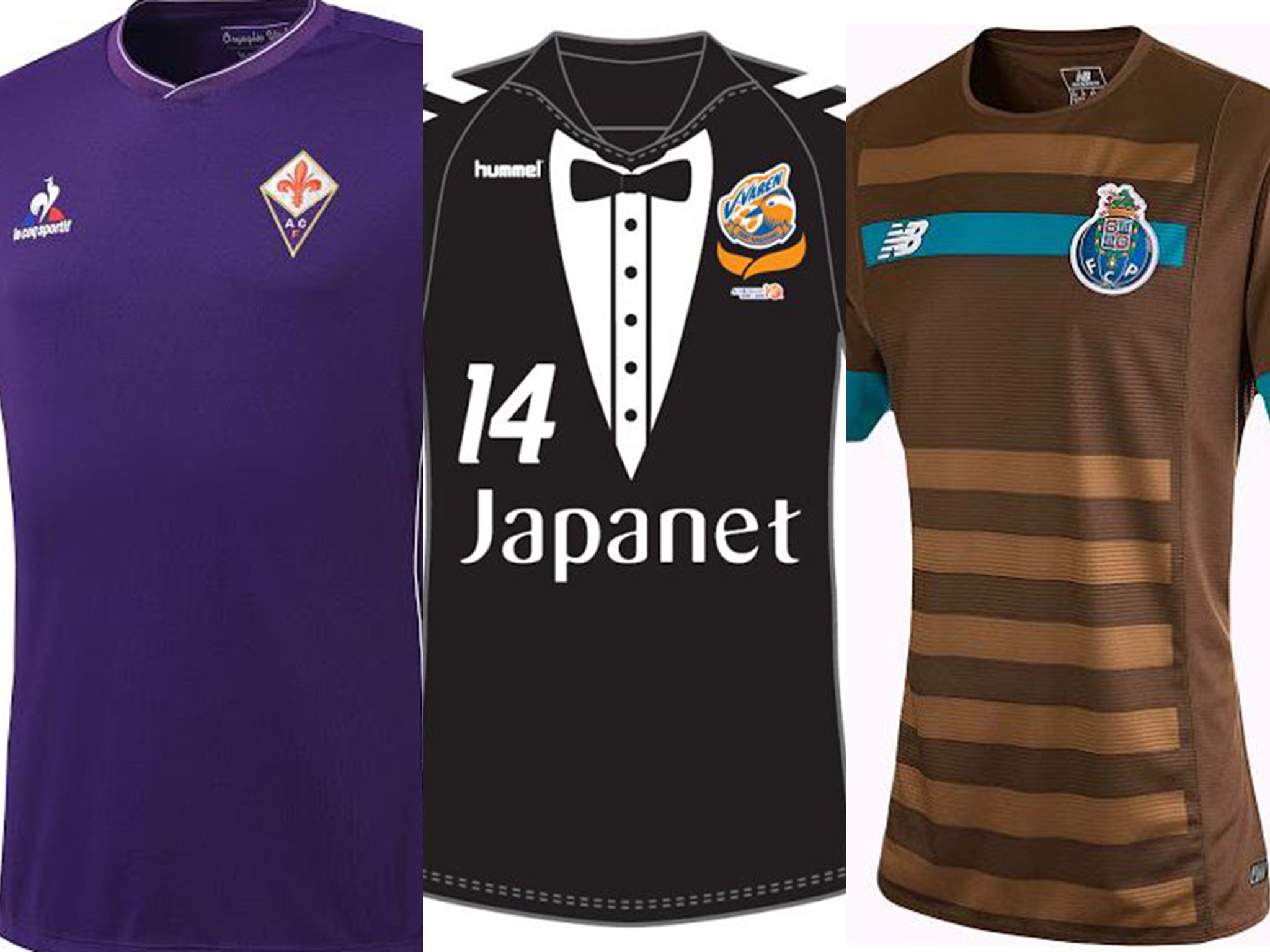
Others try to be a bit more creative and end up as wide of the mark as a Mario Balotelli long-ranger.
Plenty use neon and it never, ever works.
Having scoured the web for kits (with huge help from the excellent Footy Headlines) we've found some of the best and worst efforts for next season.
What we've learnt:
- DO stick to classic colour schemes and retro styles
- DON'T revert to awful neon if you can help it
- DO try and keep your kit free of gaudy sponsorship logos
- DON'T try to do too much
- DO try and add a proper collar rather than make it look like a t-shirt
- ABSOLUTELY DO NOT employ the designer of Austrian side Sturm Graz
This gallery will be updated periodically - some of these are rumours and leaks that may be false
Join our commenting forum
Join thought-provoking conversations, follow other Independent readers and see their replies
Comments