None more so than those of film studios, who need to make their idents as cinematic and rousing as possible and update them in accordance with advances in animation, all without tarnishing the 'classic' feel of their brand.
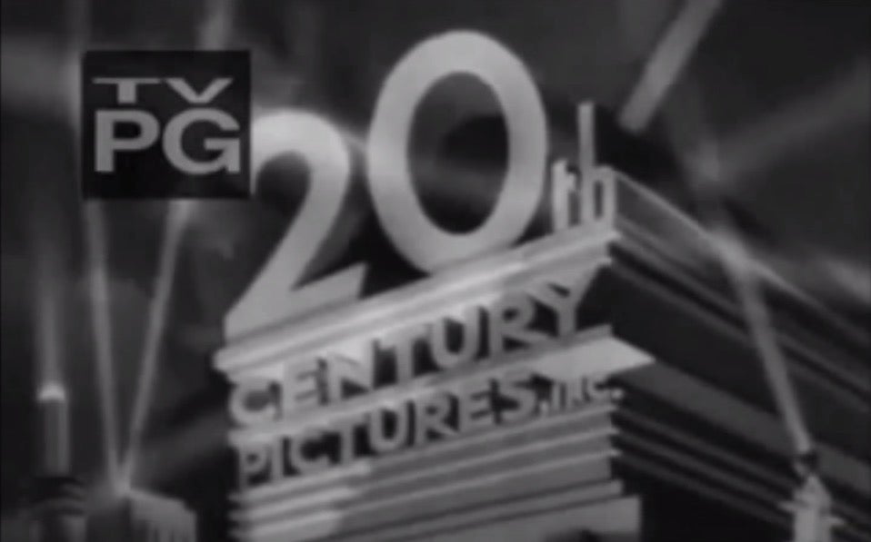
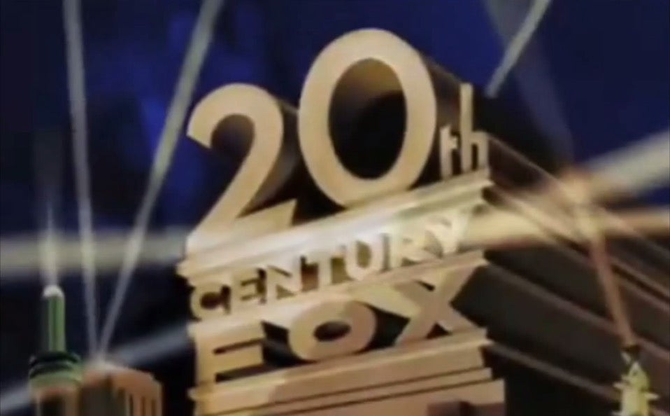
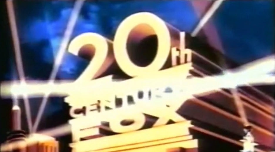
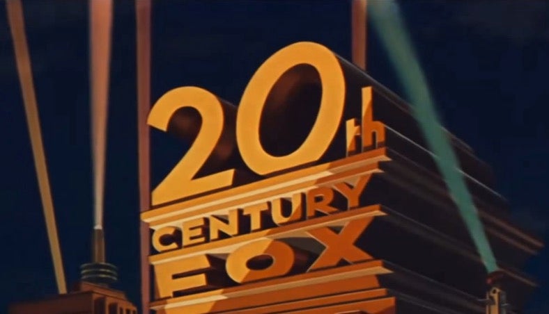
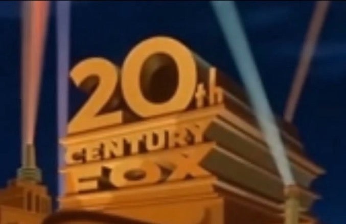
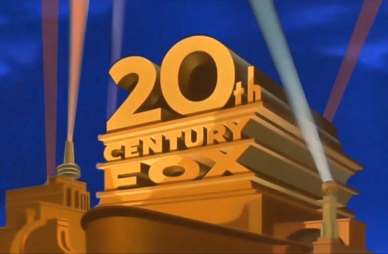
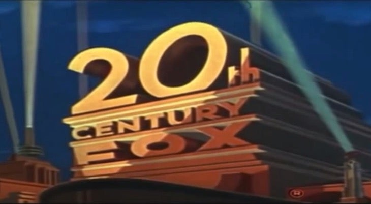
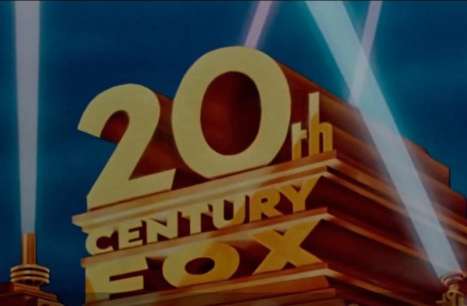
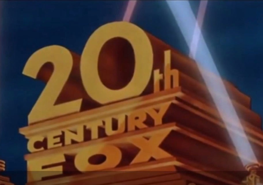
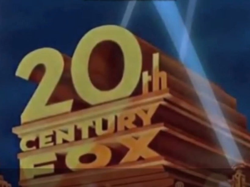
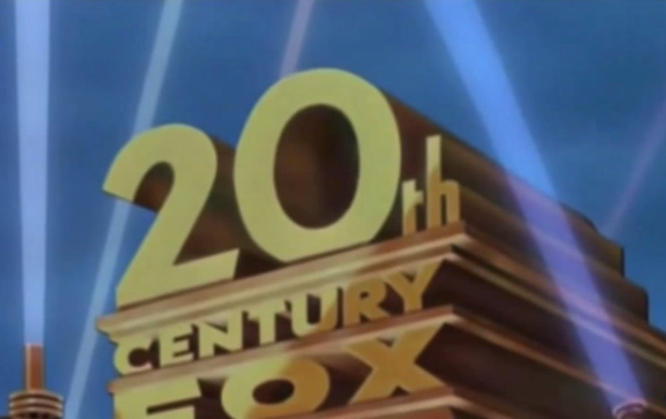
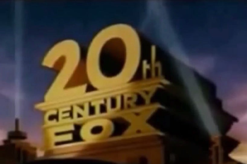
It's surprising just how many iterations of the 20th Century Fox logo there have been for instance, and how they encapsulate the aesthetic of their eras (also, they had some trouble with their 0s):
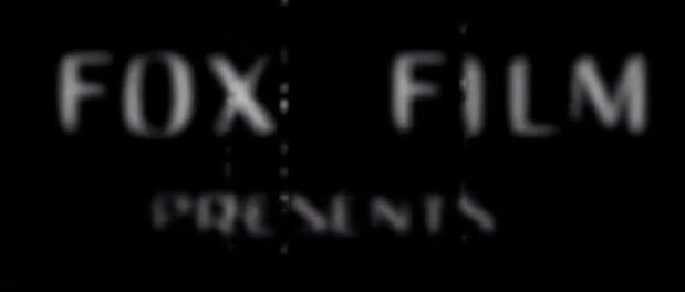
1914
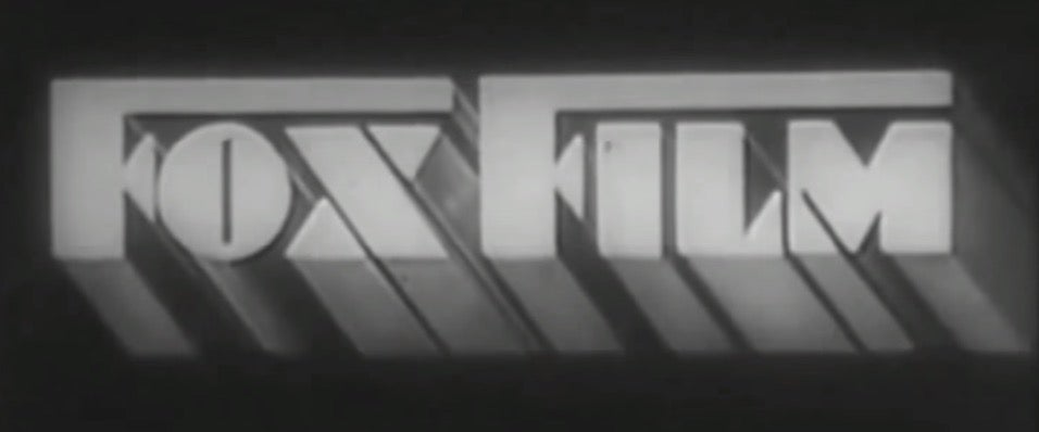
1931
1933
1936
1936
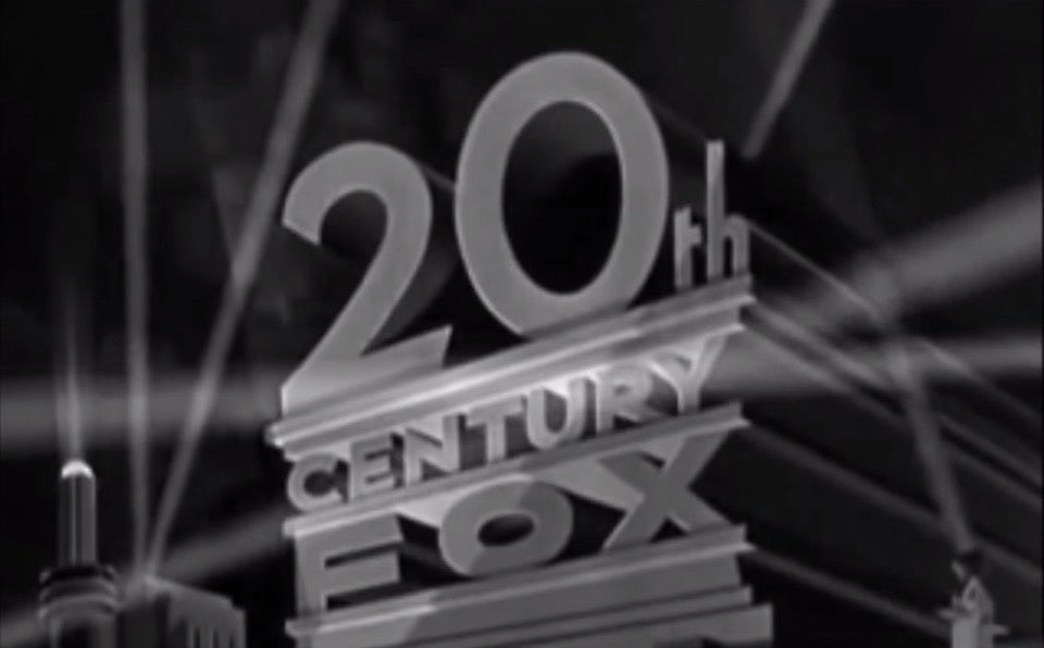
1940
1942
1953
1955
1955 again
1970
1977 (Star Wars)
1979
1981
1985
1987
1994
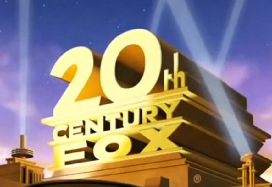
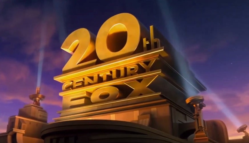
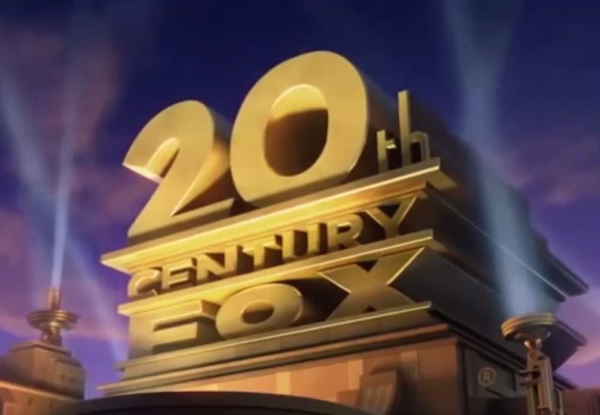
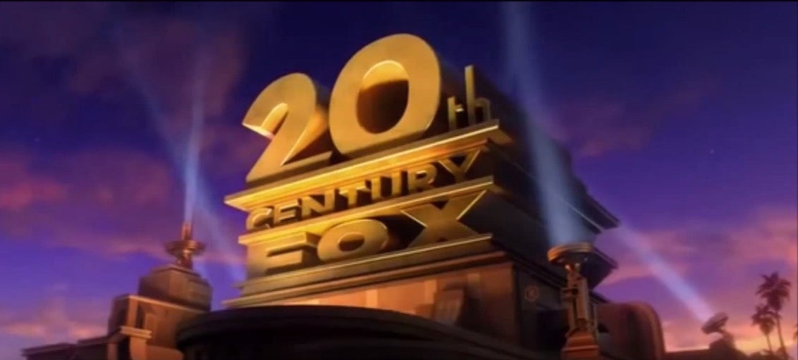
2007
2009
2011
1913 - present
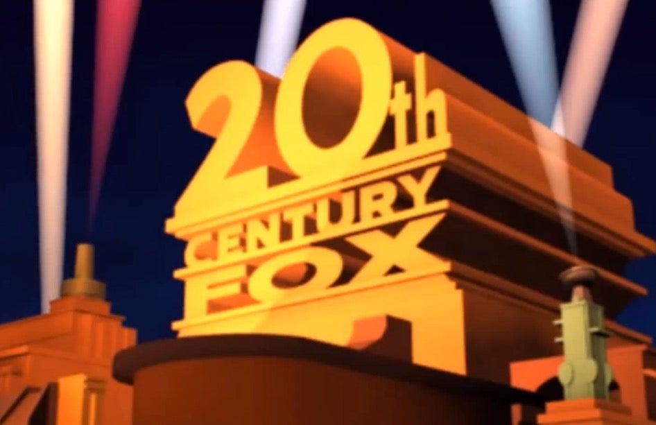
Futurama
Some other studios:
(Kubrick used an altered MGM logo for 2001: A Space Odyssey because he didn't want the lion's roar ruining the ambience)

Join our commenting forum
Join thought-provoking conversations, follow other Independent readers and see their replies
Comments