The albums you can judge by their covers
As Lady Gaga reveals tacky artwork for her new CD, Simon Hardeman cringes at 10 other violations of taste and sense
Sign up to Roisin O’Connor’s free weekly newsletter Now Hear This for the inside track on all things music
Get our Now Hear This email for free
Just when you thought album artwork didn't mean anything any more, Lady Gaga's fans are up in arms about the tacky and misguided cover that she has posted for her new release, while Arctic Monkeys' leaked visuals for their fourth collection have drawn a torrent of abuse.
The chrome and black concoction for Stefani Germanotta's Born This Way looks like the offering of a sniggering fourth-division heavy-metal band, with the singer's arms and blonde, tousled, red-lipped head morphed into a chopper motorcycle. The implication that she was born to be ridden is tacky enough, and the execution cheap, but the concept is way off: it's not her "little monster" fans who fetishise chrome bikes, it's their dads and grandads. Reaction on fansites has been hyperbolic: "holy shit... what a tragedy from the pit of hell :(", "gosh! I hope it's fake because I hate it so much", and "this is the worst and most cruel thing you've ever done for your fans. Awful :(".
Meanwhile, Arctic Monkeys' concept for their forthcoming Suck It and See – small, centred, lettering on beige – has provoked an ever-so slightly more considered, but still vituperative, web dissing along the lines of: "Yes, it's supposed to be clever and yes, I do 'get it'. But it's still shit", "shite", and, "If ya ask me this album cover is typical of the artic moneys [sic] attitude."
So while the significance of covers should have shrunk along with their size – from 12 inches for vinyl, to less than five for a CD, and then to the dimensions of the icon on the screen of whatever music-player/smartphone you have – they, plainly, remain powerful symbols. The greatest – such as Pink Floyd's Dark Side of the Moon, The Beatles' Abbey Road, Nirvana's Nevermind – are inseparable contributions to the impact of the contents, while the worst, as Lady Gaga and the Monkeys may find, can indicate, even precipitate, a major act's decline. Here are 10 examples of acts for whom the picture on the cover may as well have been the writing on the wall...
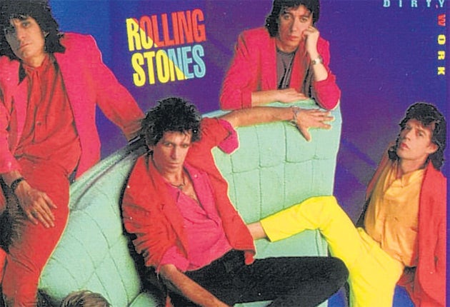
Rolling Stones
Dirty Work (1986)
It's difficult to remember now, with the Stones established as the world's greatest ever self-tribute act, but in the 1980s they were as irrelevant as a tired old dad-rock band that all hated each other could be. Yes, this disc produced a hit (a cover of "Harlem Shuffle"), but they couldn't look more fed up. Keith Richards describes Mick Jagger at the time as saying the Stones were a millstone around his neck, and describes recording the album as "horrendous... Bill Wyman almost stopped turning up; Charlie [Watts] flew home." So it's not surprising that the cover shows Mick kicking Keith in the back and Keith kneeing Mick in the groin.
James Blunt
All the Lost Souls (2007)
The title itself was a hostage to fortune – did it refer to fans of the diminutive war-hero turned sex-god? If so, they didn't mind, buying his second album in droves and creating more platinum discs than a jewellers' flattened by a tank. So it didn't affect sales. But the message for the rest of us is that Blunt's babes really are so tasteless that they don't mind a dreadful mixture of neon typefaces for the title and the way that what appears to be one picture of Blunt is, in fact, more than a thousand tiny ones, seemingly saying "look at me me me me me me [repeat 1,000 times]..."
M.I.A.
Maya (2010)
You know when your computer slows down, the cursor freezes, and you want to punch the screen as you realise that trying to open the 54th window simultaneously was one too many? That's the moment that M.I.A. documented on Maya, with help from art director Aaron Parsons (whose website follows a similarly irritating theme). It didn't initially seem to have affected the UK/Tamil rapper's sales, but they plummeted the week after a promising start, perhaps when listeners realised the aptness of the image as they punched their iPods while listening to an album that M.I.A. herself said was "weird and wrong".
CocoRosie
Noah's Ark (2005)
"Child's drawing" album artwork has produced many dreadful covers. This is one of the worst, and is perpetrated, as is often the case, by the artiste: in this case, Bianca "Coco" Casady, one half of the "freaky-folk" duo. Is it three unicorns involved in the sex act (too many for Noah's Ark), or two unicorns and a horse, or even a unicorn, a horse, and a horned zebra? Is the left-most animal vomiting, bleeding, or coughing? And why does the middle one have a rainbow coming out of a Star of David? Despite the girls' cult live following, it didn't trouble the charts.
The Beatles
Yesterday and Today (1966)
This Capitol Records compilation was issued in the USA, and only went on sale for a day in a few stores with its infamous "butcher" cover before being recalled on the orders of label-owners EMI. The photographer Robert Whitaker had wanted to create an artwork called "Somnambulant Adventure" ("a personal comment on... mass adulation") but the image was also a clear indication of a band fed up with being a media-friendly live act. Two months later, during their American tour, John's remark that The Beatles were more popular than Jesus was published in the USA. Tour over, they never played another proper gig.
Enjoy unlimited access to 70 million ad-free songs and podcasts with Amazon Music
Sign up now for a 30-day free trial
Enjoy unlimited access to 70 million ad-free songs and podcasts with Amazon Music
Sign up now for a 30-day free trial
Kevin Rowland
My Beauty (1999)
Dexys Midnight Runners gave us "Come on Eileen", "Geno", and a cover of "Jackie Wilson Said (I'm in Heaven When You Smile)", but their mainman had a drug problem that he chose to document on this collection of partially rewritten cover versions. Unfortunately, the worst cover was, well, the cover, with a groin-und-drag image that did nothing to reverse Rowland's 17-year hitless run. Talking of runs, that's what he had to do at his Reading Festival guest appearance that year when he dressed in a similar way to perform three covers to a hail of bottles. As if all that wasn't enough, the album also marked the demise of Alan McGee's Creation Records.
Carl Barât
Carl Barât (2010)
So your shambolic Libertines were adored by trilby-wearers, Pixie Geldof lookalikes, and sub-William Blake sixth-form poetry writers. But they split up, and your next band imploded after more chaotic escapades. So, when you release your solo record, you want it to be fresh, clean, different. But what you end up with is (according to fansites) "Ewww!", "Don't you turn into a stupid hipster" and "that hairstyle isn't working... and the pose is just wrong". Barât explained somewhat contradictorily: "I didn't want to be clever... I thought the mirror thing's quite clever, but I've been told that's been done a lot." The Libertines reformed prior to the album's release.
Michael Jackson
HIStory (1995)
Another hostage-to-fortune title, especially when it's the first since your image was damaged by allegations of child-abuse. The choice of a memorial-like statue of yourself is also curious. The clearest message from the artwork and, indeed, the album it wrapped, is "hubris". And tragic downfall did indeed follow, albeit slowly. In the following 14 years, as his money dwindled and scandal gathered, the King of Pop made only one more studio album, the disappointing Invincible, before dying in tawdry circumstances as he tried to resurrect a collapsed career.
The Scorpions
Virgin Killer (1976)
Heavy metal bands are notorious for using crass imagery to gain attention. While the results are often as shocking as an electric chair in a power-cut, occasionally they take the breath away. This not only did the job of getting the band noticed worldwide, but also resulted years later in Wikipedia being blocked in the UK for several days after being accused of hosting paedophile content. The image was reportedly designed by an RCA Records employee. The photographer, Michael von Gimbut, later reassured critics: "We loved and protected children and did not sleep with them." So that was all right, then.
Weezer
Hurley (2010)
"Eh?", was the reaction to the eccentric US rockers' choice of a photo of the actor who played Hurley in Lost. The band seemed confused about why they had done it, claiming it was named after a clothing firm, then denying it, then going on to design a Weezer line with that very firm. "Weezer Sells Out to the Mall" was typical of the headlines that followed. Sales on Weezer hoodies may have been good but Hurley is their lowest grossing album by some distance.
Subscribe to Independent Premium to bookmark this article
Want to bookmark your favourite articles and stories to read or reference later? Start your Independent Premium subscription today.
Join our commenting forum
Join thought-provoking conversations, follow other Independent readers and see their replies