Stay ahead of the curve with our weekly guide to the latest trends, fashion, relationships and more
Stay ahead of the curve with our weekly guide to the latest trends, fashion, relationships and more
Cast your mind back to 2015. It was a simpler time when continents were (more) united and 75% of women had ombre hair.
Fast forward to the present and the ombre backlash has begun in the hair world, but there’s one area where you may not have noticed ombre’s ubiquity over the past 12 months: tech.
As much as we may like to pick out one shade as the colour of the year, 2016 was actually all about ombre - the gradual blending of one colour into another - Wired reports.
Once associated with the psychedelic swinging sixties, ombre has made a reappearance, and it was perhaps in the world of tech that the trend was most apparent.
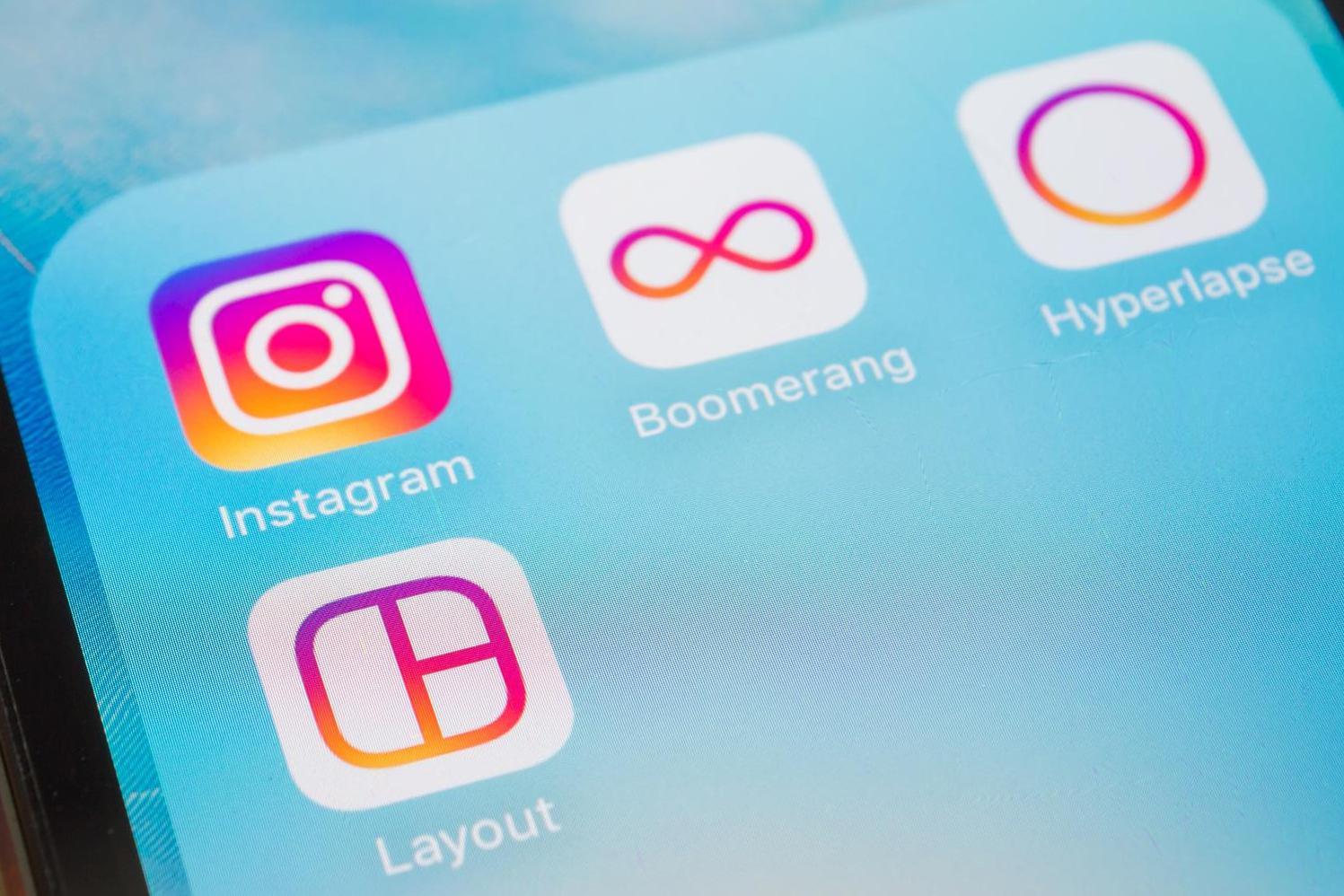
Take a look at the apps on your phone and you’ll realise many of them - Instagram, Boomerang and iTunes for example - have redesigned their logos this year to feature ombre shading.
Ombre design is now used by numerous brands and websites including PayPal, The Verge and Jason Kottke’s superblog.
If you look out for it, you may notice that ombre is everywhere.
Gadget and tech news: In pictures
Show all 25
It’d be easy to think this was a case of the Baader-Meinhof phenomenon, whereby you learn about something for the first time and then it suddenly seems to pop up everywhere.
But the rise of ombre is very real. “It’s definitely a trend,” says Lisa White, creative director at trend forecasting company WGSN.
Way back in 2013, The Pantone Institute identified ombre as a trend to watch, and a few years later it’s hit the big time.
And they weren’t the only ones to see it coming - ever the trend-setters, Apple has been using ombre in its branding for three years too.
But why have we all suddenly fallen for ombre?
Graphic designer Hamish Symth believes the current trend maybe down to our nostalgia for the 70s and 80s.
“Colorful gradients look a lot like the computer games and graphics of that time period,” he told Wired.
Some people argue the smooth appearance of ombre design entices people in, but others believe we shouldn’t overstate the science behind it: ombre just looks pretty.
Join our commenting forum
Join thought-provoking conversations, follow other Independent readers and see their replies

Join our commenting forum
Join thought-provoking conversations, follow other Independent readers and see their replies