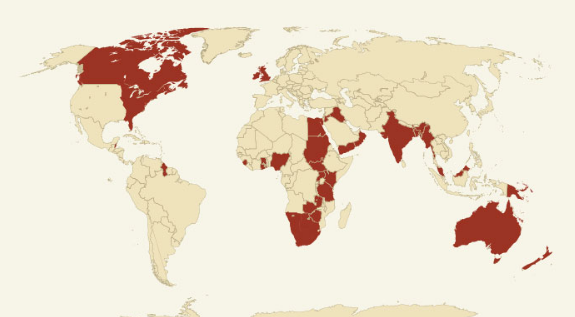
This graphic shows how history's mightiest empires compared

Although empires from long past have since lost their iron grip over their constituents, it's striking how effects from their influences still resonate within cultures across continents today.
Often glamorized in films and video games, it's difficult to fathom how far across the globe these kingdoms and empires once spanned.
In order to illustrate how vast these famous entities once stretched, Just The Flight created this helpful infographic illustrating on a modern political map where and how they ruled.
Read more:
• This chart is easy to interpret: It says we're screwed
• How Uber became the world's most valuable startup
• These 4 things could trigger the next crisis in Europe
Read the original article on Business Insider UK. © 2016. Follow Business Insider UK on Twitter.
Subscribe to Independent Premium to bookmark this article
Want to bookmark your favourite articles and stories to read or reference later? Start your Independent Premium subscription today.

Join our commenting forum
Join thought-provoking conversations, follow other Independent readers and see their replies