Tom Sutcliffe: How's about that for a perfect exit?
The week in culture
Sign up for the View from Westminster email for expert analysis straight to your inbox
Get our free View from Westminster email
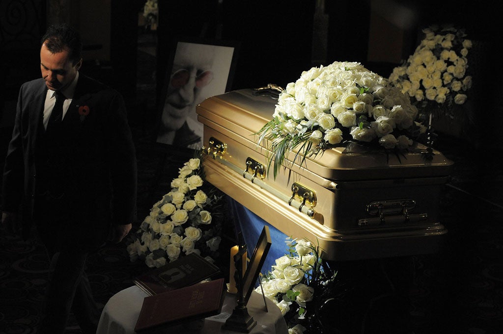
There was a lovely detail in the coverage of Jimmy Savile's lying-in-state the other day. Robert Morphet, the funeral director responsible for the occasion, revealed that Sir Jimmy had been laid to rest in a tracksuit. He wouldn't confirm its exact colour – perhaps out of the reflex discretion that tends to accompany that profession – but he was prepared to go on record as saying that it was "appropriate for a funeral". Which got me wondering a little bit really. Is there any secure social consensus about the appropriate colour for a funeral tracksuit? I know there's a common prejudice in favour of conservative dress for one's last formal gathering on Earth – but does that really extend to sportswear as well? Had there been a slightly awkward scene as Mr Morphet went through Jimmy's sizeable tracksuit wardrobe and passed over the turquoise shell-suit and the silver lamé hoodie looking (more in hope than expectation) for a more dignified garment?
More to the point, why fret anyway if you're wrapping the deceased in a gold coffin – or "the final piece of bling" as Sir Jimmy's nephew described his choice of casket. The whole point of Sir Jimmy's elaborately choreographed exit, surely, from the metallic paint-job on the coffin to the stipulation that he was to be interred at a 45-degree angle so that he would be looking out to sea, was to sidestep the "appropriate" and the commonly done thing. I couldn't help but hope that Mr Morphet was being a little economical with the truth and that inside that gilded box Sir Jimmy was sporting the eye-gouging parti-coloured affair in which he once presented Top of the Pops. Death might be a leveller and decomposition return us to the common clay, but everyone gets one last shout at individuality with their own funeral.
Very few of us take advantage of that last shout, though, because most of the aesthetic decisions about our funerals tend to be made not by us but by our survivors – and they often fear tastelessness above all. Paradoxically, the result of that decorous anxiety is a different kind of tastelessness altogether – an aesthetic dead zone in which expressive choice is surrendered entirely in favour of the inherited conventions of Victorian funerals. The result is that the vast majority of us pass out of the world wearing uniform, however resistant we might have been during our lives to the idea that we were essentially indistinguishable from the person standing next to us. In recent years there has been a mild loosening of the sartorial straitjacket in this respect. You can be buried in a wicker casket these days, I understand, if you want your funeral to have an organic, rooted quality. But the choice available from most funeral directors is still pretty limited.
It can be strangely heartening, though, when the default options are ignored in favour of something more idiosyncratic. The funeral for this paper's late art critic Tom Lubbock was a sorrowful occasion, not least because his death was so premature. But the fact that his plain coffin was painted an exceptionally beautiful shade of green meant that the event was (literally) a shade less grim than it would otherwise have been. He hadn't entirely been eclipsed by some off-the-peg solemnity but was dressed for the occasion in something that suited him. And we could go much further than colour, of course. The Ghanaians do it best, with elaborately carved coffins that represent the profession or the passion of the recently deceased. You can go to your long home in a Mercedes Benz, or a sewing machine, or a beer bottle or even an oversized cigarette – pretty much anything, in fact, which can be shaped to take a human body. Like Jimmy Savile's golden coffin, these caskets don't exactly meet our established notions of funereal good taste. And they certainly don't conform to the one-size-fits-all notions of dignity which prevail at a British funeral. But we have a very long time in which to be dignified and undifferentiated. More of us should go out like Jimmy Savile, I think, making a show of our character even when we're no longer around to do it ourselves.
High-flying ambitions fail to ruffle feathers
I visited Ghosts of Gone Birds the other day, an exhibition intended to raise awareness and money in the interests of endangered birds (it's on until 23 November at Rochelle School, Arnold Circus, London E2). A long list of artists has responded to the invitation to produce work for the show – and the display is proudly indifferent to distinctions of genre or conventional artistic elevation. A knitted portrait of a great auk, produced by the novelist Margaret Atwood, sits in company with a Marcus Coates sculpture of an auk and its egg (reduced to Platonic solids). There are straight illustrations, abstracted sculptures, and drawings of zoological exactitude. What unites all the works though, hardly surprisingly, is the sense that they're all on duty, turning up to do their bit for a good cause. And somehow that has a deadening effect, even if you agree that the cause is a good one. Ralph Steadman comes closest to shrugging off the air of piety, with a drawing of a very Scouse Liverpool pigeon, and the Marcus Coates piece is intriguing. But mostly what you get is the sense that the artist involved has "done their bit", and that contradictions and mixed feelings have been set aside. Everyone is on their best behaviour and pushing in the same direction, which is fine for enlisted activists but a bit trickier for creators. I hope it saves the birds, but too much of this kind of thing could leave artists endangered.
That's my type of software
I'd like someone to invent an app for me. It would work a bit like Shazam, that almost magical bit of software that analyses a sample of recorded music and then tells you what it is. What I want is a typographical equivalent, which lets you snap a picture of a bit of text and then identifies the typeface that's being used. The premium version could then direct you to a short essay on its design origins and cultural associations. I would have liked to use it the other day on the opening credits of Andrea Arnold's Wuthering Heights, a film which, even before it has really started, makes it very clear to the audience that it's not interested in faithful good manners. What would you expect for a Brontë adaptation? A tasteful serif face, perhaps, with a hint of gothic about it but certainly nothing aggressively contem-porary. What do you get? Well, I don't know exactly, but it is very redolent of Eighties discos, a curvy sans-serif typeface that called to mind the poster for Boogie Nights. The effect was startling – a bit like getting a condolence note printed out in the much despised Comic Sans. But it was also effective, a mutely eloquent way of warning you to adjust your expectations. I could have done with a little more subtext in the film that followed, but the subtext of the title couldn't really be faulted.
t.sutcliffe@independent.co.uk
Join our commenting forum
Join thought-provoking conversations, follow other Independent readers and see their replies