The idea of a painter's "palette" – meaning the chromatic range that you associate with a particular artist – has always struck me as one of those slightly hazardous bits of aesthetic vocabulary. It's terrifically easy to use, of course, and can make even the blandest statement sound soigné and well-informed. But, for precisely that reason, you can't get away from the anxiety that it might not mean very much at all. And, even if it does, the occasions on which the average gallery-goer might employ it are fairly limited. I suppose that all of us could identify David Hockney's palette, just after he'd moved to California and was painting those big glaring acrylic landscapes. And I imagine you could talk of the palette of a painter like Fragonard and reasonably hope to evoke the idea of pastel silks and blush pink. You could also meaningfully talk of the range of an artist's palette.
But, with quite a lot of artists, I'm not sure anyone but a real connoisseur would be able to make a blind identification of the authorship of a painting on the basis of the colours employed alone. Perhaps even that is far-fetched. Computer programmes can, with reasonable success, analyse the syntactical fingerprints of great writers. But could you programme the equivalent for visual art – a scanner that would weigh up tints and colour saturation on a canvas and spit out the name of the artist who'd produced it?
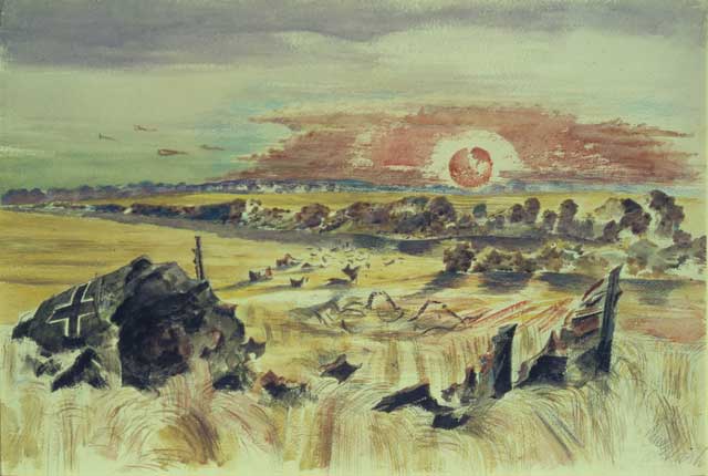
Occasionally, though, you encounter an artist whose palette is so distinctive that you'd have to be near-blind to miss it. Paul Nash, the subject of a fascinating show at the Dulwich Picture Gallery, is one of those – and you can even put a name to the palette he's used. He's unmistakably a Farrow & Ball man, I would say, dedicated to colours which (and it's quite difficult to phrase the feeling of the thing) seem to absorb light from your eye rather than bounce light into them.
Since he started before Farrow & Ball (the firm was founded in the 1940s) it might be fairer to put it the other way round – and point out that their colour swatches are very Paul Nash – but that there's some kind of kinship between the two is undeniable, I think. You see the same natural tones, the same preference for tints from which brightness – in the most tasteful way – appears to have ebbed. Zing and pizzazz and showiness are the very last words you'd use. The Farrow & Ball colour chart rather expressively gives you a sense of how studiously these tints avoid glamour, with names like Mouse's Back, Dead Salmon, Tallow, and Lichen. And that's what you see in Nash's canvases too – landscapes in which no colour really insists on your attention.
There are exceptions of course – paintings in which he's had a crack at brilliant sunshine or saturated vibrant colour. But they aren't terribly convincing – and the bits that feel most like Nash are where he returns to something more overcast, more drab to put it bluntly. It's too pejorative a word now to be really to the point but it captures – with its etymology in the name of a plain undyed cloth – the sense of a matt, unreflective surface to the paintings.
Very little gleams in a Nash painting and even still pools of water have the scuffed plainness of a weathered bit of plaster. It is – to a surprising degree – not a world of colour so much as discolour; of blood that has dried, leaves that have turned and paper that has yellowed. And the sun, very often is low in the sky and veiled by cloud, so that you sense that the temperature will only get cooler the longer you look. It's a palette that genuinely is unique to him. And any DIY store that stocks Farrow & Ball, of course.
Suicide is not painless
It was a slightly odd business watching Tom Ford's film A Single Man in such close proximity to the news of Alexander McQueen's death. I'd seen the film when I read the news and, though I'd found it Botoxed by style (Colin Firth thoroughly deserves his Oscar nomination for getting at least a bit of human feeling in there) I thought it had a certain ornamental flair to it. Not only that, but the containment of its manner felt as if it conveyed something about what it might feel like to be locked in the closet – constantly on guard, constantly vulnerable to the unthinking cruelties of straight assumptions.
Then I read about Alexander McQueen and thought back to the way the central character in A Single Man prepares for his suicide, by laying out the clothes he plans to be laid out in. He attaches a note insisting on a Windsor knot for the tie. I don't know whether this detail is in the Isherwood novel or is a Ford invention but, in the context of McQueen's suicide, it suddenly changed from a wry detail into an artistically catastrophic flippancy. Suicide isn't an extension of style – it's the abandonment of it. In the light of real despair the film suddenly seemed shallower and even a touch pathological, so concerned with exterior appearance that it couldn't even begin to acknowledge what a mess suicide leaves behind it.
Speak the Culture – a new set of travel guides which aim to give you a working knowledge of the indefinable gestalt of a country – look rather good on the basis of a casual browse, offering an informal introduction to the philosophy, food and artistic preconceptions of various European countries. As always with foreign guides, though, the only way you can really calibrate their approach is by looking at how they cover a culture you're already fluent in. There are some very nice touches in the British volume – including an illustration of the safe gaze-range while looking at passengers opposite you on the Tube (anywhere between shoelaces and mid-chest is OK) and the recommendation that visitors check out the website of nicecupofteaandasitdown – a deep-end immersion in the British love of the biscuit.
Where I found myself quibbling were the lists. "Three contemporary playwrights worth watching" offered Patrick Marber, Georgia Fitch and Roy Williams. Wouldn't Jez Butterworth or Gregory Burke have a claim to a place? And what about "Five great 21st-century British films"? They offer Enduring Love, Wallace and Gromit: The Curse of the Were-Rabbit, This is England, Hunger and Slumdog Millionaire. This isn't really a quibble about the books, incidentally, since such lists exist only to be disagreed with. But it does suggest you might take the French and Spanish equivalents as the opening for a conversation, rather than the last word.
t.sutcliffe@independent.co.uk
Join our commenting forum
Join thought-provoking conversations, follow other Independent readers and see their replies
Comments