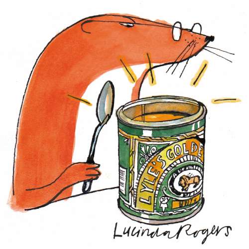
The Weasel: The art of the label

"Out of the strong came forth sweetness." Judges 14:14.
The text cropped up in a recent "Thought for the Day" by the Rt Rev Tom Butler, Bishop of Southwark. His impressive ecclesiastical ramble touched on: a) the excellence of city honey due to "the greater variety of flowers and blossoms found in urban parks and gardens"; b) the threat to bees from Colony Collapse Disorder currently sweeping America; c) how the carcass of a lion killed by Samson became a beehive that provided the Biblical strong-man with a sweet snack; d) the resulting riddle put by Samson to his Philistine enemies (Judges 14:14), whose inability to answer resulted in resumption of "the normal mayhem"; e) how hostile nations are compared to stinging bees in the Psalms; e) the Easter story, which moves from "hostile crowds ... like angry bees" to "sweetness and joy"; f) a wish for "the honey of peace and hope" in the Middle East. Phew!
Considering the extensive amount of territory covered by the Rt Rev in four minutes of the Today programme, it may seem ungenerous to cavil at his early morning musings, but I must admit to being disappointed. Not because he failed to point out the rottenness of Samson's riddle, which for sheer perplexity ranks alongside the Mad Hatter's "Why is a raven like a writing desk?" but because he omitted to mention that Judges 14:14 is the only biblical quotation to appear on a popular comestible. I'm sure I was not the only listener to the Today programme who was surprised that Lyle's Golden Syrup was omitted from the episcopal meander. Maybe Bishop Tom has never drizzled this gleaming goo on his porridge or used it for flapjacks. If he had, he might have noticed the dead feline accompanied by a swarm of insects on the tin that provided much puzzlement for the juvenile Weasel.
Introduced by the religiously inclined Abram Lyle (1820-1891), the image and quotation first appeared in 1885. Since then, the tin's gorgeous design has scarcely changed. Until now, that is. If you've bought a tin recently, you'll find the bees and lion still there but the arch of lettering around the Biblical scene no longer says "Lyle's Golden Syrup". It now declares "Pleasing on Pancakes" or possibly "Perfect in Puddings". Using the flimsy excuse that Lyle's Golden Syrup is 125 years old, Tate & Lyle has introduced seven "Special Anniversary" tins. (Yes, I know it's 123 years since 1885. Apparently, the stuff was sold in wooden casks for the first two years.)
The company suits must have known that tampering with a national treasure was risky. "Why fix it if it ain't broke?" the product's website rhetorically inquires, before answering with some patronising guff about "celebrating 125 years in style... and to remind you of how to use Lyle's Golden Syrup!" Crumbs! There was me forgetting that you can "Pour it on Porridge". I'd been using it to oil the cat-flap. The real reason is that brand managers can't resist fiddling with the appearance of their products, even though the public is irritated by such tinkering. When Uncle Ben's rice dropped the image of Uncle Ben from the packet a few years ago, sales slumped, so Uncle Ben, who was actually the maître d' of a Chicago restaurant called Frank Brown, duly re-appeared.
In Robert Opie's The Art of the Label, we can see how Colman's mustard powder tried to trendify itself in the Seventies with an inappropriately cool look for its tin. The traditional bull's head logo (beef and mustard sandwiches!) was replaced by an up-to-the-minute lettering design. Obviously, this did not go down too well with mustard lovers – not I'd imagine, a very hip bunch – because the bull's head is now back on the label, along with the gold cross of the Légion d'honneur awarded to Colman's in Paris, 1878. Perhaps because we're suspicious of any change to their contents, condiment packaging maintains a pleasing conservatism. Though the Lea & Perrins Worcestershire Sauce label has been amended over the years, the current version not only bears pictures of John Wheeley Lea and William Henry Perrins and the signature of the saucy duo but also their manufactory at Midland Road, Worcester. The red and green sans serif lettering on the Tabasco bottle, most stylish of all labels, has not altered one jot in almost a century. Another kind of sauce is equally resistant to change. The one thing that Gordon's gin has done right is to hang on to its elegant label, based on hand-written labels from gin's 18th-century heyday. Unfortunately, the contents, which were cynically reduced in strength from 40 to 37.5 per cent ABV a few years ago, have not retained such integrity.
For a classic example of the unfortunate consequences when marketing men fiddle with design, take a look at Scott's Old Fashioned Porage Oats. The archaic spelling of porage is intended to underline the authenticity of the cereal and so is the long-standing picture of the shot-putter. A favourite in Weasel Villas, this product is made at Uthrogle Mills in Cupar, Fife. The words "Scotland" and "Scottish" appear 13 times on the box. When the shot-putter was updated a few years ago, the marketers sought to further emphasise the unmitigated, 100 per cent Scottishness of the product, which, incidentally, is owned by PepsiCo, by incorporating a Highlands backdrop. It now portrays the kilted Superman about to heft his shot into a loch. Plop!

Join our commenting forum
Join thought-provoking conversations, follow other Independent readers and see their replies