Whitney Museum of American Art: Renzo Piano's picture palace is a new architectural icon
New York's rebuilt Whitney Museum, designed by the Shard's architect, is a unique home for American art, writes Jay Merrick
In the 1960s, there was the Space Race. From the 1990s, starting with the Frank Gehry-designed Bilbao Guggenheim Museum, we've had the Art Museum Race. Two months ago, Frank Gehry electrified Paris with the Fondation Louis Vuitton, like a supersized Moby Dick diced up in the Bois de Bologne.
And now we have New York's just-completed Whitney Museum of American Art, designed by the Shardmeister, Renzo Piano. Is it an architectural icon? No. Is it as frightfully cool as the sublimely retro Standard hotel straddling the High Line elevated park, or the chic fashion bunkers and eateries around it in the old meatpacking district? No.
And yet the Whitney seems unique – and not simply for its 270ft galleries, or the 600 works of art on show from 1 May. The Whitney may be the first post-Bilbao "headline" art palace that has really added something respectful to a city's existing character. It certainly hasn't landed like a space ship designed to generate maximum Likes and selfies.
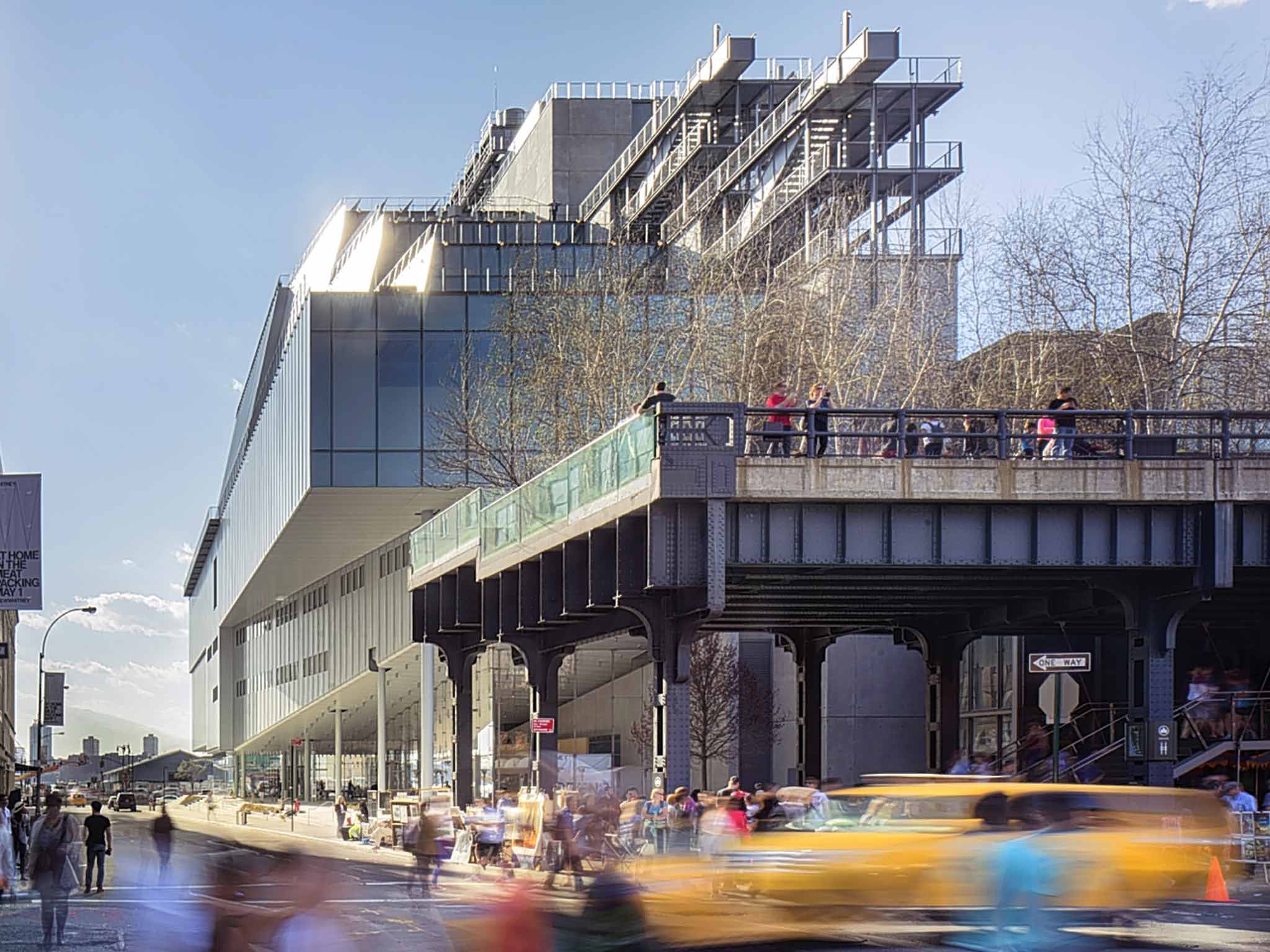
The anti-USP of the Whitney is that its architecture presents no single, killer image, because Piano has made no attempt to create a brandmark shape. Seen from the Standard's top-floor restaurant, the museum's north-facing side is unremarkable; and its main façade is not memorable in the usual ways.
And yet, the base of the Gansevoort facade, and the ground-floor reception area, are masterfully arranged. The elevation is angled to break the grid at the street corner, widening the view through to the Hudson as you turn the corner; the big, triple-height reception area has a glass envelope, maximising the visual connection to the river; and the reception's flooring and the stair treads are in roughly surfaced, pale blue-grey Catalonian limestone, which has the effect of dragging the street's surface into the building and creating a piazza vibe.
And so, the Whitney is as much an expression of its urban setting as of the artworks it harbours, or the new facilities: the theatre, archive and study centre were added when the century-old institution moved from its brutal-looking but much-loved previous home, designed in the 1960s by the legendary modernist Marcel Breuer. The new building has double the floor area, and superb views from its upper floors of the Manhattan skyline to the east, and across the Hudson to the west.
The column-free gallery volumes, across five floors, have glazed end walls, so you're always walking towards natural light. You know the spaces are working when the mildly figured blues and blacks of Keith Haring's Untitled 1981 can hang happily next to V-yramid, Nam June Paik's ziggurat of 40 very old televisions; or when you encounter Lee Krasner's massive but exquisite The Seasons next to the vividly smeared yellows, greys and pinks of Willem de Kooning's Door to the River. It's not all perfect, of course. The lighting in the sixth-floor galleries has a nasty yellowish tinge; the LED lighting needs fine-tuning.
The title of the opening exhibition, America is Hard to See, is apt. The museum's director, Adam Weinberg, speaks of American art across the last century as "being about complicating the picture, without making a mess. It's a fine line."
The remark could be applied to the Whitney's architecture. Renzo Piano is famous for giving the structures of his buildings – the grunt elements – highly refined, even delicate, details. It's mostly grunt here: 4,000 tons of steel in a building weighing 28,000 tons; huge, exposed steel beams above two of the galleries; heartwood pine flooring recycled from defunct manufacturers, such as the Maidenform bra factory in New Jersey.
The only fine lines you'll see at the Whitney are in its secondary features – the window frames, the stairs, the sawtooth rooflights, the superb steel balconies jutting like battleship bridges from the east façade, which will surely feature in an Annie Hall remake.
One section of the opening exhibition is called "Machine Ornament" – a phrase that could subtitle most of Renzo Piano's architecture. But it doesn't suit the Whitney. Piano says the design is "impolite" and that he's been a "bad boy" in the same way as when he and Richard Rogers designed the shock-of-the-new Pompidou Centre in 1977. But that's a bit precious. The only naughty thing the charming Italian has done is design a "Whitney Bag" for Max Mara.
The Whitney's architecture, like America, is hard to see in any decisive, clear-cut way. It's not an icon. It's not sexy. But its design has, in unexpectedly thoughtful ways, made great American art, and a great American city, much more vividly visible.
The Whitney Museum of American Art opens on Friday
Join our commenting forum
Join thought-provoking conversations, follow other Independent readers and see their replies
Comments
Bookmark popover
Removed from bookmarks