Classroom posters get a design makeover: The one-man mission to transform the walls of our schools
Pop-science is combining with modern design to create a new vogue for educational posters that will look as good at home as they do in the classroom
Simon Tyler likes to do a Google experiment to prove that he's on to something. Have a go now, if you can. First, search “vintage educational posters” and go to the image results. You are presented with a gallery of hand-drawn anatomical drawings and often beautifully simple diagrams of planets and butterflies.
Now, do the same again but just search “educational posters” and brace your brain for the instant cold shower of ugliness. Judging by the results – glorified clipart and crowded typefaces that make comic sans look sophisticated – contemporary educational posters are no longer worth the Blu-Tack they hang on.
“Serious scientists used to produce posters of a quality that was as good as any artist working at the time,” Tyler says from his studio outside Hastings. He blames the rise of desktop publishing for what followed. “Now people just chuck colours and fonts at a page and hope it looks OK.”
A year of biochemistry at university, ditched for a degree in the history of science, and later graphic design work for a furniture business, have given Tyler an unusual perspective on how science is presented – and how it used to be.
He now runs Atomic Printworks, his one-man mission to transform the walls of our classrooms, bedrooms and beyond with posters that leapfrog what could be described as the “Microsoft era” of cluttered, lazy design. His bold, modern posters, originally intended for children's eyes only, are now part of a broader, overdue reacquaintance of design and science.
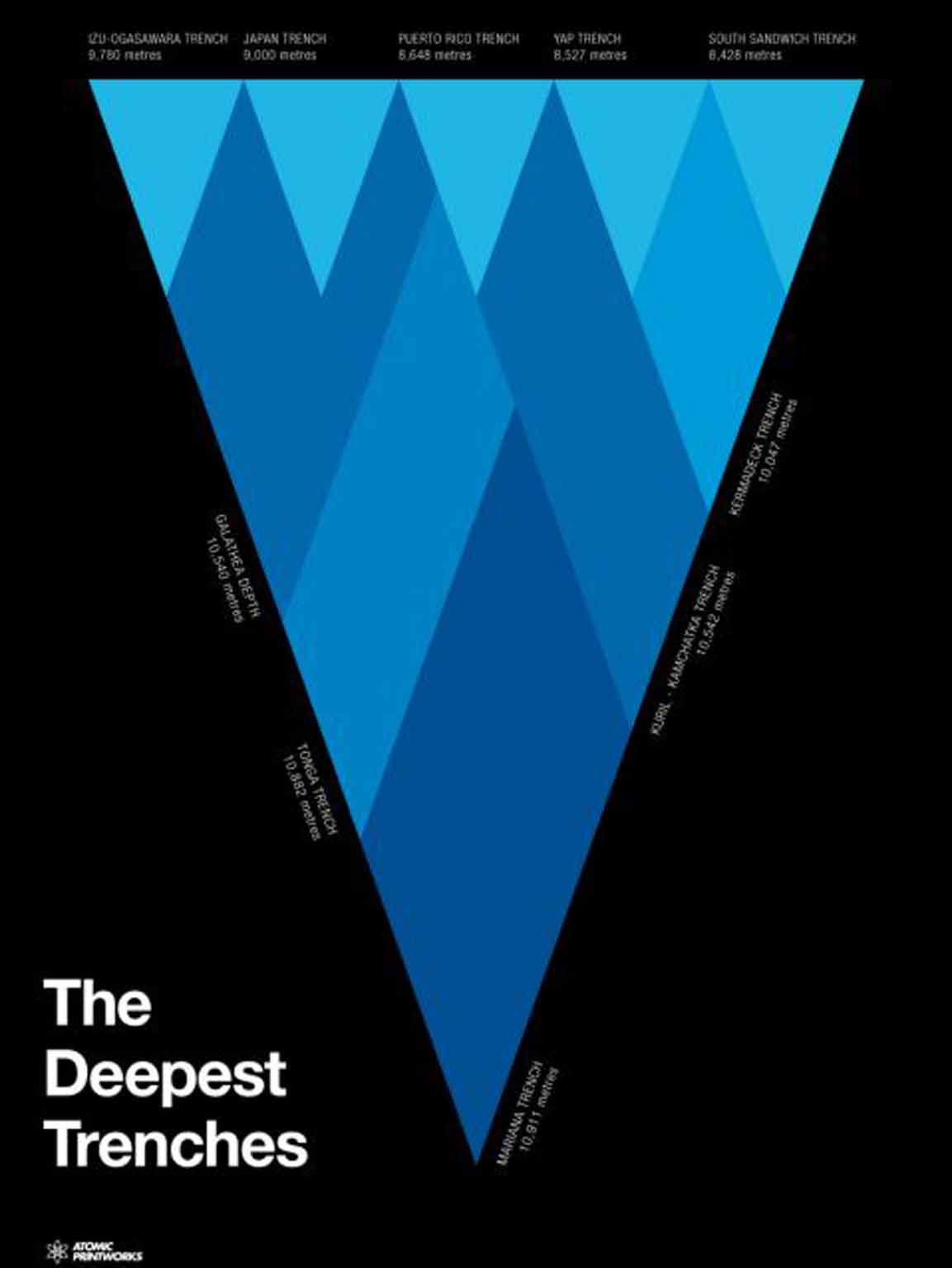
Tyler's DNA poster shows the double helix alongside the biological compounds that make up the vital molecule. Standard stuff, but the image is rendered in bold colours with minimal text in a way that would make it stand out and look nice in any room. Other posters are simpler still – a planet and nothing else – while another charts the geological timescale of Earth over 4.6 billion years, including every eon and age in a way that is intuitive and striking.
“When I first started working on the designs in 2013 I really had kids in mind,” says Tyler, 38, whose four-year-old daughter is a key critic. “But also design-conscious parents who would hopefully put the prints up around the house instead of hiding them in their kids' bedrooms. In fact, kids have been massively enthusiastic, but what I hadn't expected was the enthusiasm of all ages.”
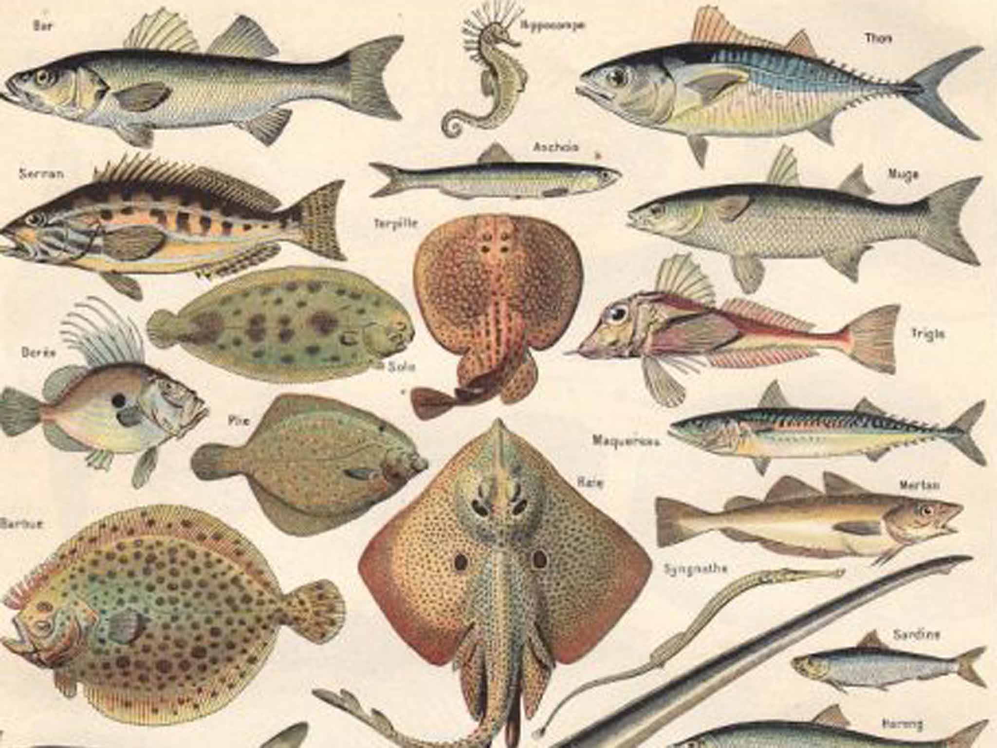
The designer sells a lot of his posters to people in their 20s and 30s, who are also, he notes, buying the classroom and laboratory posters from what he sees as a golden age for the form. The original poster boy of science in Tyler's eyes was Ernst Haeckel. The 19th-century polymath and contemporary of Darwin's produced beautiful images of the natural world, particularly underwater scenes. A Victorian tradition endured into the mid-century modern period before slipping into computer-induced dormancy.
Tyler is now exploiting the happy coincidence of a new popular interest in science, be it probes on comets or the tweets of astronauts, and a modern obsession with data and infographics. Educational posters were due a revival, he argues, and he's not alone. British firm Future Maps is bringing new aesthetics to cartography while, in New York, Pop Chart Lab majors on data. Manchester's Dorothy design collective makes pop-culture posters including a history of electronic music presented as a blueprint.
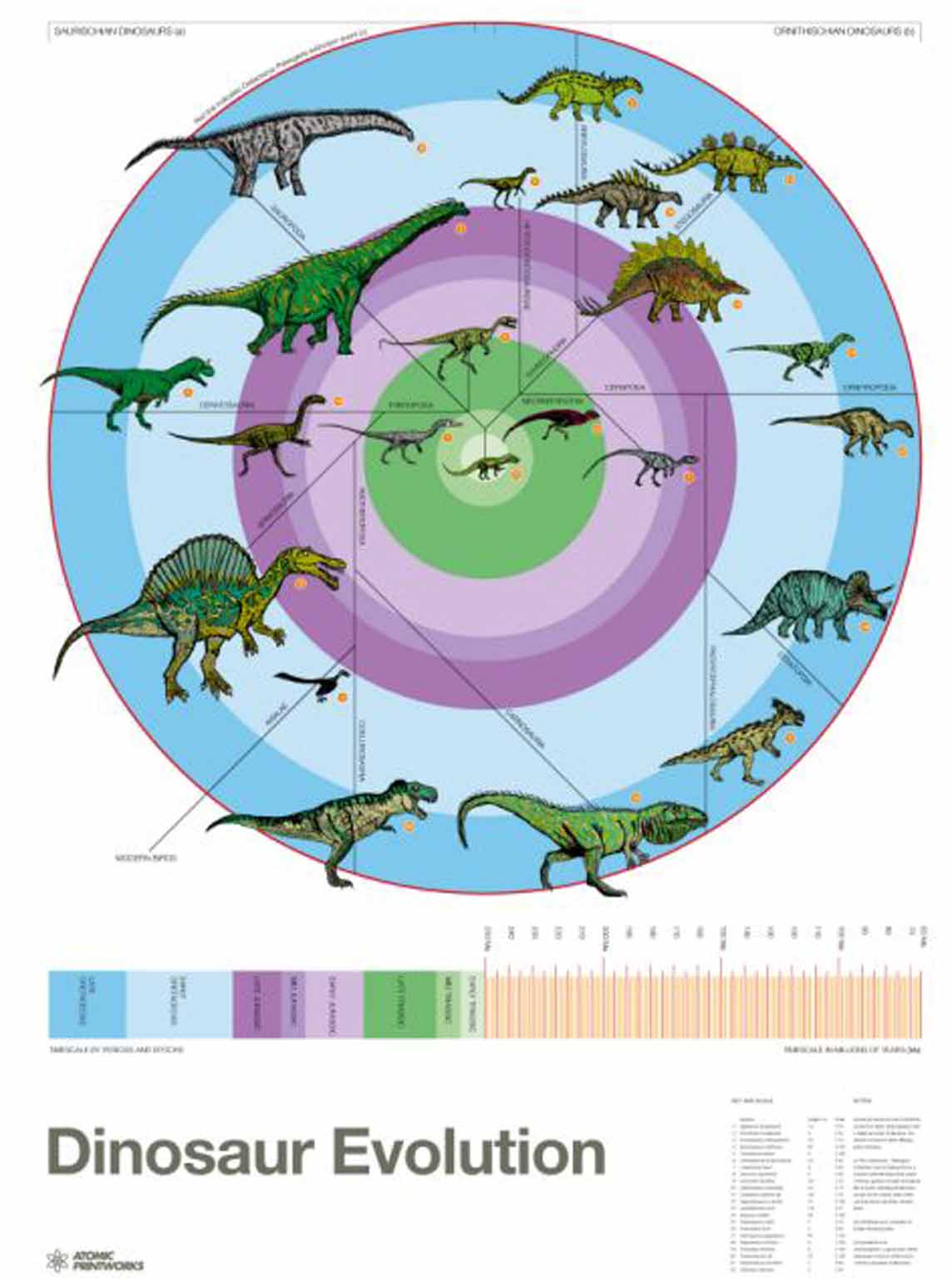
Accuracy is key for Tyler's posters, which sell in several countries. He is also in advanced talks with John Lewis, who ought to have a renewed interest in his best-selling poster – a giant rendering of the moon (lonely old man not included). Teachers have bought hundreds of posters and Tyler wants to produce cheaper versions of his works to supply schools more formally. Wherever they appear, he says a good poster should “explain something visually that's hard to do with language. If you're having to use tons of words on a poster you're better off putting them in a textbook,” he adds. “It's actually pretty simple.”
Join our commenting forum
Join thought-provoking conversations, follow other Independent readers and see their replies
Comments
Bookmark popover
Removed from bookmarks