Lands of milk and honey: The edible atlas
Using real food, two artists have created an edible atlas that shows that we really are what we eat

So often, it’s the food that we eat that characterises our travels. Grilled sardines eaten under the Kefalonian stars; the sticky sweetness of Moroccan pomegranates; overindulging in gorgonzola in Milan. A simple local treat enjoyed in the very spot in which it was cultivated it can hold fast in the memory.
And it was this sort of passion for travel and eating that inspired the Kiwi photographer Henry Hargreaves and American food stylist Caitlin Levin, both 34, to create a series of charming food maps.
“Exploring new places through the food you eat is often a portal to the cultural complexities of that place,” Hargreaves says.
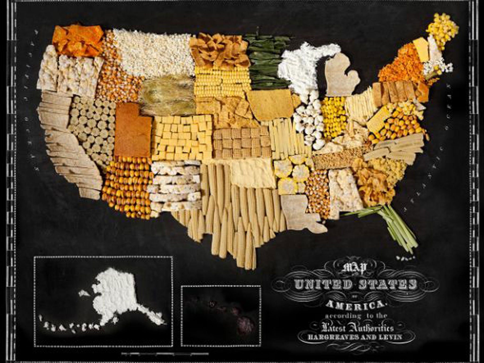
The pair took products that each of their locations are well-known for and, using those ingredients in various forms, turned them into metre-wide physical maps.
“These maps are a playful representation of our interpretation of food from around the world, painstakingly created with real food,” Hargreaves says. “The project speaks to the universality of how food unites people, brings us together, and starts conversations.” The United States is represented by corn in many different guises (a nod to the country’s wide use of the crop; everything from uncooked kernels to popcorn, tortilla chips to corn cakes can be spotted); Japan is made up of various kinds of seaweed, and citrus fruits illustrate South America. Meanwhile, each nation in Africa is plotted using a different part of plantain and banana, New Zealand is made up of kiwi fruits (boom boom!) and noodles map out China. But how did Hargreaves and Levin decide on which food to use for each place?
“We simply took the iconic foods of those countries and continents. While we know that tomatoes originally came from the Andes in South America, Italy has become the tomato king. These maps show how food has travelled the globe – transforming and becoming a part of the cultural identity of that place. Who doesn’t hear the phrase ‘throw some shrimp on the barbie’ and not think of Australia? Who goes to France without eating bread and cheese? And who makes a Brazilian caipirinha without a fistful of limes?” The culinary cartography of Great Britain and Ireland, meanwhile, nods to our love of biscuits, with jam tarts, digestives and custard creams being used to map out the islands.
Hargreaves and Levin met 10 years ago and have been working together ever since, often using edible props (another series of theirs involved deep-frying models of gadgets such as iPhones and Game Boys).
“Food is something that everyone can relate to, but we seldom see it, beyond something to eat,” Hargreaves says. “We like to challenge people’s expectations of it and use it to tell stories and display it in new, fun ways.”
Using fresh produce this time around, the project wasn’t without its difficulties. Each of the maps, which can be purchased as fine art prints, was created in one day at either Hargreaves’ studio in Brooklyn or Levin’s Manhattan apartment. And it was a race against time to plot out the countries in comestibles, then photograph them, before the food they used started to decay. The citrus fruits drying out and the bananas turning brown were particular issues. Not to mention the delightful smell a bucket of prawns emits over the course of 24 hours.
Still, Hargreaves says that on some days the food was intact enough for them to enjoy it afterwards.
This isn’t the first time that Hargreaves’ food work has captured people’s attention. His chilling recreations of death-row inmates’ last meal requests, a project entitled “No Seconds”, received plenty of interest in 2012. He says the appeal of photographing food simply comes from a lifelong fascination with what people choose to eat.
The success of Food Maps has already led to the pair’s next commission: recreating America’s 50 states using breakfast materials, for the Food Network. It would seem that, despite what you were told as a child, sometimes it’s no bad thing to play with your food.
For more information about the artists’ work, visit hargreavesandlevin.com
Join our commenting forum
Join thought-provoking conversations, follow other Independent readers and see their replies
Comments
Bookmark popover
Removed from bookmarks