Read between the lines: Are Bridget Riley’s paintings really fine art?
Bridget Riley's paintings are beautiful creations, but should they be regarded as fine art – or merely framed wallpaper?
I once had dinner with Bridget Riley. I can't remember much about the occasion – it was at the house of a prominent broadcaster, one firmly rooted in the arts establishment – except that Riley herself was likeably dynamic and feisty, keen on hand-rolled cigarettes, and professed herself – as she often has in print – to be an anarchist.
Even at the time I thought this a little dissonant, given that she is a Commander of the British Empire, but I gave her the benefit of the doubt: perhaps she was a fifth columnist, seeking to command said empire, solely in order to effect its dissolution?
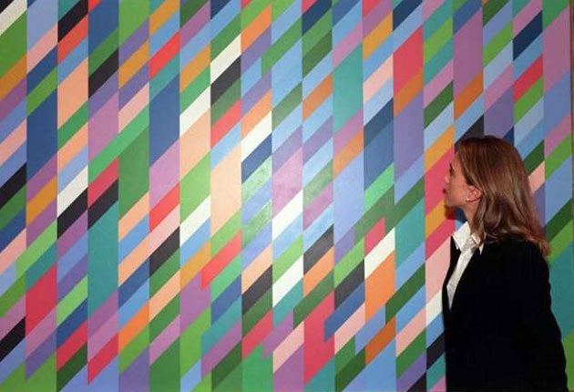
I've been to exhibitions of Riley's work as well, most notably at one of her secondary market dealers, Robert Sandelson, in London's Cork Street. Standing in a whole room full of Rileys – in this case jaggy ones – is a very specific kind of experience, one to which I'll return later. My wife and I even own three Riley prints, Green Dominance from 1977 (an edition of 100); Fête from 1989 (an edition of 60), and Rose from 1978 (the artist's proof). They're beautiful things, no doubt: the two from the late 1970s are all sinuous lines and ripples of colour like the heliotropism of waterfalls, whereas Fête is of the jagged and blocky type.
They add light, symmetry and distinction to our home, these prints, but I've never seriously considered sitting down and regarding them for any period of time. I once had a lengthy wrangle with a famous art dealer and an equally famous collector about the merits of Warhol as an artist, and while I was able to concede his significance, and by extension his achievement, I take it for granted that a fundamental mark of an artist's distinction is the length of time that it engages its viewer; not as the signpost towards or aide-memoire of some aesthetic theory, or intellectual construct, but in the very depths of its thisness.
Of course, if we take Riley at her own word, she has no real need of our concerted attention. Since she herself professes her abstraction to be an analogue of what we see before we impose any intellectual rubric on that raw sense datum, she presumably would be happy for the works to receive such scant regard, for them to be a species of framed wallpaper.
Except that she can't be, because while the vast critical literature associated with her oeuvre can be instantly read as the conceptual analogue of those patterns themselves, it takes far longer to wade through the verbiage than it does to admire the pretty colours and simple shapes. Now, most of what passes for contemporary art criticism is arrant nonsense and Riley's supporters, together with Riley herself, are no more guilty than most; but what seems particularly sad about this piffle is that once upon a time – back in the 1960s – she had interesting ideas about what art could be, and where it might lead.
But Riley's theory throttled her practice. Consider Riley's use of assistants to paint her canvases. In a conversation with Lynne Cooke in 2005, she reiterates the well-known riffs: how from the get-go, in 1961, she provocatively turned away from the handmade aesthetic of the American Abstract Expressionists, enlisting assistants to paint for her, and enacting a "little rebellion" against "handling" by using household paint and washing the paintings with bleach. Riley says of her assistants, "They help me establish distance. The way I work means I am, inevitably, my own spectator. Since the spectator who looks at my work is part of the work itself, it helps very greatly to be as objective as I possibly can." But why not simply say: It's boring painting all those geometric shapes and I can't be bothered – an explanation that everyone would understand.
I return to my own subjective experience of standing in a room o' Rileys. Did it provoke anything more than a sense of retinal queasiness? Did Riley's works make me think about the way I am impelled to view things? I rather think not. And nor did I find the densely structured arguments about the genesis of these patterns that Riley herself has constructed. I didn't look upon the jagginess and think of Blake, Turner and the abandonment of chiaroscuro; nor Seurat, and Post-Impressionism or Klee against Divisionism. Nor did the titles of the paintings supply some evolved, wise subtext – I simply liked them, in a quite uncomplicated fashion.
Because the truth about Bridget Riley is that she's a decorative artist masquerading as a fine artist, and her paintings are the perfect decorations for Modernist habitations and workspaces. Far from Blake or Turner being the English painters with which she stands comparison, she's really the 20th-century counterpart to William Morris. In a curious inversion of Morris's own creative and political trajectory, instead of trying to elevate artisans to the status of artists, Riley has simply elevated her own craft work to the status of fine art.
The parallels go further. Morris had his idealised creative communities at the Red House and Kelmscott Manor, while in his workshops he aimed to produce artefacts that were, first and foremost, affordable. Riley has Space (organisation providing studios and a community for artists which Riley founded in 1968 with Peter Sedgley) and now her capacious London atelier, where her workmen and women happily toil away, applying fine art techniques to wall hangings that only the very rich can ever afford. These assistants say of the gaffer that theirs is the fun part of the enterprise, while she must do the hard graft. You'd have to go back to a Victorian factory to find quite such a clearly articulated sense of deference.
Seen in this light, Riley's desire to distance herself from the Op-art label is entirely understandable: the important thing was stop those patterns escaping the bounds of their frames and spreading all over everything ready made. In the 1960s the decorative nature of her work was only too obvious – those simple geometrical patterns perfectly complemented the rectilinear architecture of the day. Now, in the postmodern era, the paintings are instant bibelots of the era just past, with all the charm that the gothic revival had for Morris, Rossetti and Burne-Jones.
By none of this do I mean any disrespect. I can well appreciate why someone would choose to think of themselves as a fine artist rather than as an artisan – it's simply the peculiarity of the age that they're taken at their own estimation. Besides, there's a highly pleasing quality to Riley's work: it's feel-good, it isn't difficult or harsh – but playful. However, my stair carpet, which is patterned with vertical stripes of irregular thickness, and coloured from buff through blue and yellow, is just as pleasing – although perhaps not quite so ineffable.
In the final analysis we must say of Riley's work what was said of Morris's wallpaper patterns in the Dictionary of National Biography: "[They] only reveal their full excellence by the lastingness of the satisfaction they give." The same will undoubtedly be true of Riley's paintings.
Circles Colour Structure: Studies 1970/71, Karsten Schubert Gallery, London, to 30 Jan 2009; www.karstenschubert.com . Read the full version of this article in the current issue of 'Art World' magazine.©
Join our commenting forum
Join thought-provoking conversations, follow other Independent readers and see their replies
Comments
Bookmark popover
Removed from bookmarks