The Ideas Factory: Curating the future - a US gallery's digital reframing
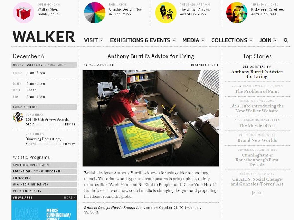
The Walker Art Centre in Minneapolis, Minnesota is one of the United States' premier modern arts spaces. Its permanent collection features works by Pablo Picasso, Edward Hopper and Georgia O'Keeffe.
It's a place full of inspiration, but stuck in the relative artistic hinterland of the midwest USA. To make sure that the Walker stays in the game – or, you might argue ahead of it –it's launched The Ideas Hub which acts not just as a website to promote the work that's going on at the gallery but also as a very web 2.0 place to gather, curate and promote arts innovations from around the globe.
It's look, states the site's Olga Viso in an introductory post, is meant to mimic an arts magazine – but with the resources of a leading gallery behind it.
The main stories on the site on Tuesday included a feature on how difficult it is to repaint famous sculptures, an interview with artist Anthony Burrill and links to stories "from elsewhere" such as a piece in the British press about the sculptor Martin Boyce. It's curation, but not as we (or other galleries) know it yet.
It ought to help hugely the Walker's role on the arts stage, suggests The Atlantic's Alexis Madrigal – who wrote a nice piece welcoming The Ideas Hub into the world: "They can do more than stave off a slow spiral into irrelevance. The internet means the Walker can become a global art powerhouse from the comfort of the upper Midwest."
See more: walkerart.org
More more more! Why do we always want extra stuff?
The annual Christmas lectures by the Royal Institution – now in their 186th year are always fascinating. Last year's lectures by material scientist Dr Mark Miodownik on size were particularly good. This year, Professor Bruce Hood from the experimental psychology department at the University of Bristol will be inviting us to "meet our brain".
The lectures will cover the way our minds work from brain waves to how we subconciously trick ourselves. Another part of Professor Hood's work looks at why humans covet owning things (it stems from early ideas of what is ours), and how we cope with the trauma of our belongings being taken away.
It is something that would be fascinating at any time of the year – but with the lectures being broadcast the week after Christmas, as six-year-olds scrap over whose Moshi Monster is whose, it seems particularly apt. Tickets are sold out, so catch Professor Hood's speeches on TV.
Royal Institution Christmas Lectures, BBC4, 8pm, 27, 28 and 29 December
The real digital super highway
This column previously featured a video from Microsoft in which the computer giant wondered what the interactive world will look like in a decade's time. What that clip didn't show was how the roads might evolve. German car makers Audi revealed an answer last week at a conference in Miami. Its concept is an electronic highway in which the presence of both cars and pedestrians on an LED road is communicated to the technology in the car. It was designed by Danish architect Bjarke Ingels for last year's Audi's Urban Future competition and brought to life this year in Miami.
It looks fun all right, but the thought of traffic jams caused by a faulty LED circuit at the Eccles Interchange isn't a happy one.
See more here: ind.pn/audifut
The right type: a font that makes legalese visually pleasing
Apart from a sense of dread, a letter from a lawyer is unlikely to tickle many human emotions – especially one of aesthetic delight. The US legal industry's standard font is Times New Roman, which due to its tight fitting allows a lot of words on to a page. But it's not much to look at. Despite that, some companies and even authorities state that the font should be used at all times.
But is there a better way? Yes, says US magazine Fast Company.It spoke to Matthew Butterick, who has worked as a designer and a lawyer. His new font, Equity, is designed specifically for lawyers – it makes things such as underlined and bold sentences read clearly.
Could it be used here? The Ideas Factory spoke to two lawyers who were sticking to their guns – and those guns are 11pt Arial.
Jeremy Stone from media lawyers Sheridans says: "We were persuaded while at university and law school to use Arial as it's the easiest to read for people with learning difficulties or dyslexia. That's our firm's style, the one I am most used to and the easiest to read and 'decipher legalese'." So there you are.
Read more: ind.pn/legaleasy
Send us your Ideas Factory fuel
The Ideas Factory is a weekly round-up of the best, weirdest and most interesting new discoveries, theories and experiments from around the world. If you have an idea you'd like to share, I'd love to hear from you. You can email me on w.dean@independent.co.uk or tweet me at @willydean.
Join our commenting forum
Join thought-provoking conversations, follow other Independent readers and see their replies
Comments
Bookmark popover
Removed from bookmarks