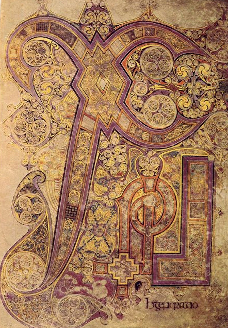
Anonymous: The 'Chi-Rho' from 'The Book of Kells' (c.800)
When we're talking art, we divide up pictures into images and abstracts. There is representational art, and there is non-representational art, and there's also a sort of middle ground between these poles, and that's about it.
It's not, of course. There are all kinds of other pictures – pictures that generally don't qualify as art and don't fit into this bipolar model. What about diagrams? What about pie-charts and flow-charts and spidergrams and Venn diagrams and family trees, where do they sit along the representation-abstraction axis? And what about maps? And flags? And heraldic emblems and corporate logos?
Come to that, what about letters? Letters, words, text are often considered to be a kind of opposite to pictures. Perhaps they're nearer to images than abstracts, because words tell stories and describe the world, and so do images. Or perhaps they're nearer to abstracts, because the written letter is non-representational form that can be shaped into a pattern, as commercial design and Islamic calligraphy demonstrate.
And then there's the decorated letter. It's a form of visual work very familiar to us. Think of a teenager's school book, and how the words on it – the owner's name say – can be elaborated with doodles that coast around the letters' forms or draw them out into extensions or fill them in with intricate detail, developments that may spread to cover a whole page.
It would be strange to call this abstraction. These forms aren't autonomous. They are decorations of something, adornments to the name at their centre. They're a way of honouring, making precious, imbuing with worth and power. And it might not be your own name that gets this graphic glorification. It might be the name of loved one, or the name of God.
The Book of Kells is an illuminated manuscript of the four Christian gospels. It was made in Ireland, or possibly England, about AD800, by monks belonging to the Columban movement. In the Middle Ages it was kept in the Abbey of Kells in County Meath. It was designed as a treasure, a wonder. An old chronicle called it "the chief relic of the Western world". Modern opinion rates it the finest example of the "insular" (i.e. British Isles) gospel-books.
One of its finest pages illuminates the Gospel according to St Matthew, chapter 1, verse 18. The Latin verse begins "Christi autem generatio sic erat" – "this is how Christ came to be born". The page dwells almost entirely on the name of Christ, or rather on its traditional abbreviation into the "Chi-Rho" symbol (say it kai-roe).
Chi and Rho are two letters of the Greek alphabet, the first two letters of "Christ". Chi gives a hard Ch sound. Rho is an R. Chi is written as an X. Rho is roughly a P.
In this illumination the Chi is the dominant form, an X with uneven arms, somewhat resembling a pair of curvaceous pliers. The Rho stands in its shelter, with its loop turned into a spiral. There is also an Iota, an I, the third letter, passing up through this spiral. All three letters are abundantly decorated, their curves drawn out into flourishes, embellished with discs and spirals, filled with dense tracery and punctuated with occasional animals and angels.
But put like that, it sounds as if the letters came first and the decoration after. The three letters, though visually distinct, are nowhere just letters. They have been shaped with a view to the patterns they will be part of, and they are themselves filled and formed by ornamental elements, like the diamond that makes the hinge of the X, and the head (Christ's?) that oddly finishes the P's spiral.
Such decoration hates emptiness. Every space must be filled. It also resists contingency. It redeems writing from its arbitrary nature. The letter Chi might just as well be written like an O as an X. The name of Christ could take any shape. But buttressed and packed with pattern, the lettering becomes absolute, unalterable.
Yet there is an aspect of contingency. The doodling principle is at the heart of this decoration, an additive improvisation in which one form breeds another, and lines of connection sprout, and become enclosures to be filled in, and the thing grows across the page until at some limit it stops. As with musical improvisation, part of the art of decoration is knowing how to bring things to a satisfactory stop.
There is also an aspect of infinity. The letters are the biggest forms, and around them and within them things get smaller, smaller still, vanishingly small and faint. Recent commentary has compared these proliferating details to fractals.
A medieval Welsh historian said: "Look at them superficially with the ordinary glance, and you would think it is an erasure, and not tracery. Look more keenly at it and you will penetrate to the very shrine of art. You will make out intricacies, so delicate and so subtle, so full of knots and links, with colours so fresh and vivid, that you might say that all this were the work of an angel and not of a man."
Join our commenting forum
Join thought-provoking conversations, follow other Independent readers and see their replies
Comments
Bookmark popover
Removed from bookmarks