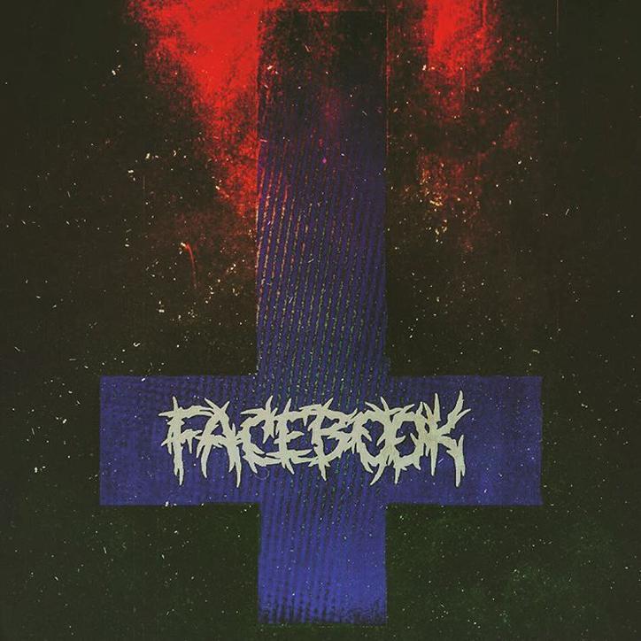
Brand logos reimagined as heavy metal albums
Brand logos and typefaces are all about minimalism in the app-orientated world, to the point of tedium.
It’s with a fondness for more ornate ones that designer Sean Ross (who is from San Francisco, so he sees a lot of social media companies) reworked the logos of Twitter, Facebook, Google et al into metal album covers.
He riffed on album covers by Danzig, Black Sabbath, Slayer and more, delighting in disrupting the brand’s uniform identities.
“As someone who thinks about visual culture, I’m concerned that branding has become an afterthought in this space — technology and function now lead the way over story and image — what’s under the hood, the core values and DNA of what it is you’re voting for as a consumer, are sidestepped,” Sean told It’s Nice That.
“The visual language of disruption is much more exciting and strange then anything you see in tech; it usually stems from youth and street culture, not white dudes on computers, and it’s constantly shapeshifting.
“While the signifiers of rebellion are always eventually co-opted, it seems like we’re skipping over that part entirely, and immediately going for what blends in to the landscape, which makes sense when you’re chasing ’adopters’, but it’s so detrimental to brands being representative of anything unique or concrete.”
“Having grown up in the 1980s, heavy metal music became the perfect spark for to explore these ideas, because metal does a pretty good job at visually representing what it actually is—loud, disruptive and shocking—anything but safe.”
Join our commenting forum
Join thought-provoking conversations, follow other Independent readers and see their replies
Comments
Bookmark popover
Removed from bookmarks