Ed Ruscha: 50 years of painting, Hayward Gallery, London
Words and images collide in an amazing half-century of work by a master of the modern consumer age
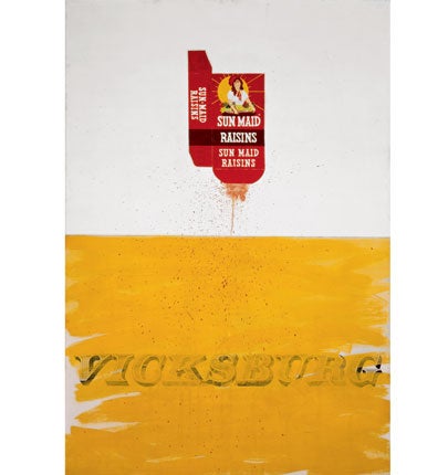
Of the several ways of looking at Ed Ruscha’s Box Smashed Flat (Vicksburg), the least obvious is as a self-portrait.
That, though, is what this painting, begun in 1959 when the artist was 21, turns out to be. Box Smashed Flat is a work of two halves, split laterally. In the top, on a white field, is the photorealist image of a packet of Sun-Maid Raisins, apparently squashed by something heavy: a spray of red spurts from it. The picture’s lower half contains the word Vicksburg in Victorian type, sloppily painted over in the yellow of the sun on the box. It is a mess of a work, and it is meant to be.
And the self-portrait? In 1959, Ruscha, an Oklahoma boy, was studying in Los Angeles at what would become the California Institute of the Arts. His pre-Angelino life had been the down-home one of a million middle-Americans: Vicksburg was a Mississippi town Ruscha had passed through when hitchhiking, aged 14 – these were simpler times – to Florida. The young Edward Joseph Ruscha IV had thought to train as a commercial artist, and the picture’s rubbed-out lower register suggests a youthful project abandoned. Over it rises not just the sun but – infinitely more wondrous in 1959 – the Sun-Maid. Here is a brave,
new, American world of brands and branding, of a consumerist reality better, bigger, brighter than the merely real. Across the continent, in New York, that same sun was shining down on Andy Warhol. The thing we would call Pop Art was about to be born.
And yet this picture’s story is more complex than that. Vicksburg may have belonged to Ruscha’s past, but it also belonged to America’s. Barely a century before Box Smashed Flat, the town known to Abraham Lincoln as “the nail that held the South’s two halves together” fell to Union troops in the last major action of the Civil War. In US history as in Ruscha’s, Vicksburg marked a split, a division of after from before. The field from which the Sun-Maid rises is a battlefield, watered with blood. Something may have been gained in her birth, but something historic has been lost.
One of the many amazing things about the half-century of Ruscha’s paintings, hung chronologically in the Hayward Gallery’s new show, is the speed with which their maker found his voice. In 1966, there is his most famous image – Standard Station, one of a series of pictures of petrol forecourts. Like Box Smashed Flat, this is preoccupied with modernity in art, with Modernist grids and Modernist flatness. On the face of it, Standard Station sets out to be graphic, commercial, a CinemaScope screen split in two – diagonally this time, into a triangle of unbroken blue-black and another of Mondrian-ish red, white and yellow. To that extent, the work is, as its painted title suggests, standard. But it is also deeply self-questioning, anxious about the language it speaks, the easy way it says what it says. For all the glitz of Fifties gas-station architecture, of the American mobility it suggests, it is the work’s upper half that dominates, weighing down on the lower as if to squash it. Standard Station is not a happy painting.
Fast-forward 30 years to the Hayward’s upper galleries and we find An Exhibition of Gasoline Powered Engines. Where Ruscha once played with Technicolor, this newer picture turns, contrarily, to black and white. The grid is still there, but projected as a series of crosses by light falling, church-like, through a window. The artist had a strict Catholic upbringing, and you wonder if the dualities in his work – canvases halved, the battle between word and image – may be touched by a fear that bad and good are each other’s shadows.
What does the writing on Ruscha’s canvases – sometimes of mountains, sometimes pastures or cinemas or city blocks at night – have to do with the images? Here, too, there is anxiety. We look at words as we read them, we read pictures as we look. The typeface Ruscha mostly uses is a military one of his own design: it is as much a part of his work as the images – maybe more so, since these are largely copied (or at least remembered) from magazines or books. Long before we try to find a moral, long before we look for a meaning, Ruscha makes us ask a question he has been asking for half a century: what does it mean to be modern, to be an American; what is it like to be Ed Ruscha?
To 10 Jan 2010 (020 7960 4200)
Join our commenting forum
Join thought-provoking conversations, follow other Independent readers and see their replies
Comments