Penguin Random House Design Awards: Meet the people who judge books by their covers
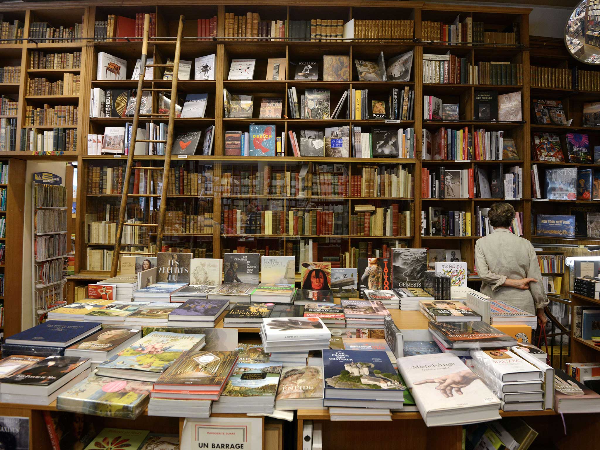
Penguin Random House is celebrating the 10th anniversary of its annual Design Awards this year, which provides students with an opportunity to win a year's placement at the company and get involved with design.
The Independent spoke with judges Anna Billson and Suzanne Dean to see what they look for in a cover design, and how cover art has the potential to encapsulate the words inside.
Q&A with Anna Billson, Art Director for Penguin Random House Children's:
What do you look for in a cover design?
A connection. Something that sparks an emotion – powerfully and appropriately.
A clear vision that communicates the meaning of the book in an instant.
Beauty and originality.
Attention to detail and skill in execution.
How do you feel a design can impact a reader – either in a good or bad way?
The moment you see anything you make a snap judgement – whether you realise it or not. You can’t escape the impact that physical appearance has. However visual or not you think you are you will have a gut reaction to what you see. A cover design is no different to anything else you see in the impact it can have. A good cover design is all about kick-starting the imagination of the reader. A good cover will intrigue and inspire, tap into memories or ignite new passions. A good cover will make the words inside the book speak more powerfully. A bad cover will just stop you picking up the book!
Choose 5 books that made you want to be a designer
In the chronological order that I came across them...
Mother Goose – Brian Wildsmith

One of the first books I can remember owning and one that I returned to a lot when I started as a Junior Designer in children’s publishing.
The First Puffin Annual
Just a wonderful thing – I find something new every time I look at it.
My parents collection of Penguin paperbacks

I can’t claim to have read them all, but they had a huge impact on me visually. I spent hours looking at them, lining them up on the shelves and admiring the simplicity and gracefulness of the design.
How it works – PRINTING PROCESSES [A Ladybird Book]
Never underestimate knowing about a process – even if it is only not to follow it.
The Letraset Catalogue
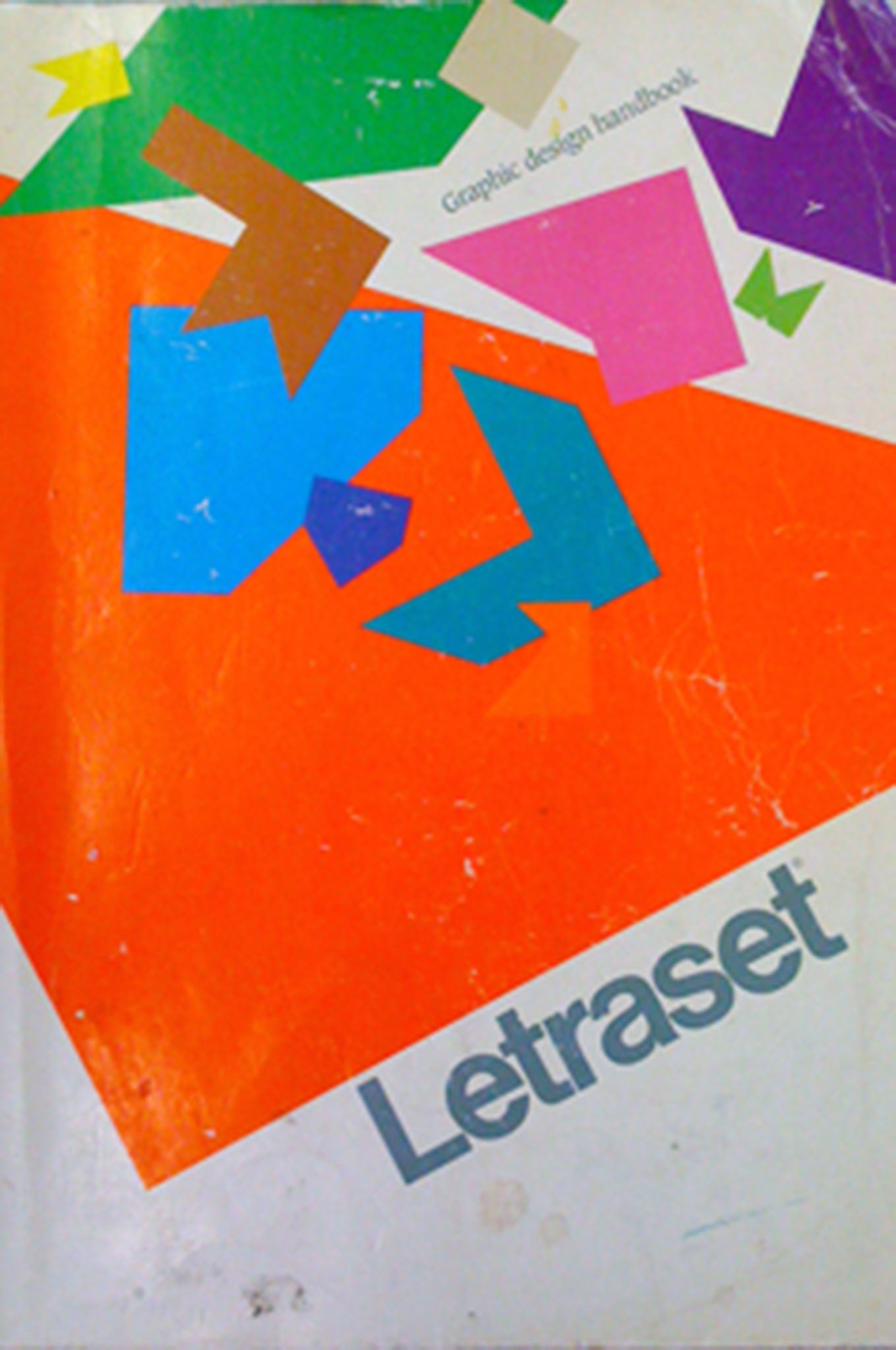
My bible at college and I can still spend hours happily leafing through an old dog-eared copy.
—
Q&A with Suzanne Dean, Art Director for Penguin Random House Vintage:
What do you look for in a cover design?
Book covers can be a visual foreword for the book. They have to capture the essence of the contents.
The cover needs to catch the eye, engage the potential reader and get them to pick the novel up. (It is said you only have a couple of seconds to catch a browser’s eye as they move through a bookshop.) The design has to do this in a unique, creative and striking way on a single page. It is partly this format restriction that makes cover design so interesting.
How do you feel a design can impact a reader – either in a good or bad way?
We live in a visual culture and we react to what we see. It is almost impossible not to judge things based on a first impression.
The cover image can connect with your subconscious; play with visual puns, the real and imaginary. The design can be nostalgic or shocking. At its best the cover distills the essence of that book, in a way that gets you to look twice, pick it up and buy the book. We all know how difficult it is to start a book, even when it comes highly recommended, when you don’t like the cover.
What are your top 5 book cover designs and why?
I find my top book cover designs vary over time. Below are my present choices:
A Clockwork Orange by Anthony Burgess
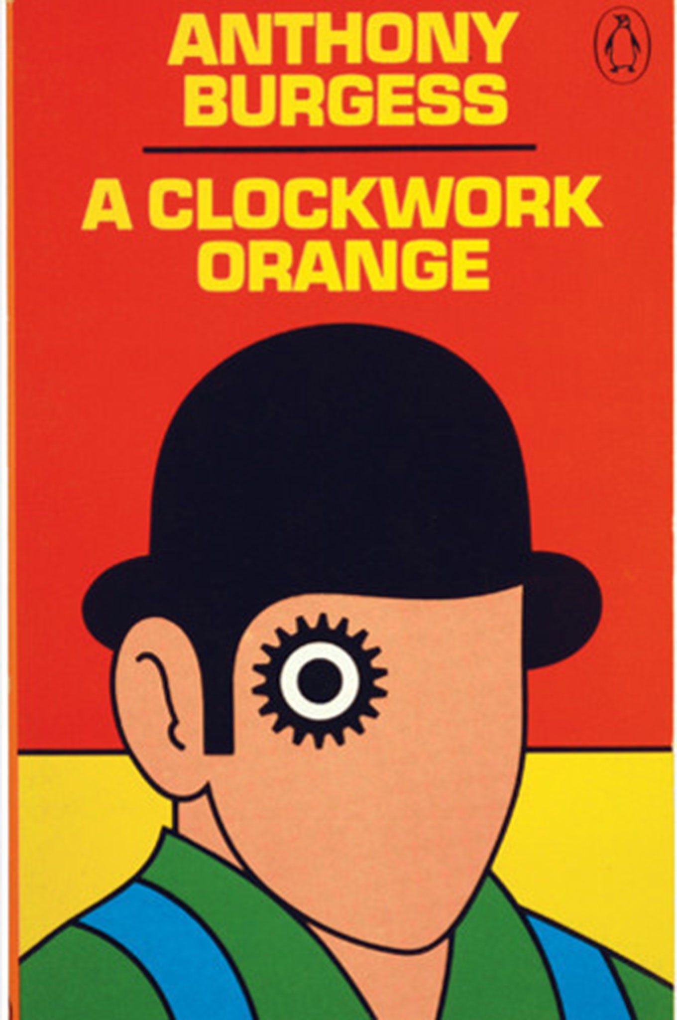
This iconic design by David Pelham is striking with its bold colours, thick outline and cog-eye symbol.
Albert Camus series

Helen Yentus redesigned the complete works of Camus for Vintage Books, USA. The covers’ stark, utilitarian type treatment contrasts with the optical illusions triggered by the interplay of the bold black and white graphics.
Extremely Loud and Incredibly Close by Jonathan Safran Foer
Design by Jon Gray. Hand-rendered lettering enclosed within a red hand. The design is so simple and memorable. You could recognise this title across a bookshop.
America by Kafka
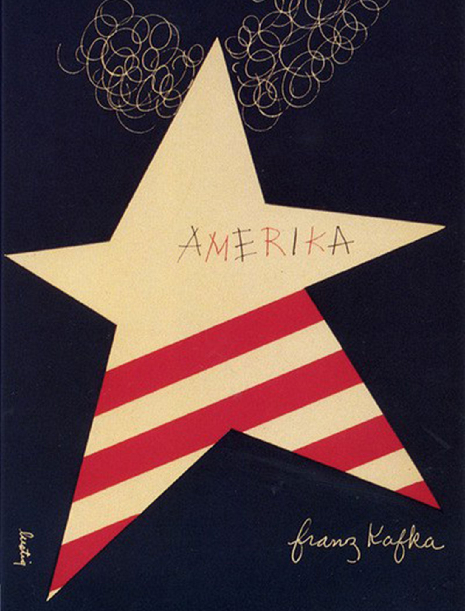
I have a great admiration for all Alvin Lustig’s (1915-1955) designs, especially for the New Directions New Classics Series. America is my favourite. Lustig creates an exceptionally strong graphic abstraction with a prominent star symbol in American red white and blue. It may have been designed in 1946, but looks as fresh today as it did then.
Nineteen Eighty-Four by George Orwell
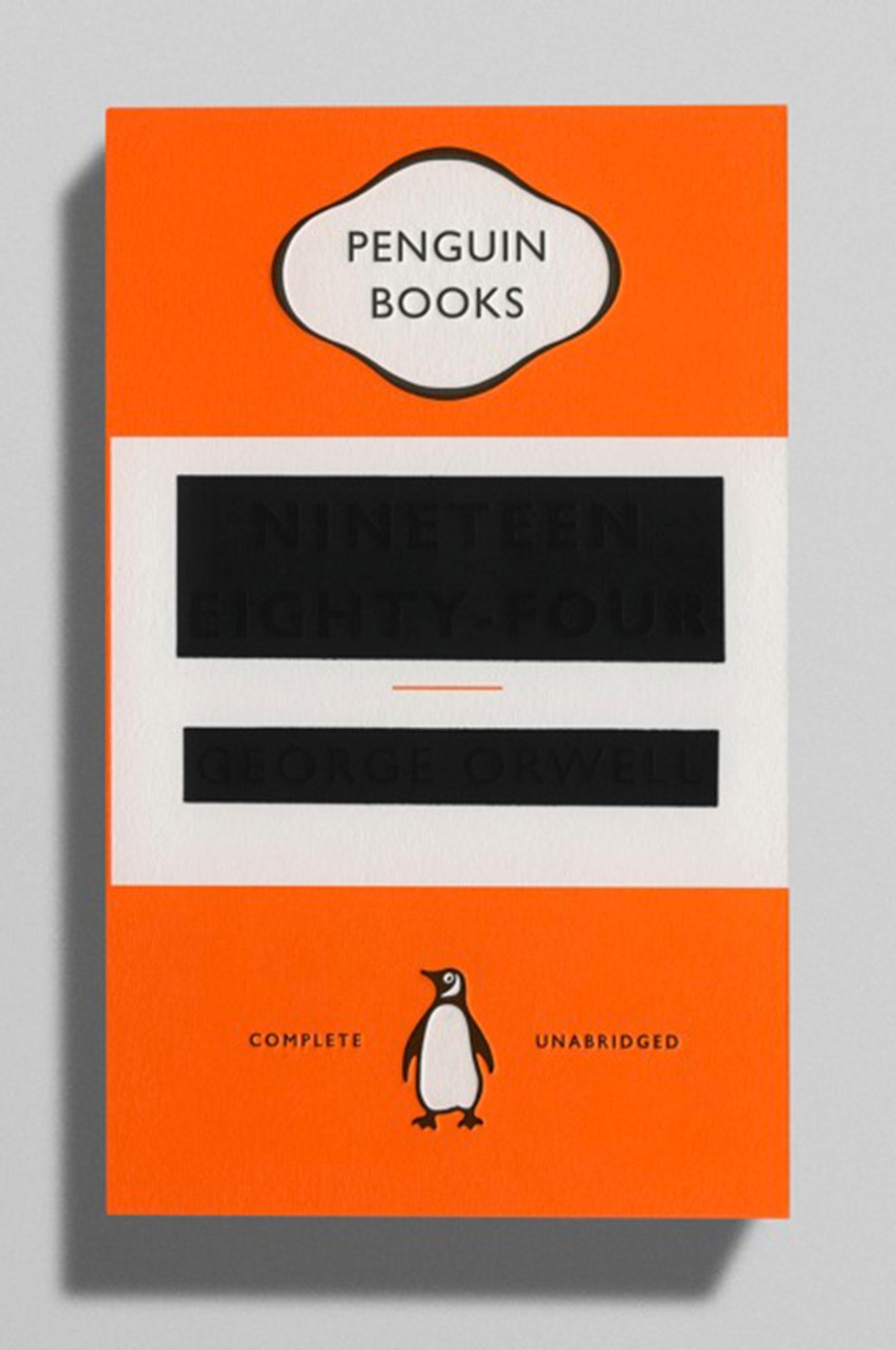
Perhaps one of Penguin’s most radical covers of recent years, this edition designed by David Pearson, has the title and author’s name almost completely obscured by black foiling. It references the rewriting of history carried out by the novel’s Ministry of Truth.
Anna Billson, Art Director of Penguin Random House Children and Suzanne Dean, Art Director of Vintage (PRH) are judges at Design Award 2016. For more info and to check out this year’s shortlist visit the site here
Join our commenting forum
Join thought-provoking conversations, follow other Independent readers and see their replies
Comments
Bookmark popover
Removed from bookmarks